
How to Create a Fashion Campaign Moodboard
Fashion boards fail when one page tries to do everything. Split it into mood, styling, and casting and set, keep the clothes the hero, and the stylist will thank you.
By the Spark team ·
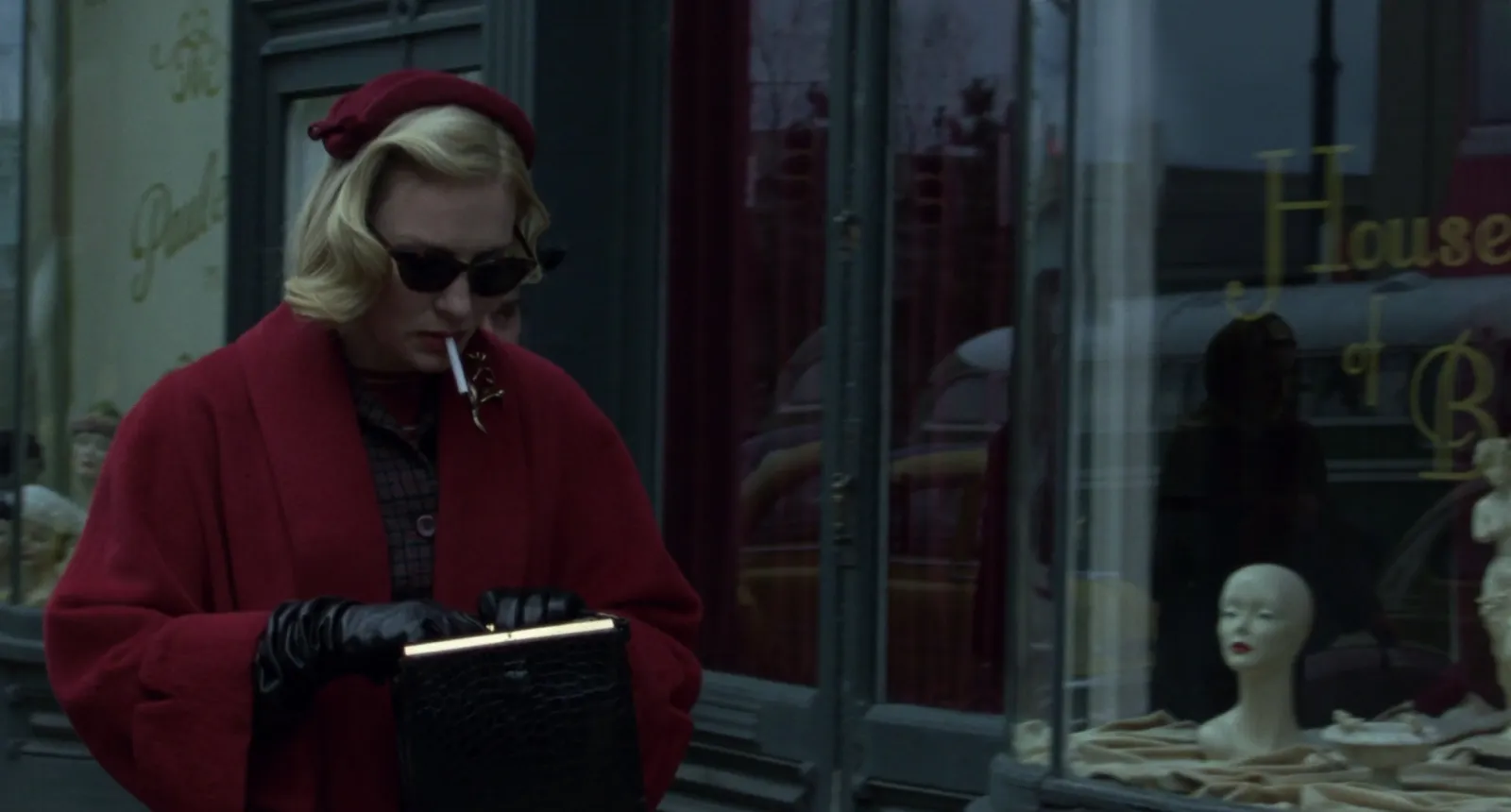
A fashion campaign moodboard works best as three boards, not one. A mood board for the world (story, colour, light, finish). A styling board for the clothes (silhouettes, fabric, how things are worn, hair and make-up). And a casting and set board for the faces and the places. Each gets 8 to 12 frames with a one-line note on why it's there, built from the collection outward, never from Pinterest inward. Because the product is the clothes, every frame has to earn its place by making them look better, not by being beautiful on its own.
That last rule is where fashion parts company with every other kind of shoot. Below is how we'd build each board, with film stills and moving references as worked examples, and how to send the thing so the movement survives.
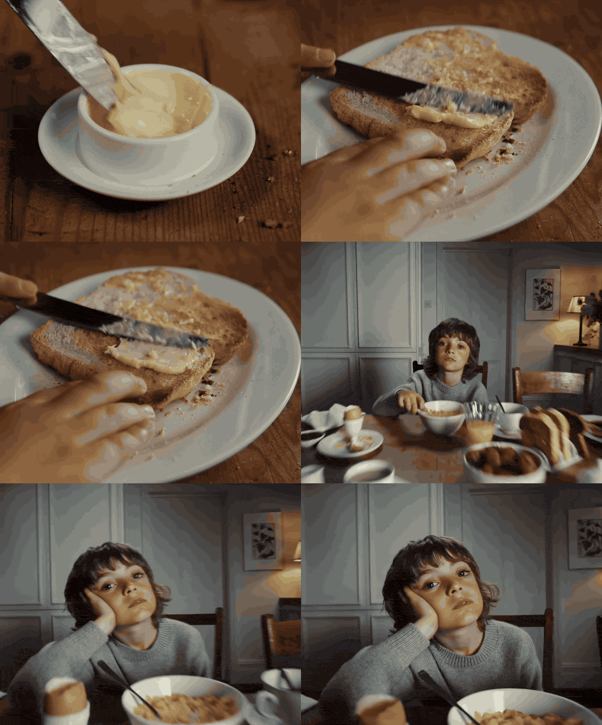
How a fashion board differs from a film board
The general method (brief, gather wide, cut hard, a note under every frame) is the same for any shoot, and our guide to making a moodboard for a video project covers it step by step. Fashion adds four complications.
The clothes are the hero. A gorgeous frame with a busy print in it can bury the collection you're there to shoot. Every reference has to leave room for the product.
Texture matters as much as colour. Mohair, patent leather, washed silk and boiled wool all photograph differently under the same light. A board that only talks about colour gets you the right shade in the wrong finish.
Casting is the brand. In a car ad, the actor serves the story. In a fashion campaign the face often is the story, so casting gets its own board.
It ships in a dozen shapes. The same shot has to work as a 4:5 feed post, a 9:16 story, a 16:9 film and probably a six-sheet. Your references should show compositions that survive the crop.
Start from the collection
Before you collect anything, sit with the collection itself: the line sheet, the lookbook if there is one, the fabric swatches, and whatever the designer was looking at when they made it. Designers nearly always have their own references (a film, a decade, a painter, a grandmother's wardrobe), and a campaign that ignores them feels like it was made for a different brand.
Then write the one sentence. "Upper East Side in winter, 1952, and someone is about to make a bad decision" is a brief you can find pictures for. "Timeless, modern, quietly luxurious" is every brand's sentence, and it finds you nothing.
Board one: the mood
This is the board the brand signs off, so it leads. Three sections, a few frames each.
The world
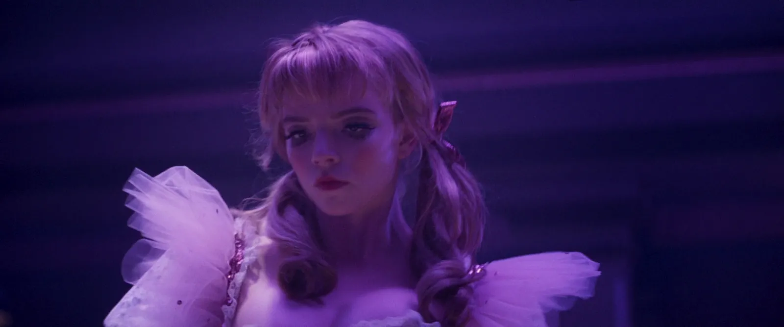
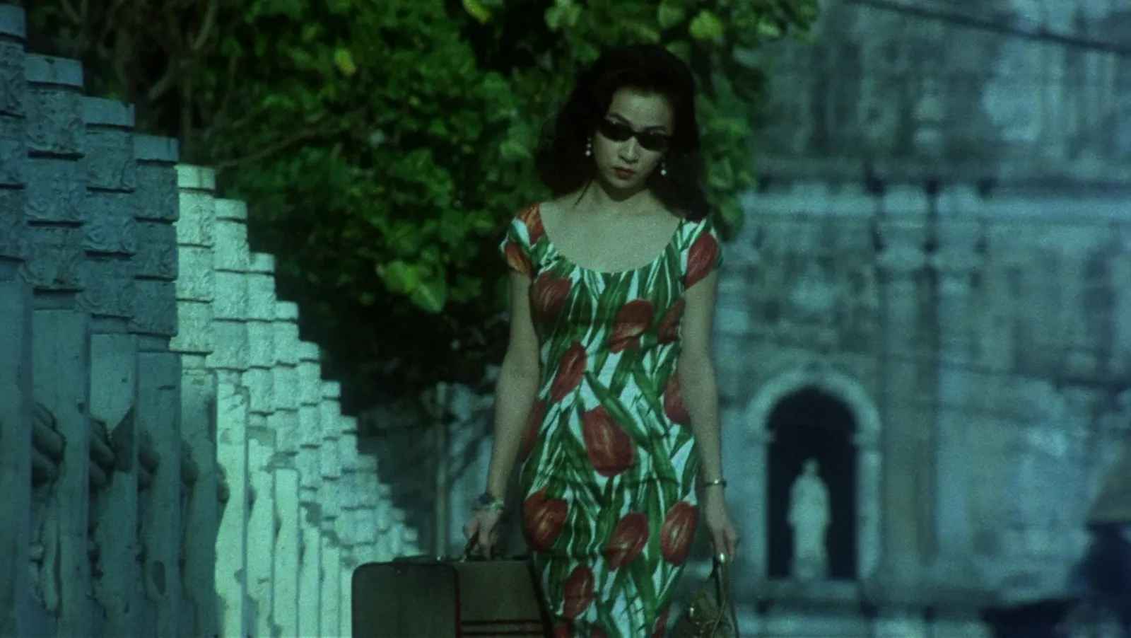
Two or three frames that tell everyone which era, city, weather and social class we're in. Film is the richest source here, because a film has already built a whole world with consistent costume, set and light.
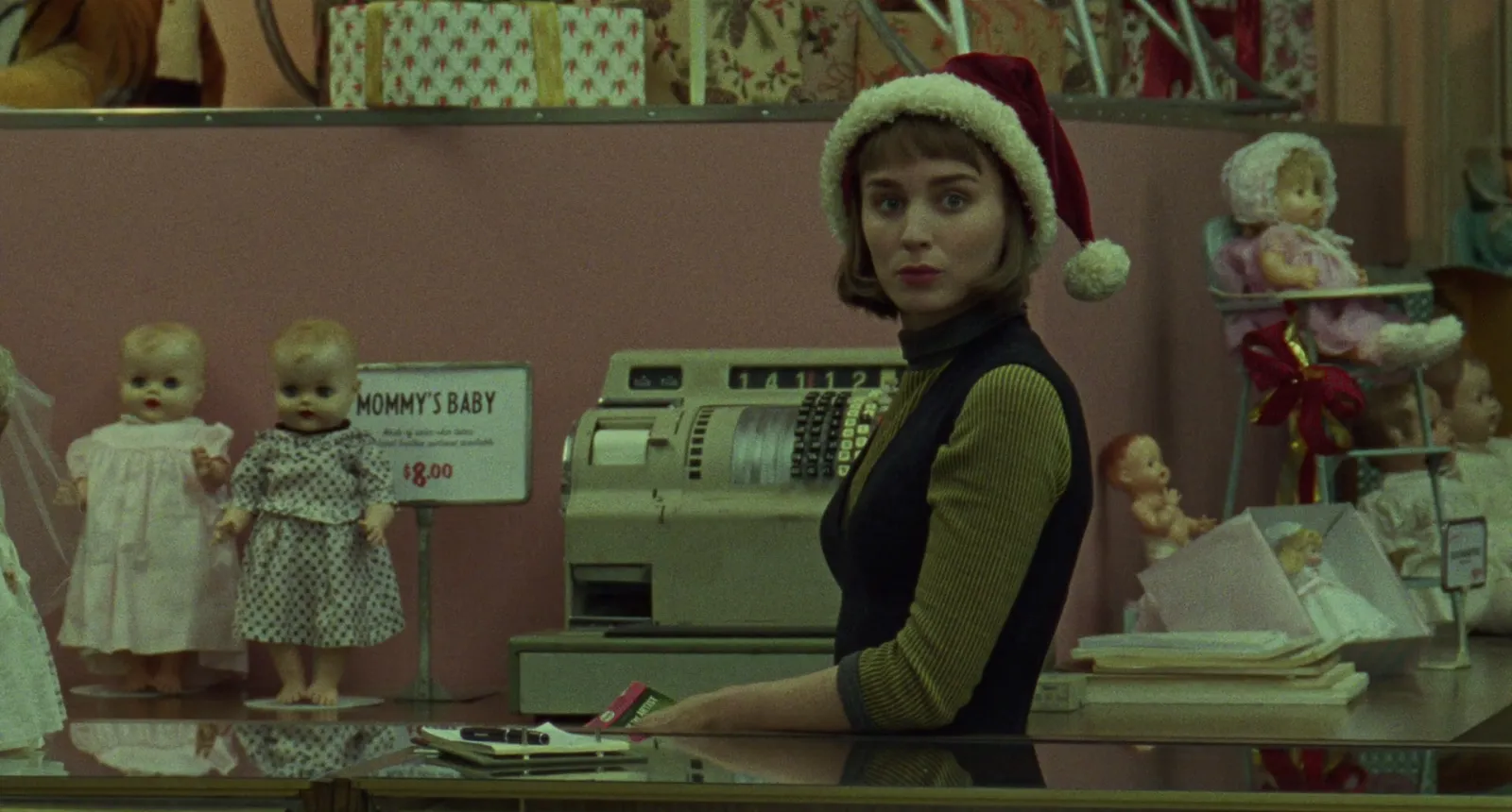
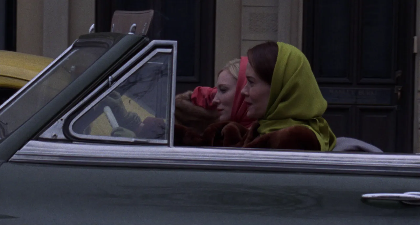
Two frames from one film are often stronger than two from different films. They agree with each other, so the board reads as one world rather than a playlist.
Colour
Anchor the palette to the actual product. Photograph the fabric swatches by a window in daylight and pull colours from those photos, not from your screen's idea of "camel". Drop a swatch photo into our palette extractor for the HEX values. It works on any film frame too. Then add frames that show those colours living in a world. For reading colour and grade from film, our guide to finding and saving colour grading references works through examples.
Light and finish
Say how it should feel to look at: hard direct flash, soft north-facing daylight, warm tungsten interiors, stage light. And the finish: clean digital, grain, a little halation, retouched to glass or left with pores. The photographer and the retoucher both need this, and they need it before the shoot.
Board two: styling
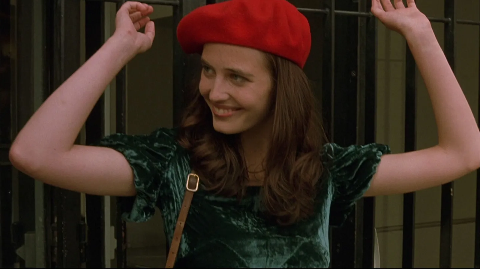
The stylist will build their own detailed boards from this (they always do, and they're better at it than you), so yours sets direction rather than going shopping. Sections that help:
- Silhouette. Long and narrow, boxy and cropped, oversized on small frames. Show the shapes, ideally on bodies in motion.
- How it's worn. Collar up or down, sleeves pushed, a shirt half tucked, tights or bare legs. This is where a campaign looks styled or looks like a catalogue.
- Texture against texture. Velvet against iron, mohair against plaster, silk against skin.
- Accessories. Bags, shoes, jewellery, glasses, and the rule for how many at once.
- Hair and make-up. Its own page, for the hair stylist and make-up artist. Three to six faces, the finish (dewy, matte, done, undone), and anything that's off limits.
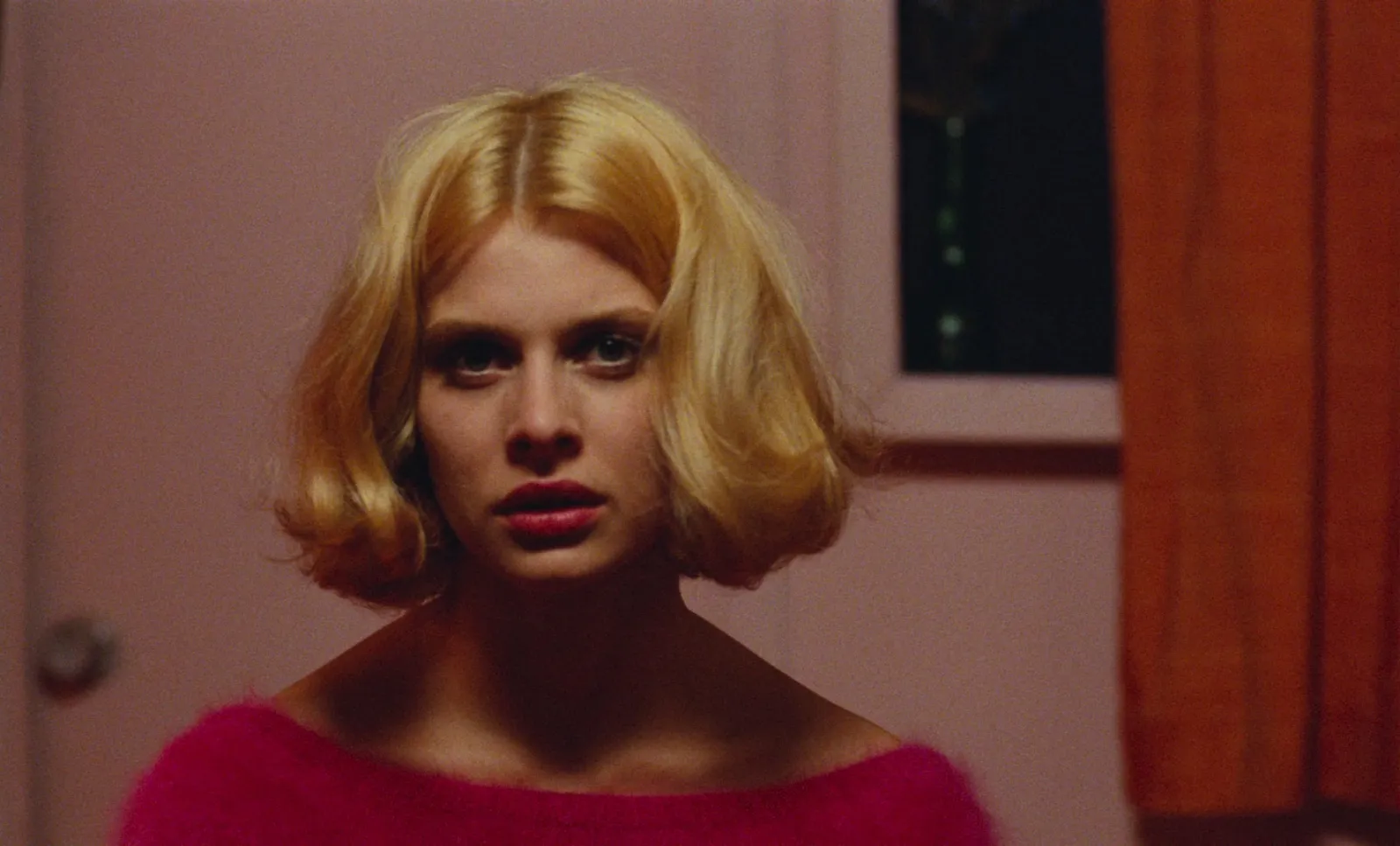
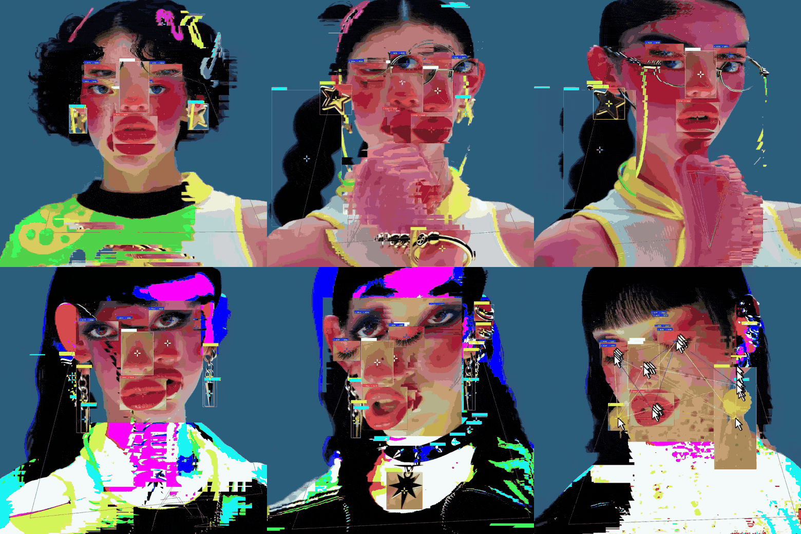
For beauty, a still often undersells it. Saturated colour, a glossy lip, eyes that catch light: these read best moving.
Board three: casting and set
Casting
Faces, ages, attitudes and how people hold themselves. Pull from street photography, past campaigns, films and agency boards, and keep it internal: casting references are a working tool, and the people in them didn't sign up to be in your pitch deck. Note what you're after in plain words. "Unbothered, not sulky." "Looks like she's about to laugh."
Set and location
Textures, scale, and how much world shows around the clothes. Interiors with one strong colour on the walls. Exteriors with weather. Note what the location manager should look for, not just what you like: "stone, columns, deep shade, a balustrade at waist height".
Movement: the bit stills can't carry
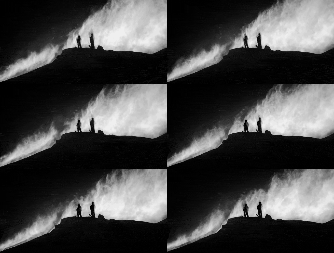
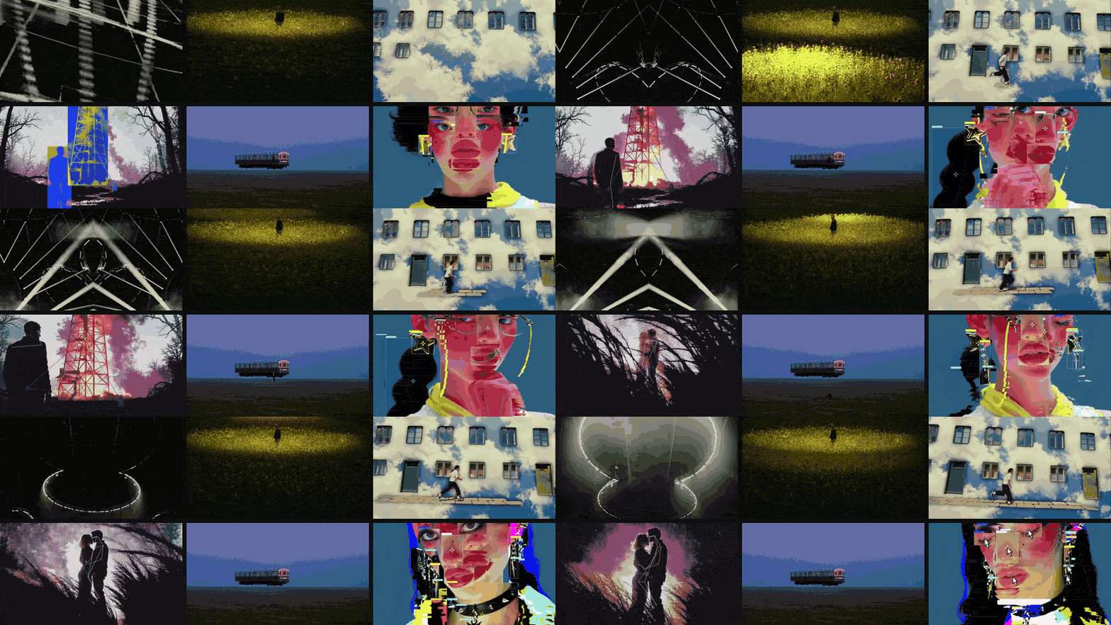
Most campaigns now include some film, even if it's twelve seconds for Reels. And clothes move in ways a still can't show: a skirt swinging on a turn, a coat settling as someone sits, hair in the wind or in front of a fan. Put short clips or GIFs beside the stills for every piece where movement sells the garment. Our guide to building a video moodboard covers trimming, GIF or MP4, and the playback traps.
Fashion films and runway footage are the best sources. Keep each clip to the two to five seconds that show the movement, and label it with what to watch: "the hem on the turn", not "nice". To cut exactly that moment, frame by frame, trim the clip into a GIF in your browser.
Where fashion references come from
- Film. Costume designers have done the research for you. Period films are especially good for silhouette and how clothes were actually worn.
- The brand's own archive. Old campaigns, old lookbooks, the founder's original references. Nothing reassures a brand like seeing its own history on your board.
- Runway archives. Vogue Runway goes back decades and is searchable by designer and season, though much of the archive now sits behind a Vogue subscription.
- Photo books and magazines. The good ones aren't on Pinterest, which is exactly why they're worth scanning.
- Instagram and TikTok. Where styling moves first. Also where references vanish when an account goes private, so save a copy.
- Pinterest. Fine for the last mile, filling a gap on a board you've already built. Terrible as a starting point, because everyone else's board started there too.
Credit everything. Fashion is a small world and photographers notice their own pictures in other people's decks. Internal pitch use is normal practice; anything public-facing needs permission.
Laying it out and sending it
One board per page, the mood board first. Eight to twelve frames each for the brand, more in the working versions for the team. Size by importance, leave space, and put the labels in one quiet style. Fashion boards want air around the pictures far more than film boards do.
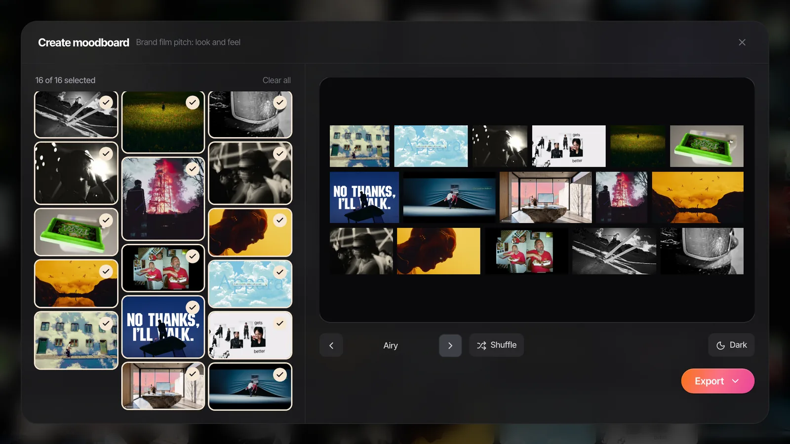
Send it in a format where the loops keep looping. Keynote, PowerPoint, Google Slides and Canva all play GIFs; a PDF freezes them on the first frame. If the brand insists on PDF, add a link to the moving version.
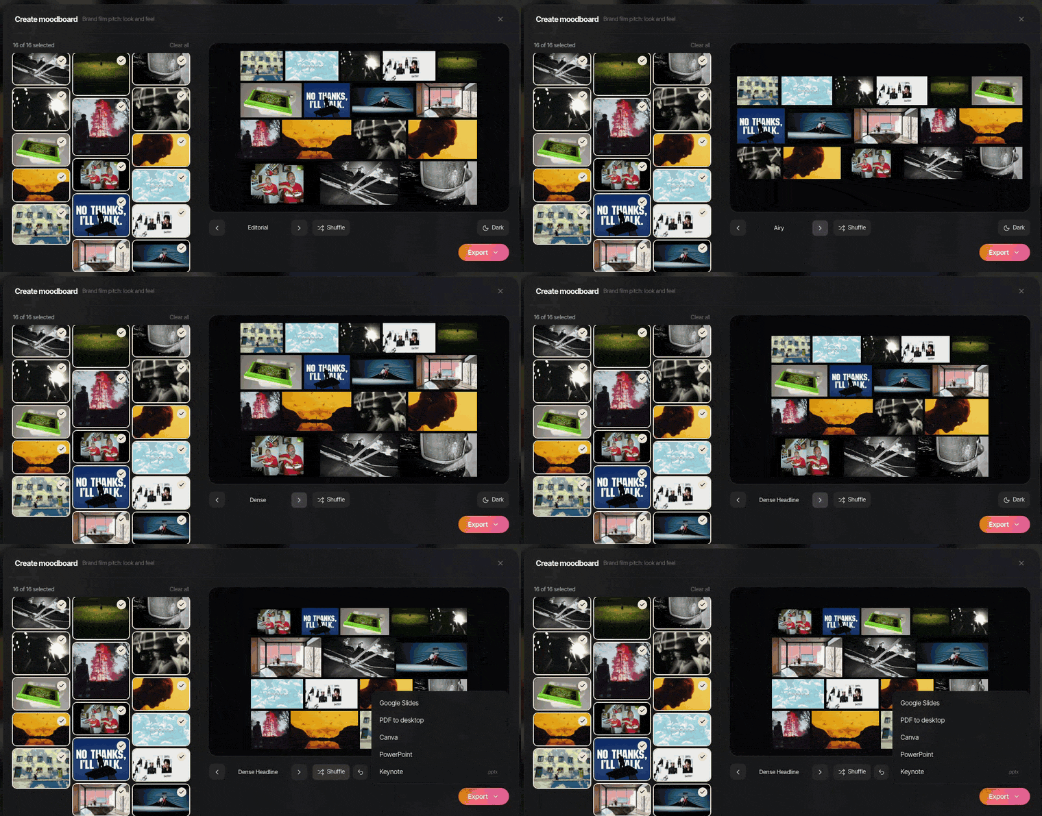
For a quick layout without opening a deck app, the moodboard maker we built arranges images and GIFs across eight layouts, and exports a .pptx (PowerPoint, Keynote, Google Slides or Canva), a PDF or a PNG. It runs in the browser and nothing is uploaded.
For the shoot itself, the styling and casting boards usually outgrow the deck and become the stylist's and casting director's own documents. The rules for the whole campaign end up in a visual style guide.
After the shoot, keep the references
The worst part of fashion work is that the references are scattered from day one: half on Instagram, a few runway clips on YouTube, the designer's WhatsApps, a brand film on Vimeo. After the shoot they scatter again.
Spark is the desktop app we built to keep them in one place. Paste a link, or send a reel to @sparkreferences from your phone, and the video saves with its source. On Creator and Studio it also gets an AI description and a transcript of any dialogue. Group references into a collection per campaign, pull stills or GIFs of the exact moment (the skirt on the turn), and Create Moodboard exports a laid-out board to Google Slides, Canva, PowerPoint, Keynote or PDF.
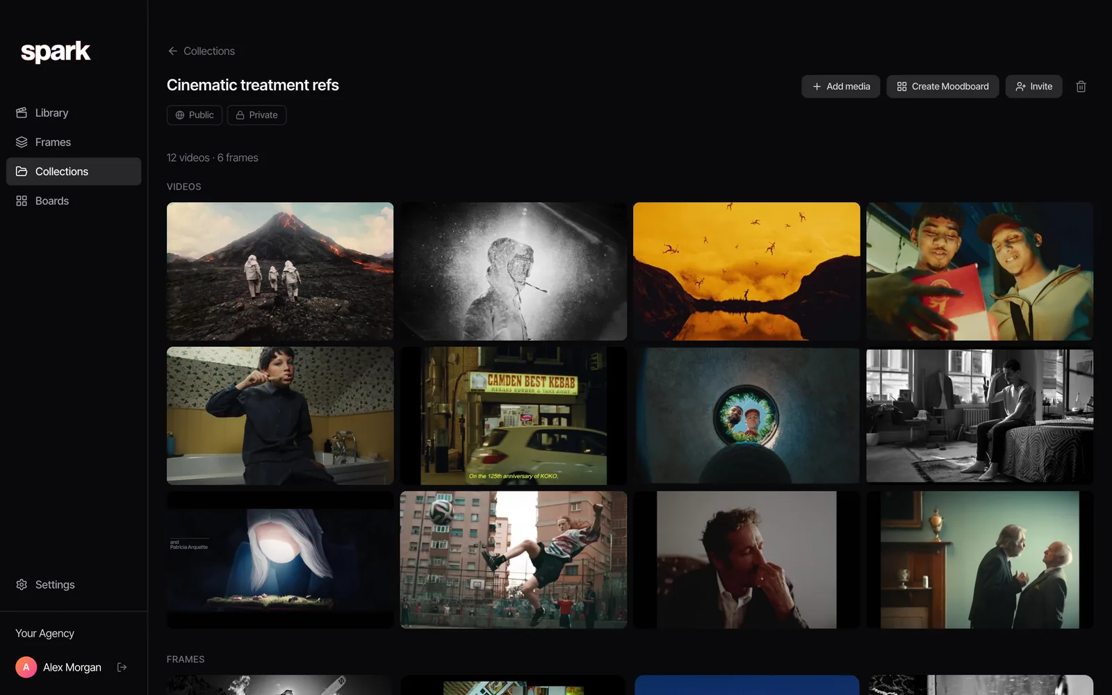
Next season's campaign will want half the same references with a new twist. Last season's collection sitting there, searchable by its descriptions and your own tags, is a far better place to start than a blank Pinterest board.
FAQs
What should a fashion campaign moodboard include?
The world and mood (era, place, colour, light, finish), the styling direction (silhouettes, fabric, how clothes are worn, hair and make-up), casting, and set or location. Most campaigns are clearer as three separate boards: mood, styling, and casting and set. Add short clips wherever movement sells the clothes.
What is the difference between a moodboard and a lookbook?
A moodboard is made before the shoot to agree the look, using other people's images as references. A lookbook is made after, from the brand's own photographs, to show the collection to buyers, press or customers. The moodboard is the plan; the lookbook is the product.
How many images should a fashion moodboard have?
For the brand, 8 to 12 frames per board is plenty, so 25 to 35 across mood, styling and casting. The working versions for the stylist, photographer and casting director can be larger. If you can't say what decision a frame makes, cut it.
Can I use film stills on a fashion moodboard?
Yes, for internal and pitch use that's standard practice, and film costume is one of the best references for silhouette and styling. Credit the film, keep them out of anything public-facing, and never present a reference as your own work.
Should a fashion moodboard include video?
Usually. Fabric movement, the way a coat falls and how someone walks in the clothes are hard to show in a still. Short loops of two to five seconds from fashion films or runway footage, labelled with what to watch, fix it. Send the board as Keynote, PowerPoint, Google Slides or Canva so the loops play.
What's the best app for a fashion moodboard?
For laying out the board, Keynote, Google Slides, PowerPoint, Canva or Milanote all work, and Spark's free moodboard maker does it in the browser. The harder part is collecting and keeping references from Instagram, TikTok, runway videos and films, which is where a reference library like Spark helps.
Keep reading
All articles
How to Make a Moodboard in Keynote
Keynote is the Mac pitch favourite for a reason. Masks, looping clips and Magic Move make a board that feels like a film. Here's the build, and what breaks on export.
How to Make a Moodboard in PowerPoint
PowerPoint is better at moodboards than its reputation. The trick is building one layout properly in the Slide Master, then never fighting a crop again.
How to Create a Moodboard in Canva
Canva gets a good-looking moodboard in front of a client in twenty minutes. Here's the route we use, video included, and the bits it quietly gets wrong for film references.