
How to Find and Save Colour Grading References
"Make it look like Amélie" isn't a grade note. Here's where good grading references come from, how to read one like a colourist, and how to save them so they help.
By the Spark team ·

Good colour grading references are clean, full-resolution frames from films, commercials and music videos, where you can say exactly why you like the grade. We find them on stills sites like FILMGRAB and ShotDeck, in colourists' own reels, and among the grading winners at craft awards. Before saving one, read it with four checks: what's happening to the skin, where the blacks sit, how the highlights behave, and how many colours are in the palette. Save the frame with one line on those four and your colourist has something to work with.
That line is what matters. A colourist can do very little with "make it look like Amélie". They can do a lot with "warm skin kept natural, the world pushed green-gold, blacks warm not neutral, red only on the hero prop".
Where we find grading references
Stills sites
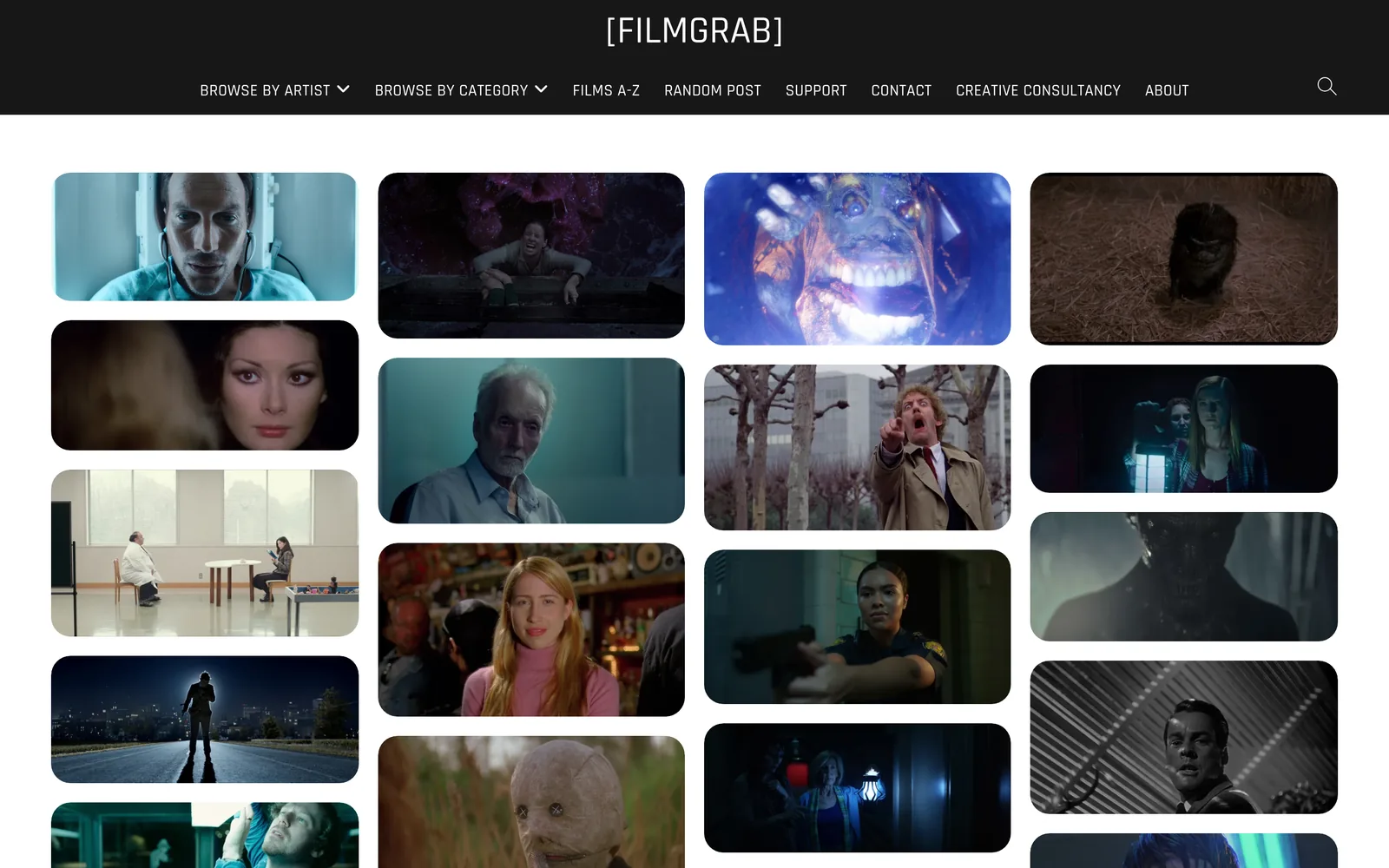
FILMGRAB is free and posts a careful set of frames from a different film most days. You browse it by film, not by colour, so it suits "I know which film I mean" better than "I need something teal".
ShotDeck is paid ($12.95 a month or $99.95 a year as of October 2026), and you can filter its film, TV, commercial and music video stills by colour, lighting and time of day. That's exactly the search you want when the brief says "cold, overcast, low contrast". Frame Set leans towards commercials; search is free and Pro is $15.99 a month per member.
What all three have going for them is quality. These are clean frames from good sources, not something squashed three times on its way to your phone. Our round-up of the best websites for commercial film inspiration goes through each.
Colourists' own reels
Most grading houses keep reels on their own sites: Company 3 and Harbor in the US and UK, Light Iron in the US, and London houses like Time Based Arts. Plenty of colourists also post before and after frames on Instagram and Vimeo, and those beat finished frames every time, because you can see what the grade did to the footage.
To find the colourist behind a spot you love, look it up on LBB Online or shots, which usually credit them. Then watch the rest of their reel. Quite often the "look" you've been chasing turns out to be one person's taste.
Craft award winners
CICLOPE, the craft festival, has Colour Grading as its own category, for commercials and again for music videos. Twenty minutes with a few years of winners is a quick education in where commercial grading is right now, and every winner comes credited.
Your own library
The best grading reference is often something you saved months ago for a completely different reason. A Nike spot you kept for the edit. A music video you kept for the casting. If your library knows about colour, search it first.

What to be wary of
Social screenshots are the obvious trap. Instagram and TikTok compress hard, and gradients, shadows and skin are exactly what compression ruins first. A reference that's been through two rounds of it has had its blacks and skin rewritten by an algorithm. Use it for the idea, never the detail.
And be suspicious of "cinematic LUT" before and afters. They're made to sell LUTs, on footage picked to flatter them. A LUT that looks gorgeous on someone else's footage rarely survives your camera, your lighting and your production design.
How to read a grade from one still
The first thing you notice in a frame is its overall colour. It's also the least useful thing to write down. Go through these four instead, in this order.
Skin. Is it natural, or pulled towards the rest of the image? Many grades push the world hard and protect skin so it still looks healthy. Others let skin go with the world, which feels more stylised. On a vectorscope, natural skin of every tone sits near the skin tone line, so a frame where it's visibly off the line is making a choice.
Blacks. Truly black (crushed), soft charcoal (lifted), or tinted green, blue or brown? Black level sets the mood more than almost anything. Crushed feels dense and graphic. Lifted feels soft and nostalgic, and cheap if overdone. Tinted blacks are where a lot of a "film look" lives.
Highlights. Do the brightest parts clip to flat white or roll off gently? Neutral or warm? Any glow or halation? Highlight handling is the clearest tell between a video look and a film look.
Palette. How many hues are there, really? Most strong grades are two or three colour families plus one accent. Count them, and note whether they're complementary (orange and teal, red and green) or neighbours (all warm). Want numbers, not names? The palette extractor on this site pulls them from a still or a video frame as HEX codes.
Then two quick calls: contrast (high, medium, low) and saturation (rich, natural, muted). That's it.
Worked example: Amélie
Start with the frame at the top of this page and its neighbours from the same film.


| Check | What Amélie does |
|---|---|
| Skin | Warm and natural, never pulled green with the world |
| Blacks | Deep, with a warm brown cast rather than neutral |
| Highlights | Soft, golden, not clipped |
| Palette | Green and gold, with red as the single accent |
| Contrast and saturation | Medium contrast, rich saturation |
The note you'd write: push the world green and gold, protect warm skin, keep blacks warm, red for one thing per frame. That last bit isn't really a grade instruction. It's production design. Half of most famous "looks" is art direction, and the red umbrella was red before anyone graded it.
Worked example: two ways to do dark
Black level is the hardest thing to put into words, so compare these.
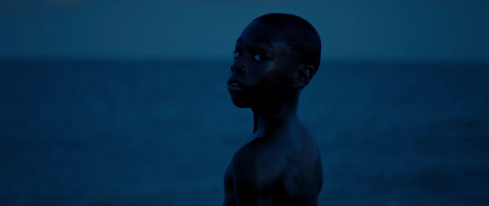
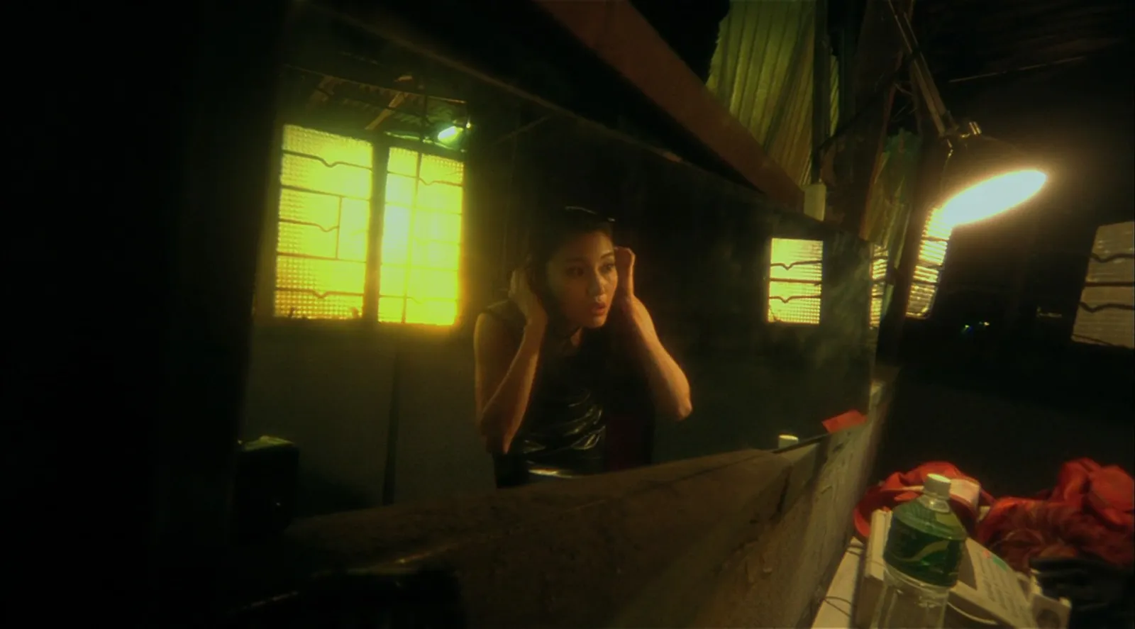
| Check | Moonlight | Fallen Angels |
|---|---|---|
| Skin | Takes the blue of the scene, with a gentle edge of light | Goes green and yellow with the room, on purpose |
| Blacks | Deep but tinted blue, shadow detail held | Crushed, big areas of pure black |
| Highlights | Few, soft | Practicals burn out and glow |
| Palette | One family: blue | Green, yellow and black |
| Contrast and saturation | Low key, rich | High contrast, sickly saturation |
Both are dark. One feels tender. The other feels like 3am in a bad flat. The difference is mostly in the blacks and the skin, which is why they come first.
Worked example: soft and quiet against bold and graphic

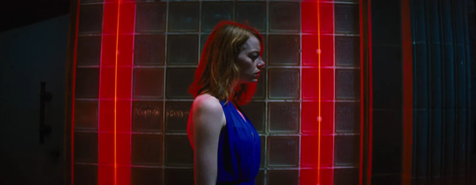
The snow on the steps in Blade Runner 2049 is low contrast done well: barely any black, highlights rolling off into grey-white instead of clipping, the palette drained almost to nothing. La La Land goes the other way, with a real black, strong saturation and two complementary colours doing all the work. When a client says "soft" or "punchy", these are the two ends of the scale. Show both and ask where their film sits.
Grading references from commercials
Features get all the attention, but for brand work commercials are usually the better reference, because that's the world the client is comparing you to. Three of ours get used a lot.


The Mile End film makes a point clients often miss. Most of that look is the location and the weather: grey London concrete, a flat sky, cool light. The grade only nudges it towards teal. If a client sends it as a reference for a shoot on a sunny high street, that's the conversation to have early, because you can't grade your way there.
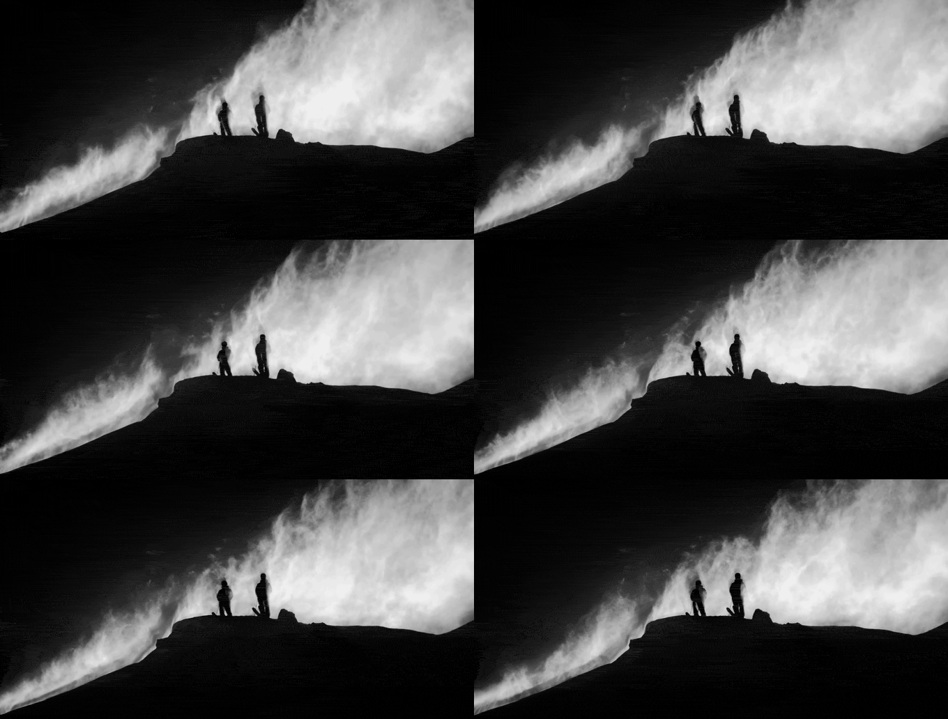
Black and white is a grade too, and an easy one to get wrong. The Salomon ridge works because the blacks are truly black and the powder is allowed to clip. Mush the middle and it looks like a filter.
Check the grade in motion
A still is great for skin, blacks and palette. It's bad at grain, halation (which can look like plain softness in a single frame) and how the grade holds up when the light changes. A night exterior that looks right in one frame might fall apart when headlights sweep through.

So for any reference that's going to drive a whole film, keep the clip with the frame. Watch it on a decent screen, not a phone with Night Shift on. (You'd be surprised how many grade notes are really notes about Night Shift.) If the clip needs to go into a deck, cut three seconds of it into a GIF in the browser. Nothing gets uploaded.
How we save them
A folder of 200 lovely frames isn't a grade reference. A dozen frames with notes is.
- Cleanest source you can get. A stills library or a high-quality stream, not a compressed screenshot.
- One frame per idea. Love the skin in one shot and the blacks in another? Save both and say so.
- Write the four checks. One line each, or one sentence for all four. People skip this bit, and it's the bit the colourist needs.
- Tag by look, not film. lifted blacks, warm skin, teal shadows, complementary, low contrast, overcast. These find frames across films. The title won't.
- Group by scene. A colourist wants to know how the night exteriors and the kitchen should feel, not a general mood.
In Spark, we export the exact frame from a saved video into Frames, write the four checks in the video's Notes, type the look tags into Tags ourselves, and put the frame and the clip in one collection for the job, so the still and the moving reference travel together. Every frame also gets a five-colour palette, so typing "teal" finds the frames that carry it, whatever we called them.

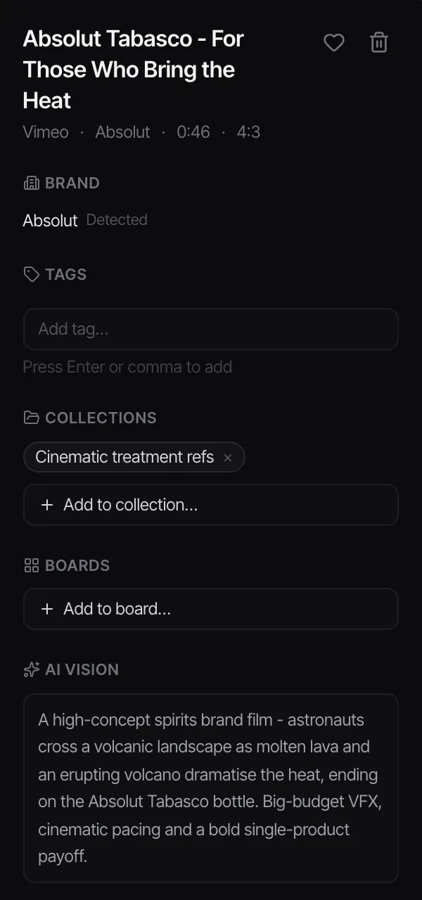
The same habits work for every kind of reference, and the rest of the filing system lives in our library-building guide.
Taking references into the grade
Give grading references their own page in the treatment or the moodboard, grouped by scene, notes underneath. Send it before the session, not during. Most colourists will pull your frames into their reference gallery: in DaVinci Resolve you can import stills into the Gallery on the Color page and wipe between your reference and the shot.
Keep the references consistent with your shot list. If shot 6 is a dusk silhouette, its grade reference should be a dusk silhouette. Our guide to building a shot list from video references shows how to attach a frame to every shot, and the grade note can sit in the same row. On a longer job those notes become the grade section of a visual style guide.
One last thing, and it's the one every overcast shoot day teaches again. A grade can only go where the footage lets it. If your references are all hard sun and deep shadow and the day is grey, no colourist will grade the sun back in. Share grading references with the DoP before the shoot, not after, and give light its own folder too: building a lighting reference library covers that.
FAQs
Where can I find colour grading references?
Stills sites are quickest: FILMGRAB is free, and ShotDeck lets you search by colour, lighting and time of day. Colourists' reels on grading house websites, Instagram and Vimeo show what a grade changed, and the colour grading winners at craft awards like CICLOPE show where commercial grading is right now.
How do you describe a colour grade?
Work through skin, blacks, highlights and palette, then add contrast and saturation. For example: "warm natural skin, blacks lifted to charcoal, highlights soft and creamy, palette of pink and red against off-white, low contrast". That's far more useful to a colourist than a film title on its own.
Can I use a LUT to copy a film's look?
Not really. A film's look comes from the lighting, production design, camera, lens and grade together, and a LUT only reproduces one transform built for someone else's footage. LUTs are fine as a starting point, but a reference frame with a clear note gets you closer.
Are screenshots good enough for grading references?
For the general idea, yes. For detail in shadows, skin and gradients, often not, because social platforms compress video heavily. Use frames from a stills library or a high-quality source where you can, and keep the clip so the colourist can see the grade in motion.
How many grading references should I give a colourist?
Fewer than you think. One to three frames per scene or look, each with a note, is plenty. A wall of 50 frames with no notes tends to produce a grade that tries to please all of them and suits none.
How do I get the exact colours out of a reference frame?
Drop the frame into a palette tool. The extractor linked above gives you the main colours as HEX, RGB or CSS values in your browser, and a palette card you can paste into the deck next to the frame.
Keep reading
All articles
Best Websites for Commercial Film Inspiration in 2026
Every site on this list was checked in October 2026. Some are free, some cost real money, and a couple are only worth it if you know exactly what you're hunting for.

Best Websites for Motion Design Inspiration in 2026
Motion design lists go stale fast. We opened every site on this one in October 2026, and found that one of the most famous places to watch short films no longer opens in the UK at all.

How to Find Examples of Match Cuts and Creative Transitions
The bone and the spacecraft, the match and the sunrise, the scream and the train whistle. The great match cuts by type, who cut them, and how to build your own collection.