
How to Create a Visual Style Guide for a Video Production
The moodboard says how it should feel. The style guide says what can't change. What to put in one, when you need it, and a template to copy.
By the Spark team ·
A visual style guide for a video production is the rulebook for the look. It writes down the decisions that keep every shot, episode and cutdown looking like the same production: aspect ratios, lenses, framing, movement, light, a colour palette with real values, the grade, type and graphics, and a page of do and don't frames. You write it after the look is agreed and before the shoot, for the people who weren't in the room when it was agreed.
That last part matters most. A one-day shoot with one director, one DoP and one editor rarely needs a style guide, because the look lives in three heads that talk to each other every day. A six-part series with two directors does. So does a campaign with forty cutdowns, or a brand that commissions films from three agencies over two years. Without a guide the look drifts, shot by shot, until episode five looks like a different show and it's hard to say when it happened.
Style guide, moodboard, treatment: three different jobs
People use these words loosely, and it causes real confusion when a client asks for "the look book" and means one of three things.
| Document | Its job | Who reads it | When | Tone |
|---|---|---|---|---|
| Moodboard | Explore and agree the feel | Client, director, HoDs | Early prep | Suggestive: "something like this" |
| Treatment | Win the job | Client, commissioner | Pitch | Persuasive: "here's our film" |
| Style guide | Keep it consistent | Crew, post, designers, future directors | After approval, before the shoot | Rules: "always, never, only" |
A moodboard is full of other people's frames, and that's fine, because it's about the feel. A treatment is a sales document with a voice. A style guide is neither. If a page could be read as a suggestion, it isn't finished. "Warm, intimate light" is a moodboard caption. "Key from one side only, practicals in every interior, never top light on faces" is a style guide rule.
Rules that work: the colour-coded film
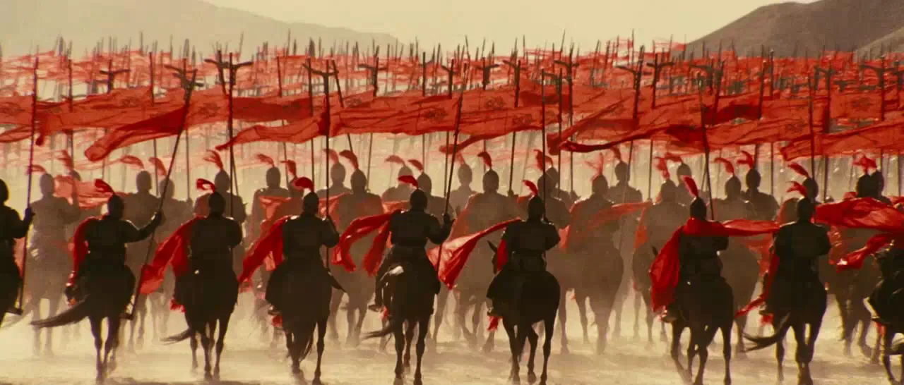
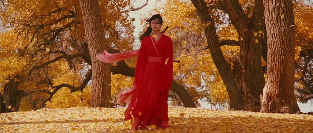
The clearest style guides on screen are films that run on visible rules. Zhang Yimou's Hero (2002), shot by Christopher Doyle, tells its story in versions, and each version owns a colour: red for one telling, then blue, then white, with green for flashbacks. Emi Wada's costumes change with the chapter. Every department could check its own work against one question. What colour is this chapter?
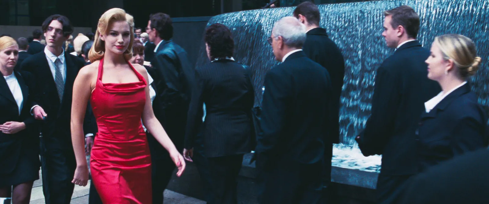
The Matrix (1999) is the other classic. Bill Pope has described the team settling on green for the world inside the Matrix, pushed with filters and colour timing, while the real world went cold and blue with the warmth taken out. Two worlds, two rules, and you always know where you are.
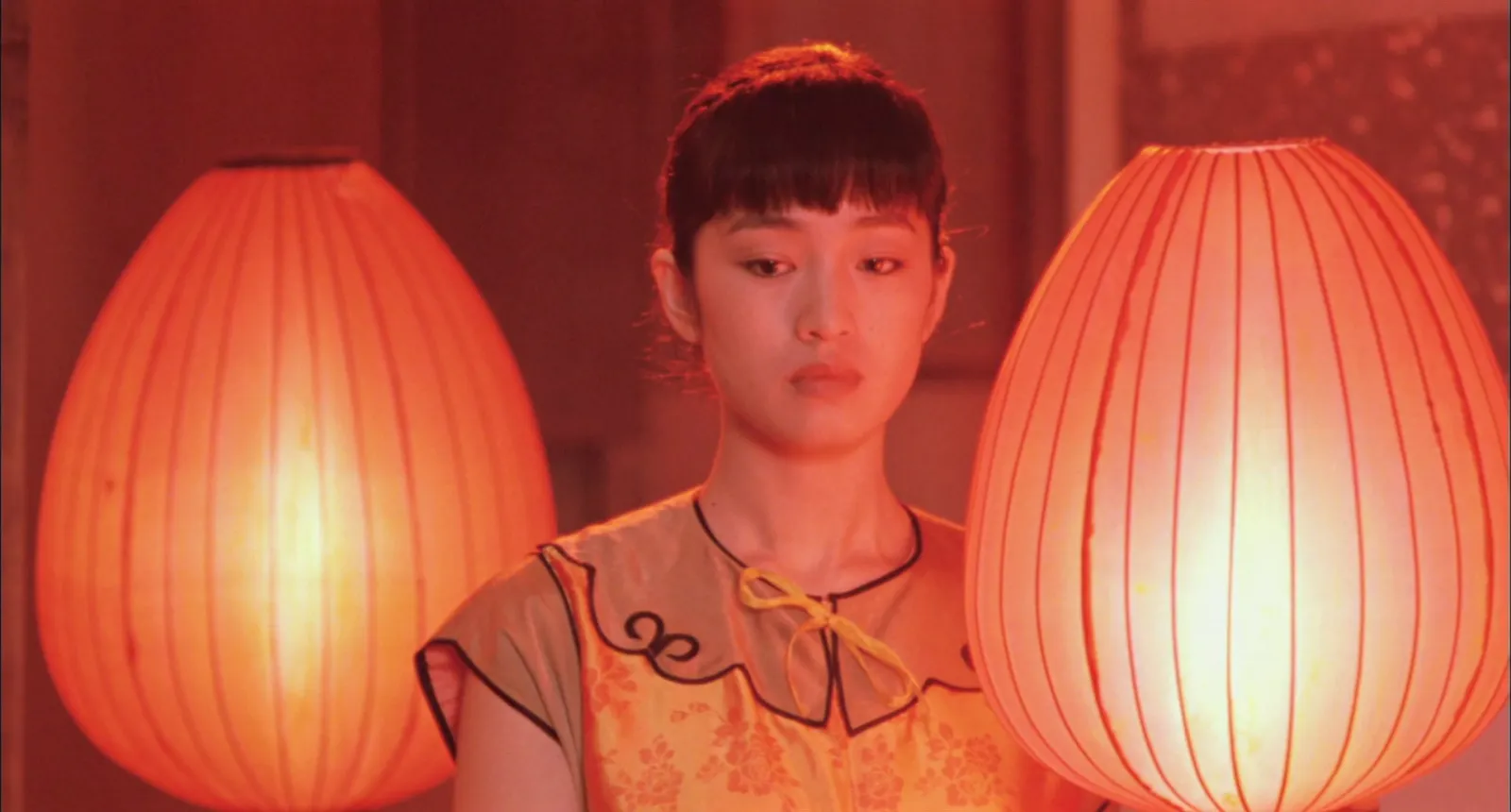
You won't be making Hero. But the same thinking works for a brand series. "The product is the only saturated colour in frame." "Exteriors are overcast or blue hour, never hard sun." "Every film ends on a static wide." Rules like these are easy to brief and, more to the point, easy to check.
What goes in a video style guide
This is the template we use, section by section. Not every production needs every section. Cut the ones you don't need, but cut them on purpose.
1. The look in one line
One sentence, plus the three words the look must never stop being. "Quiet, warm, observed. Never glossy." It goes on the cover and, ideally, taped inside the camera truck.
2. Format and deliverables
Aspect ratios for every deliverable (16:9 master, 9:16, 4:5, 1:1), frame rate, resolution, and how the vertical versions are protected. If the 9:16 cut comes from the 16:9 master, say where the safe zone sits and get frame lines built into the monitors. This section saves more reshoots than any other, and it's the one people skip.


3. Camera and lenses
Camera, lens set, allowed focal lengths and filtration. Be specific. "Primes only, 32mm to 75mm, nothing wider than 32mm on faces" is a rule. "Cinematic lenses" is not.
4. Framing
Where people sit in the frame, headroom, eyelines, symmetry or not, and how close you get. Two or three reference frames per rule.
5. Movement
Locked off, dolly, Steadicam, handheld, drone: which are allowed, when, and at what speed. "Handheld only when the character loses control" is the kind of rule that holds a series together. Movement rules read much better as loops than as words, so put a GIF beside each one if the guide lives as slides.
6. Light
Direction conventions, contrast, practicals, colour temperature per location or world, and the time-of-day rule. Our guide to building a lighting reference library covers how to describe light so it can be written as a rule.

7. Colour palette
The palette with HEX values, and which colours belong to what: product, characters, worlds, chapters. Include an avoid list too, the colours that would break the look. A competitor's brand red is the classic. Pull palettes from approved test frames rather than guessing values by eye (more on that below).
8. Grade
The show LUT or look name and its version, a reference frame for each scene type, and notes on skin, blacks and highlights. If you need a way of describing a grade in words, our guide to colour grading references has one.
9. Wardrobe, art department and locations
Palettes and materials for costume and sets, what's never allowed in frame (logos, patterns that strobe on camera, the wrong reds), and location types.
10. Type and graphics
Fonts, sizes, positions for supers and lower thirds, title-safe areas per aspect ratio, animation timings, logo and end card rules, subtitle style. On campaigns this is the most opened page in the guide, because the agency designer and the freelance online editor both need it at 6pm on a Friday.
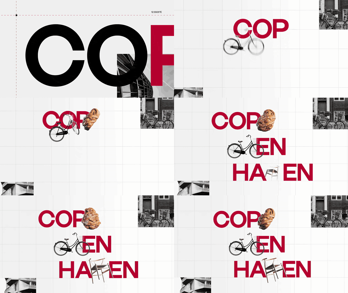
11. Do and don't frames
Pairs of frames, ideally from your own tests: one that follows the rule, one that breaks it, with a line saying which rule. People skim text. Nobody skims a "don't" frame.
12. Owner, version and date
One named owner, a version number and a date on the cover. A style guide without an owner becomes four style guides by the second shoot.
A template you can copy
[PRODUCTION NAME] VISUAL STYLE GUIDE   v1.0   [date]   Owner: [name]

1. THE LOOK         One line. Three words it must always be. One word it must never be.
2. FORMAT           Deliverables and ratios | fps | resolution | safe zones | frame lines
3. CAMERA + LENSES  Camera | lens set | allowed focal lengths | filtration
4. FRAMING          Rules + 2 reference frames each
5. MOVEMENT         Allowed moves | when | speed
6. LIGHT            Direction | contrast | practicals | colour temp | time of day
7. COLOUR           Palette (HEX) | what owns which colour | colours to avoid
8. GRADE            LUT name + version | reference frame per scene type | skin, blacks, highlights
9. ART + WARDROBE   Palettes | materials | never in frame
10. TYPE + GRAPHICS Fonts | supers | lower thirds | safe areas | end card | subtitles
11. DO / DON'T      Frame pairs, one rule each
12. CHANGE LOG      What changed, when, who approved it
Keep it short. Ten to twenty pages is plenty for most productions, plus a one-page cheat sheet with the rules that matter on set: format, lenses, the palette, the light rule and the three words.
Where to build it? We do ours as slides in Keynote or Google Slides, because movement rules can sit there as GIFs that play, then export a PDF for the people who only want to print the cheat sheet. Teams that already run the production in Notion often keep the guide there, which works fine for text and stills (just watch the upload cap: 5 MB a file on Notion's free plan). For the do and don't pages, Spark's moodboard maker lays out frame pairs on 16:9 slides and exports a .pptx in a couple of minutes.
Pulling the palette
The palette page is where style guides most often go vague. "Warm neutrals with a pop of red" means something different to everyone who reads it. HEX values don't.
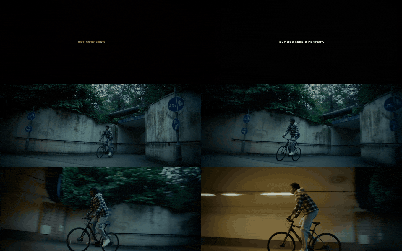
Take two or three approved frames (test stills are best, otherwise your strongest references), pull the palette from each, and agree five to eight colours with their codes. Then say which colour does which job. In both frames below the job is obvious: one colour owns the world, one owns the accent.
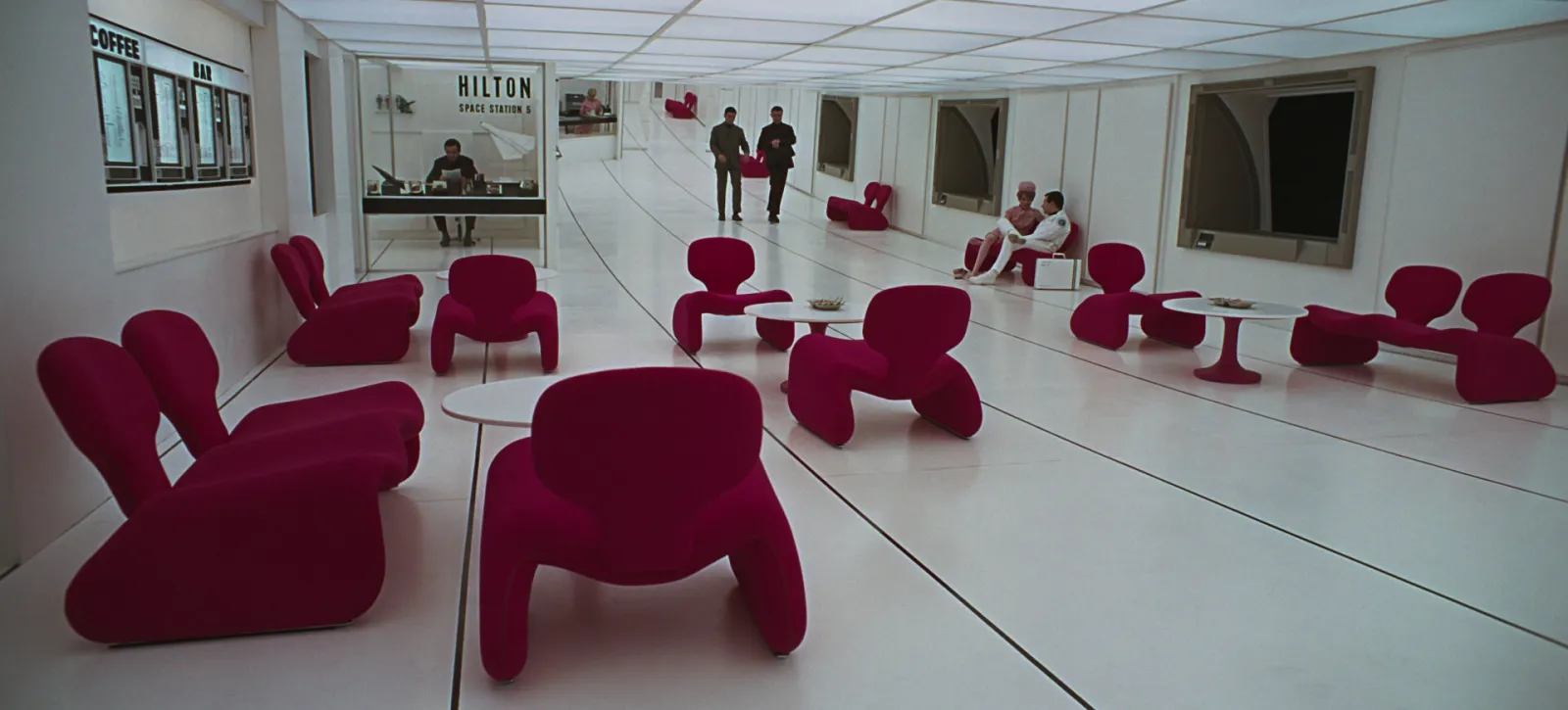

Our palette tool does this in your browser. Drop in a still or a video frame and it gives you the palette as HEX, RGB or CSS values, a palette card to paste into the guide, and swatch files for the designers.
Making the guide stick
A style guide works when it's used on set and in the edit, not when it's approved. What helps:
- Shoot a test, then write it. Rules illustrated with your own test footage beat rules illustrated with film stills, and they show what your camera and lenses actually do.
- Send it with the call sheet, not three weeks before. Print the cheat sheet for the DIT cart.
- Check against it at every review. At the offline and the grade, put the guide's frames on a second screen and compare. That's where drift gets caught.
- Version it, every time. When a rule changes (it will), bump the version, update the change log and tell everyone. An old PDF in someone's downloads folder is worse than no guide at all.
- Keep a living reference collection next to it. The PDF holds the rules. A shared collection holds the approved frames and clips, so the second director can watch the moves instead of reading about them. If the production has numbered shots, link the frames to the shot list too.
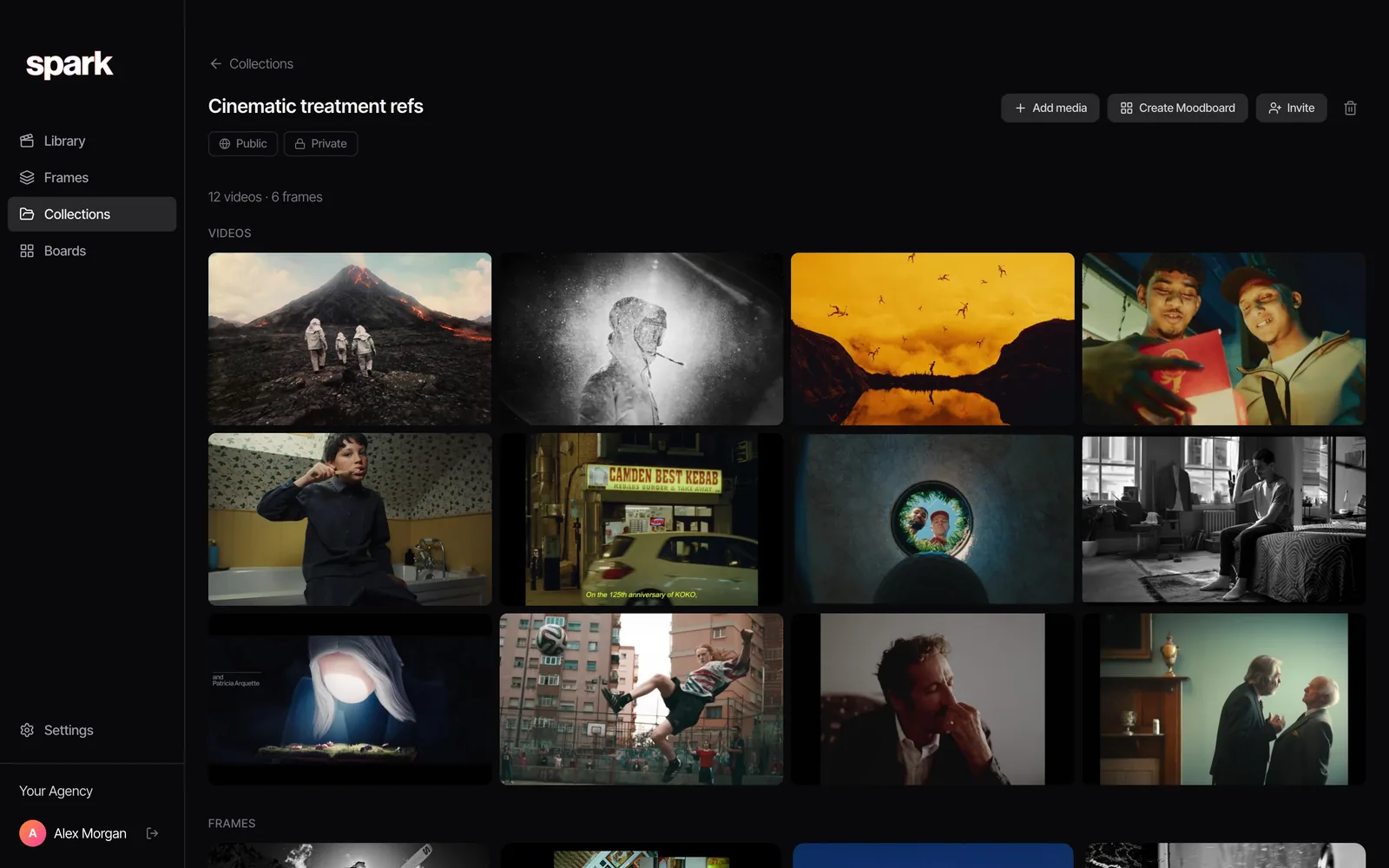
A style guide earns its keep around the third shoot day, or the fortieth cutdown, when someone who wasn't in prep makes a call and gets it right without asking. The PDF does half of that. The other half is a set of approved frames and clips people can find, which is what Spark is for. One collection per production, named like the guide. That's it.
FAQs
What is a visual style guide in video production?
It's a document that sets the rules for a production's look so it stays consistent across shoots, episodes, directors and deliverables. It covers format, lenses, framing, movement, light, colour palette, grade, art direction, type and graphics, usually with do and don't frames. It's written after the look is approved, for everyone who has to reproduce it.
What's the difference between a style guide and a moodboard?
A moodboard explores and agrees the feel, usually with other people's images, early in prep. A style guide turns the agreed look into rules ("always", "never", "only") that the crew and post team can follow and check. The moodboard is a conversation; the style guide is the outcome.
What is a look book in film?
"Look book" is used loosely. Sometimes it means a director's visual pitch, close to a treatment, and sometimes it means the production's style guide or series bible. If a client asks for one, ask whether they want to be persuaded or want rules to follow, because those are different documents.
What should brand video guidelines include?
Everything a visual style guide includes, plus the brand layer: logo use and placement, end cards, type for supers and subtitles, colours to avoid (especially competitors' colours), music and sound rules if they matter, and accessibility requirements such as captions. Give real values and frame examples rather than adjectives.
How long should a visual style guide be?
Ten to twenty pages covers most productions, plus a one-page cheat sheet for set. Longer guides tend not to get read. If a section isn't changing any decision on set or in post, cut it.
Keep reading
All articles
Best Websites for Commercial Film Inspiration in 2026
Every site on this list was checked in October 2026. Some are free, some cost real money, and a couple are only worth it if you know exactly what you're hunting for.
Best Websites for Motion Design Inspiration in 2026
Motion design lists go stale fast. We opened every site on this one in October 2026, and found that one of the most famous places to watch short films no longer opens in the UK at all.

How to Find Examples of Match Cuts and Creative Transitions
The bone and the spacecraft, the match and the sunrise, the scream and the train whistle. The great match cuts by type, who cut them, and how to build your own collection.