
How to Build a Film Treatment That Wins a Pitch
Most treatments are decided in the first three pages, often on a phone. Build yours to survive that, from the opening letter to the reference frames.
By the Spark team ·
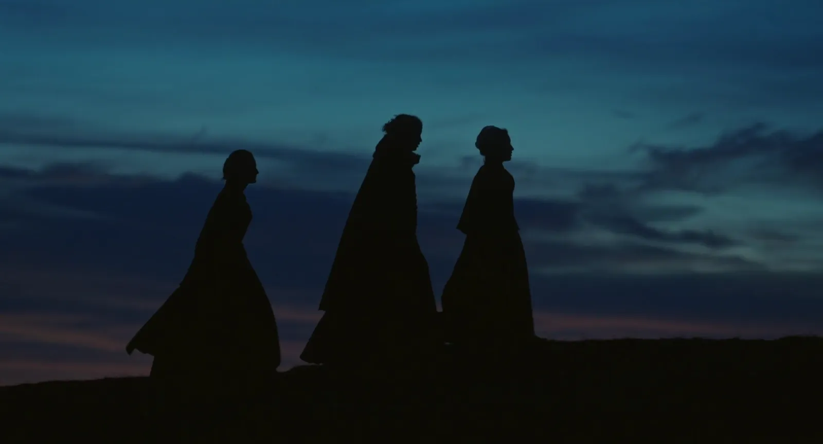
A film treatment that wins a pitch does three things in its first three pages. It proves you understood the brief. It tells the idea in a way the client could repeat to their boss in the lift. And it makes them see the film. For a commercial or brand film that usually means 10 to 20 horizontal pages, mostly pictures, written in the first person and the present tense. Everything after page three is there to make the reader trust you can shoot it.
We write a lot of these at Perspective Pictures, and we've lost pitches with treatments we were proud of. Nearly every time, the reason was in those first three pages.
This is about the director's treatment, the document you send an agency or brand when you're pitching to make their film. A story treatment for a feature, a fund or a broadcaster is a different animal (prose, hardly any pictures), and there's a short section on it at the end.
Who really reads your treatment
Picture the real audience, not the ideal one. The agency producer opens it first, on a laptop between calls, to check it's on brief and roughly on budget. The creative team reads it properly, because it's their script you're interpreting. Then it gets forwarded to the client's marketing team, who open the PDF on a phone on the train, scroll four pages and make up their minds before they ever reach your camera section.
So the first three pages carry the pitch. The rest is evidence.
That changes how you build it. Big pictures. Short paragraphs. One idea per page. A file that opens fast on hotel Wi-Fi. A 90 MB PDF with a 600-word opening letter will lose to a lean one with a single great line on page two, and we'd bet on that every time.
The structure that works
There's no official template, and some agencies send their own (if they do, theirs wins, always). But most commercial treatments that win follow something close to this order:
- Cover. Title, client, your name, one hero image. Nothing else.
- Opening letter. A few short paragraphs to the creatives: what you love about the script, what you think the film is really about, and the one thing you'd do that nobody else will.
- The idea in one breath. A sentence, maybe two. If the client only reads this page, they still get it.
- Story or beats. The film in the present tense, scene by scene. "We open on a kitchen at 5am. The only light is the fridge."
- Look and feel. Your reference pages: colour, light, framing, texture. Most of what follows is about these.
- Casting and performance. Who these people are and how they behave on camera. Street cast or actors?
- Camera. Lenses, movement, format, and why. Why handheld here, why locked off there.
- Locations and production design. Where it happens and what the world is made of.
- Wardrobe and styling. Usually a page, sometimes folded into design.
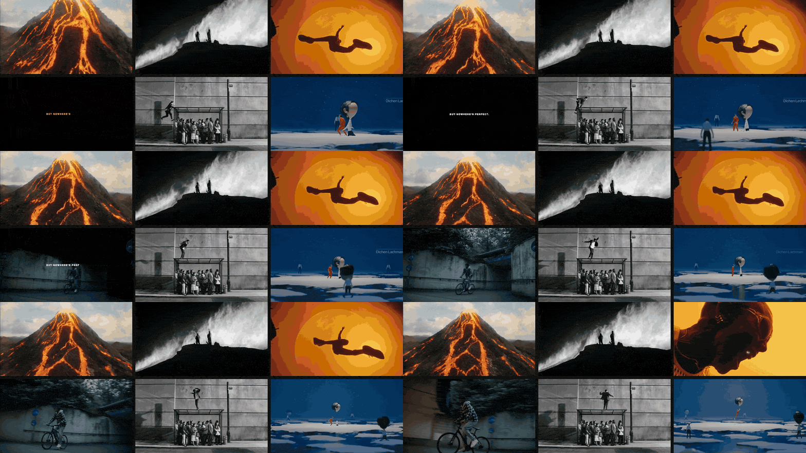
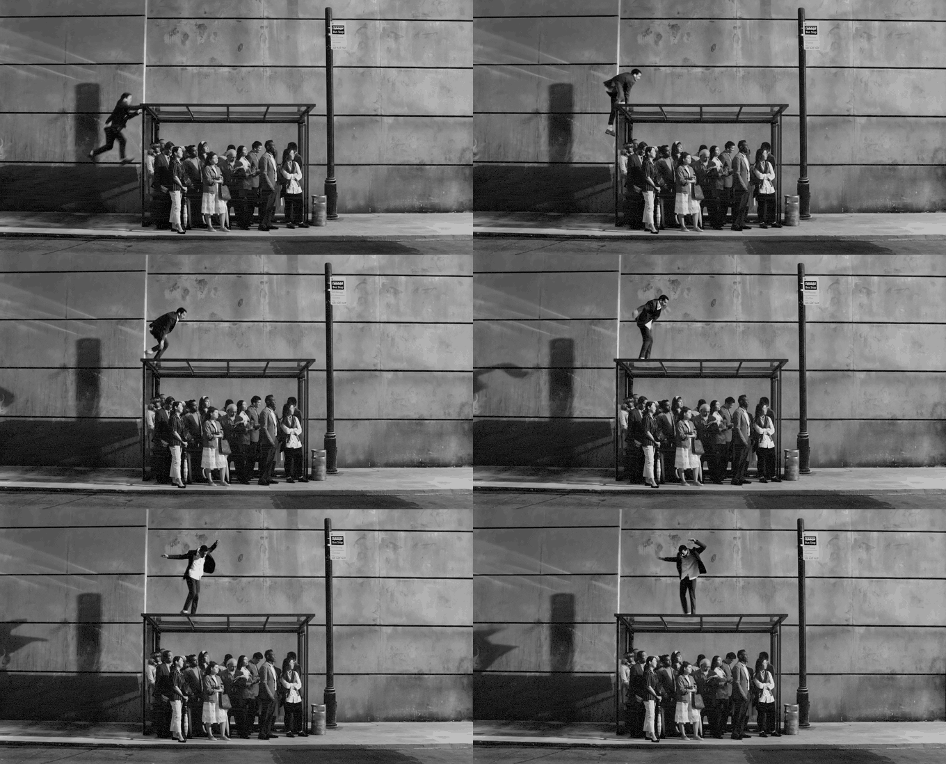
- Edit, music and sound. Pace, rhythm, a music direction, the sound idea, and any match cuts or transitions the film hangs on.
- Close. One line, one image. Leave them with the feeling.
Music video treatments run shorter, five to ten pages, heavier on references and the performance idea. Branded content and documentary need more about access and approach and less about look.
Writing it so it sounds like you
The words in a treatment are few, so each one is pulling weight.
- Present tense, first person. "We find her on the roof" reads like a film. "The protagonist will be discovered" reads like a planning application.
- Specific beats general. "Warm" is nothing. "The orange of a sodium streetlight through a wet windscreen" is a decision someone can light.
- Ban the director words. Visceral, authentic, raw, bold, cinematic. Every treatment in the pile uses them, which means they've stopped meaning anything. Say what the audience sees and hears.
- Respect the script. You're interpreting the agency's idea, not replacing it. A treatment that quietly rewrites the concept almost never wins, however clever it is.
- Keep the product in it. Clients notice when the brand turns up once, on page eleven.
- Read it out loud. Run out of breath and the sentence is too long.
Keep the tone close to how you'll talk in the room, too. If the treatment reads like a perfume ad and you turn up in a hoodie cracking jokes, the client meets two different directors and trusts neither.
The reference pages: where treatments are won
This is the bit people remember. A good reference page doesn't just look nice. It makes decisions, the same way a good moodboard does (our guide to making a moodboard for a video project goes deep on that).
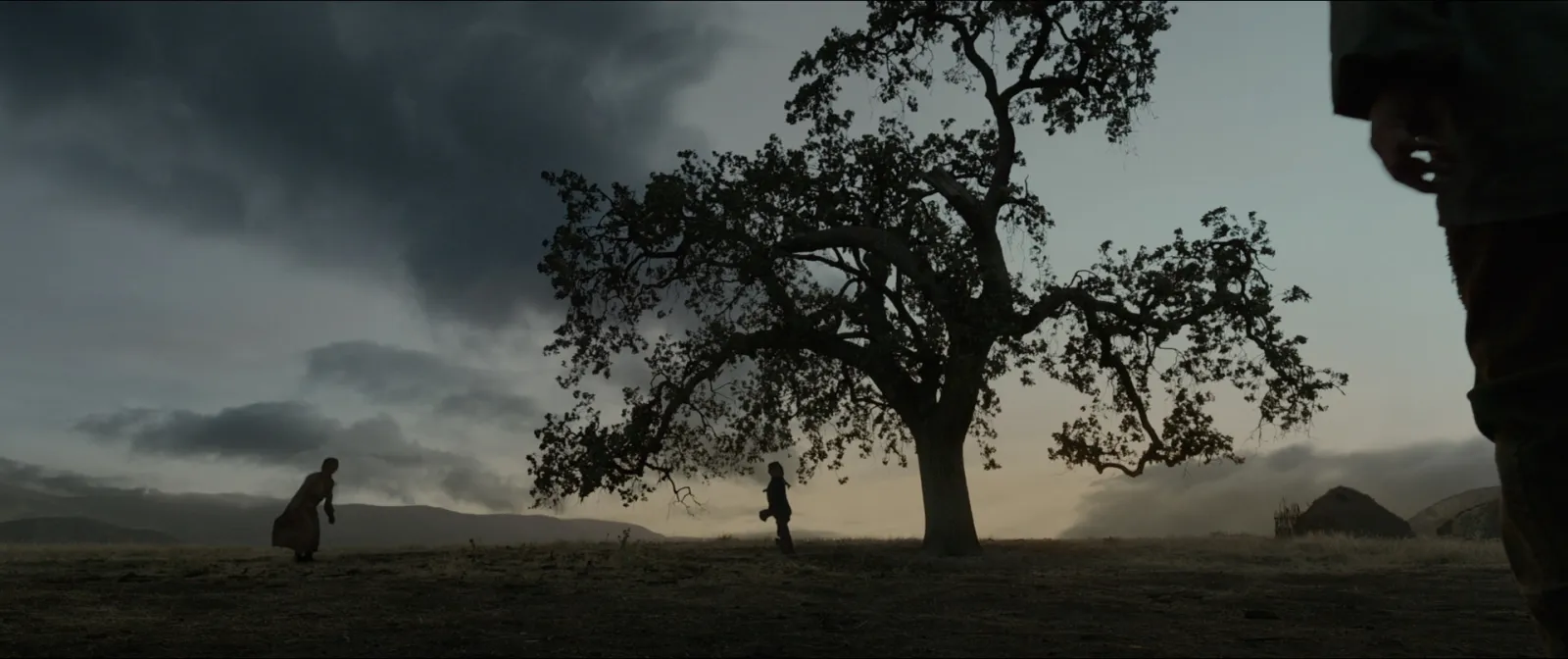
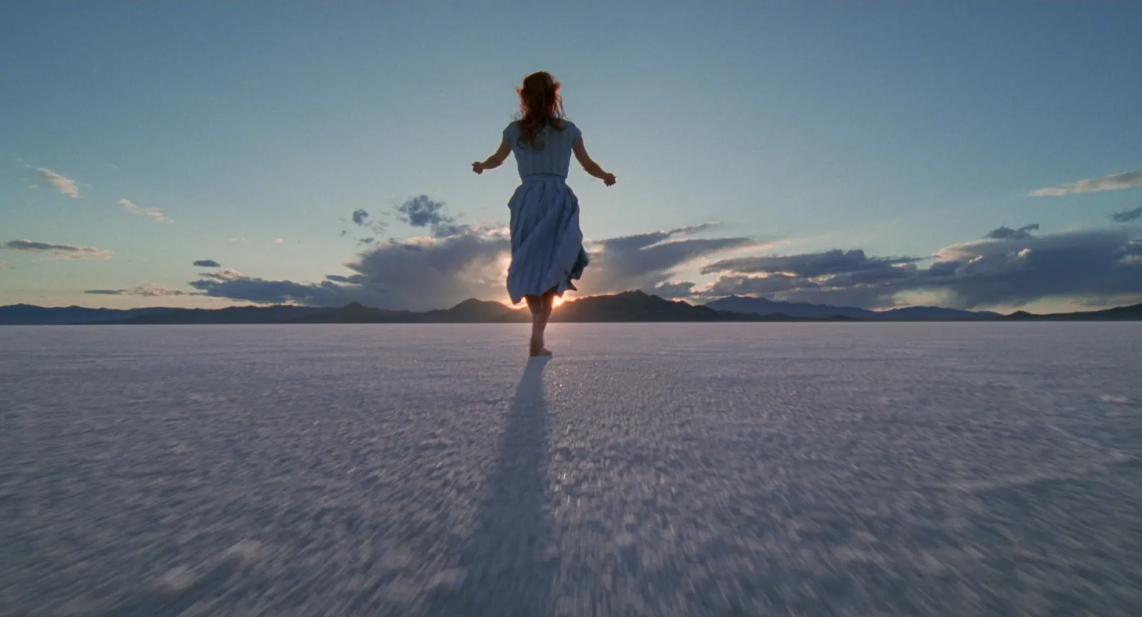
Say you're pitching a brand film for a wool and outerwear label: wild coastline, weather, women working outdoors. A lazy page throws up twelve gorgeous landscapes. A useful one is built in sections, with a line under every frame.
The world
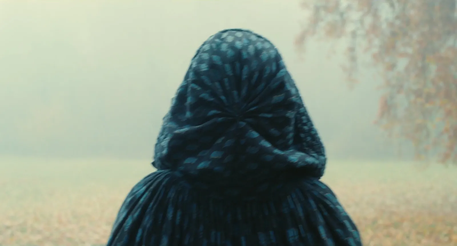
The people
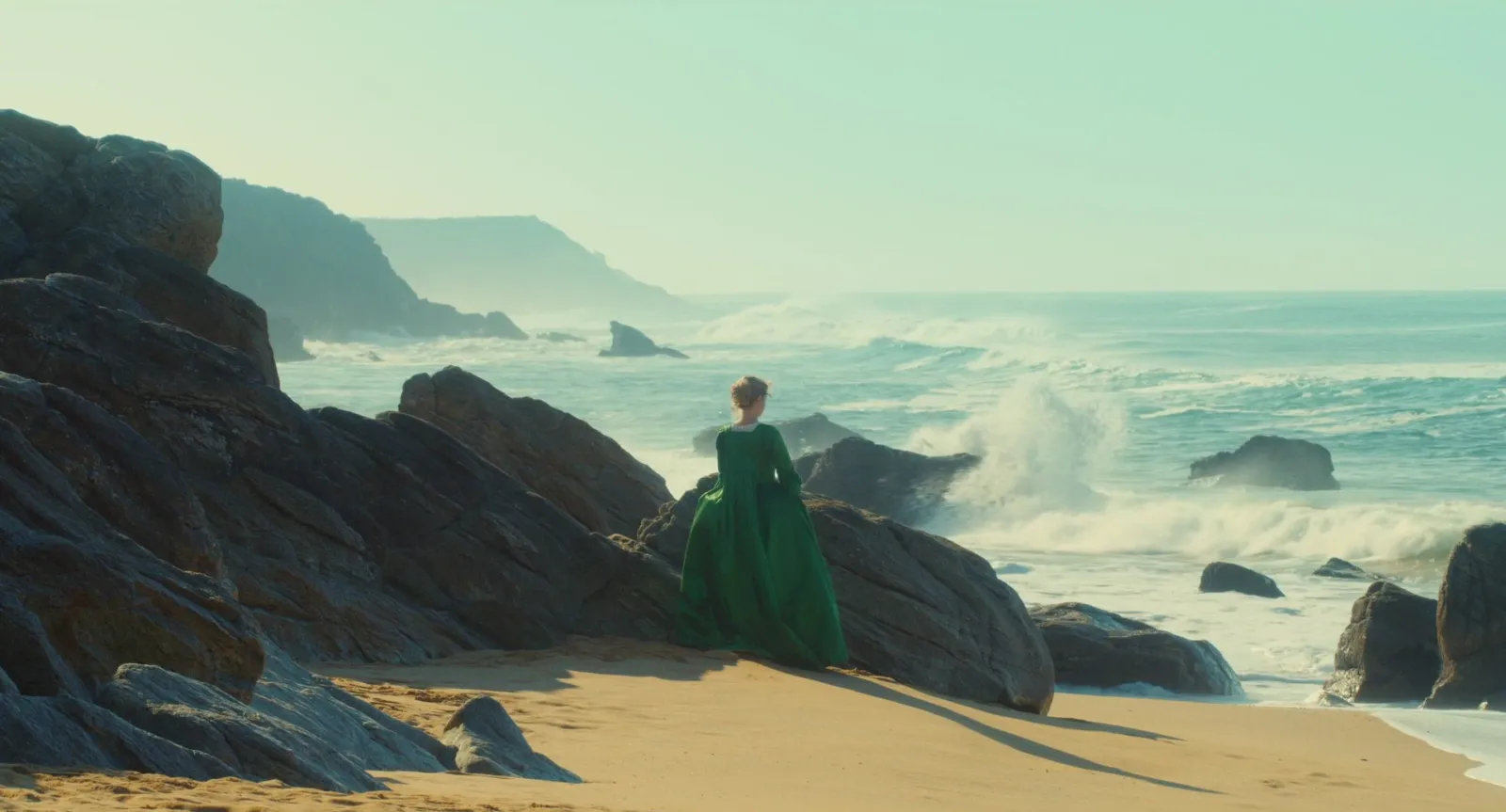
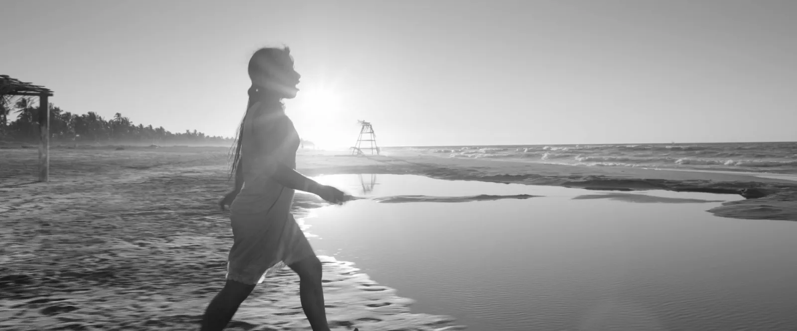
That second caption matters more than it looks. Include a reference for one quality and don't say which, and the client will assume you're proposing a black and white film. We've had that call. It's not a fun call.
How the look changes
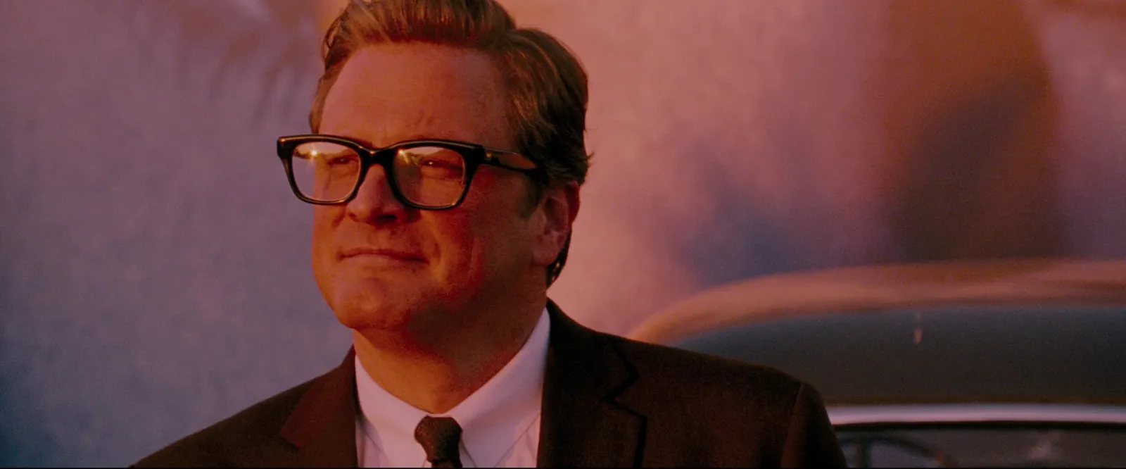
If the look evolves across the film, cold to warm or grey to colour, give it its own page with a before and after. It's one of the clearest ways to show you've thought about the full film, beyond a string of nice shots.
The last image
Rules that keep reference pages honest
- Fewer references than you think. Four strong frames per page beat twelve.
- A line under every frame. What is it there for?
- Dodge the references everyone else will use. Wes Anderson turns up in half the treatments in any pitch pile. If your symmetrical pastel frame is the same Grand Budapest still the other two directors used, you've lost the page.
- Mix film with ads, photography and your own work. Clients are reassured by a reference that looks like it cost roughly what they're spending.
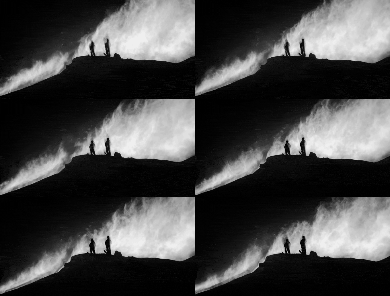
- Show movement where movement matters. A PDF can't play a GIF, so for camera moves and pace either send the deck as Keynote or PowerPoint, where GIFs play in the slideshow, or link to a short loop (our guide to video moodboards covers the trade offs).
- Keep the source of every frame. If you win, these pages become the start of a shot list built from your references, and the DoP will want the clip, not a screenshot of a screenshot.
Length, design and file size
For commercials, 10 to 20 pages is typical. Under ten can feel thin for a big job. Over twenty and few readers reach the end. Whatever the length, the cover and the first three pages should carry the idea on their own.
On design:
- Go horizontal, 16:9. It reads like a screen, suits film frames and is what everyone expects.
- One idea per page. A page called "Light" is only about light.
- Two typefaces at most, both legible at phone size.
- Big images, small words. A paragraph past six lines wants splitting.
- Credit references lightly. Film title and year in small type saves an awkward "where's this from?" email.
Export to PDF and aim for something that emails comfortably: under 20 MB is a good target, well inside Gmail's 25 MB attachment limit. Flatten huge images to around 2,000 pixels wide. No client zooms in on page eleven.
What to build it in
Use whatever you can design quickly in, because you'll be designing at 11pm. Ours are mostly in Keynote, which is free on every Mac, sets type well and plays GIFs and video in the slideshow. Adobe InDesign gives the most control if someone on the team knows it well. Google Slides is free and the easiest to share with an agency mid-pitch. Figma suits designers who already live there, and Canva is quick if you start from a decent template (Canva Pro is £100 a year in the UK as of October 2026, and the free plan covers most of a treatment).
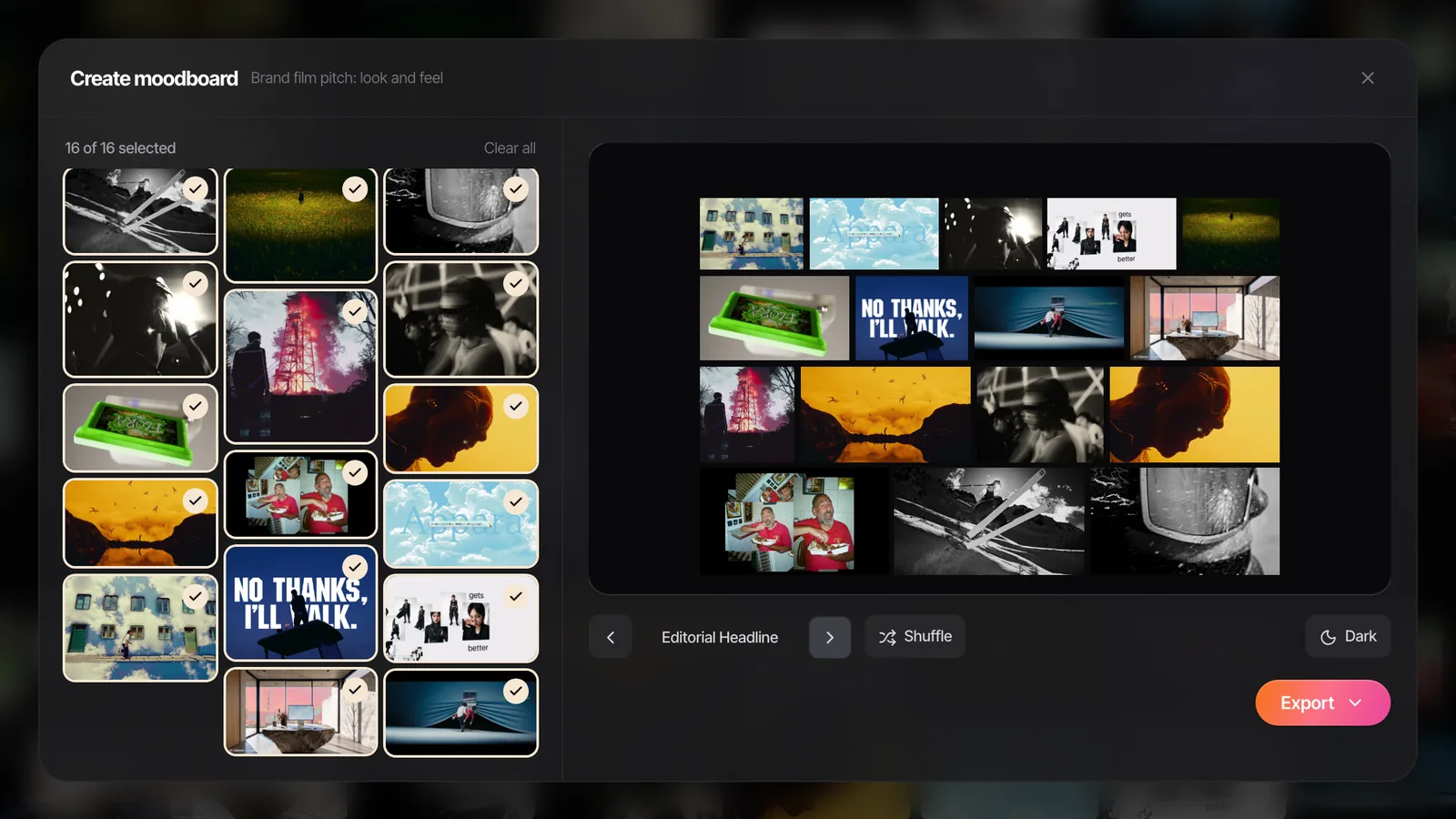
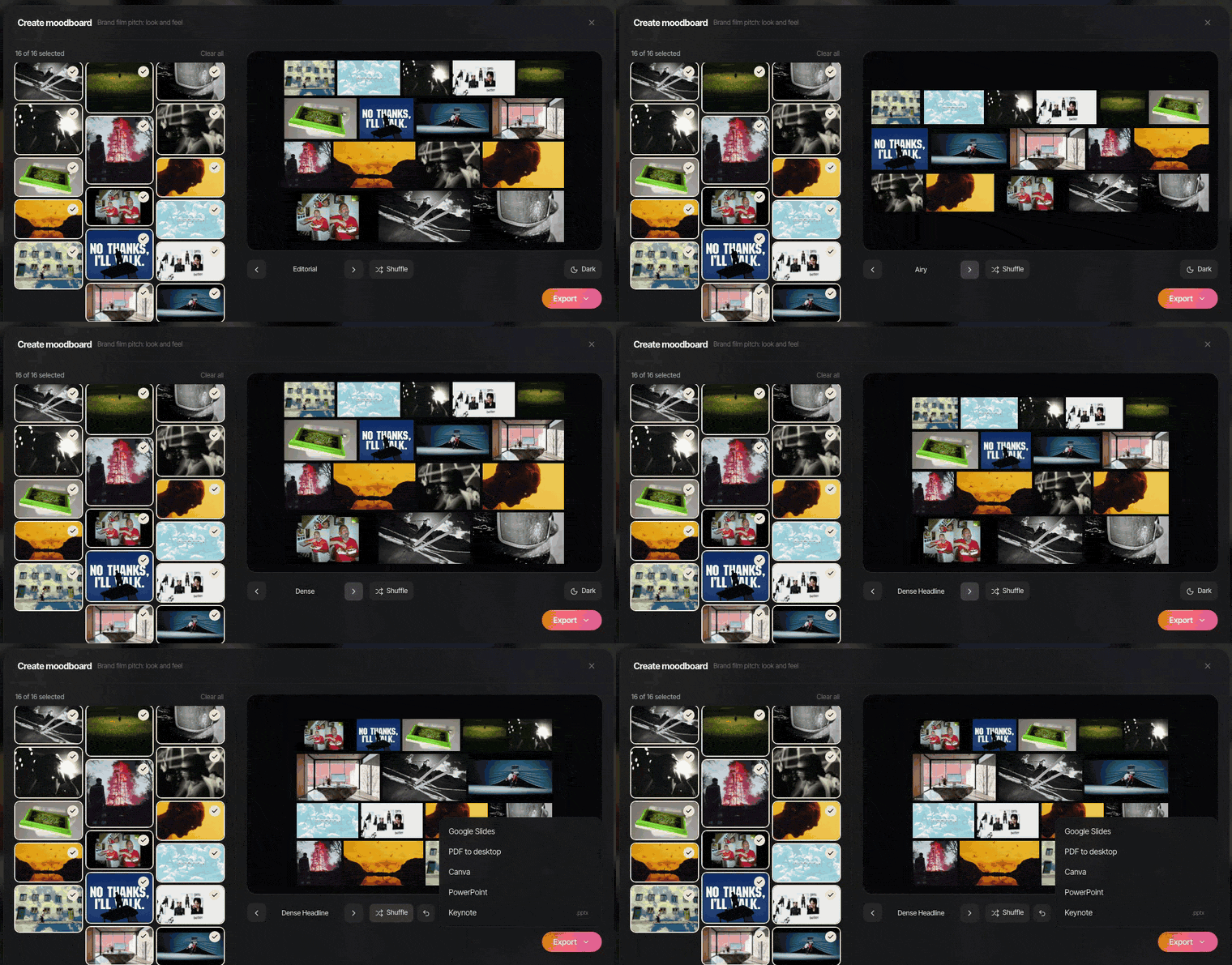
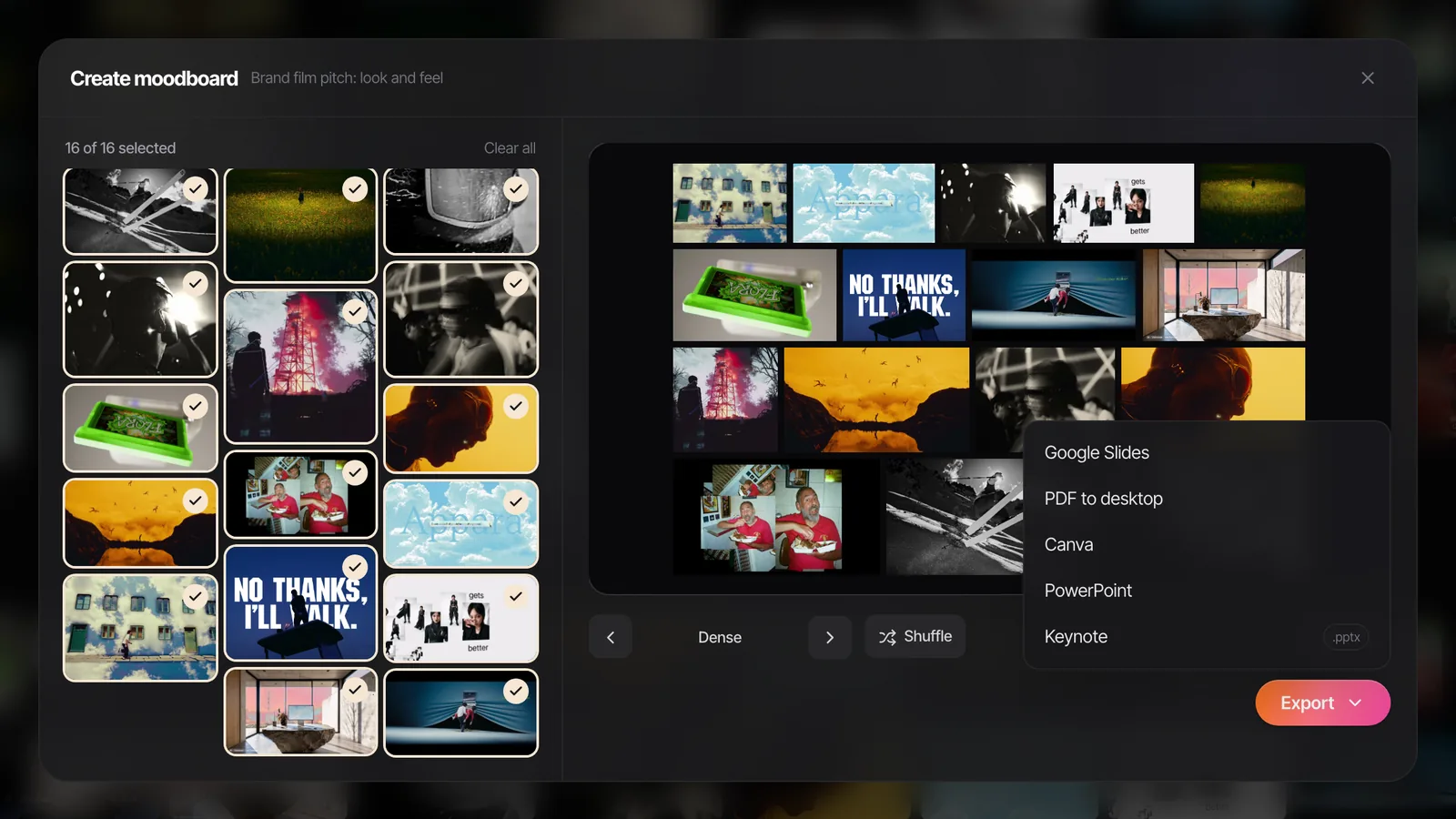
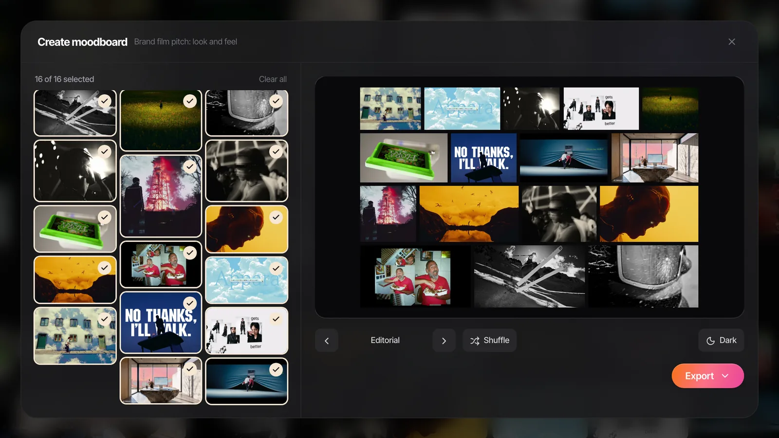
For a reference page in a hurry, our free moodboard maker lays out stills and GIFs on 16:9 slides in eight layouts, and exports a .pptx for PowerPoint, Keynote, Google Slides or Canva, or a PDF.
A realistic treatment timeline
Commercial pitches usually give you a few working days, sometimes fewer. A schedule that holds up:
- Day one. Creative call with the agency, questions sent, then a long evening of references. Gather wide.
- Day two. Write the opening letter and the idea page first, while the call is fresh. Then cut the references down to what earns its place.
- Day three. Design, then send a draft to your producer or exec. Fix what they flag. Send before the deadline, not at it.
Those three days are usually unpaid. If you're freelance, remember that when you set your rate: pitching is one of the reasons only about 60% of your working days get billed, as our guide to working out a freelance day rate shows with the sums.
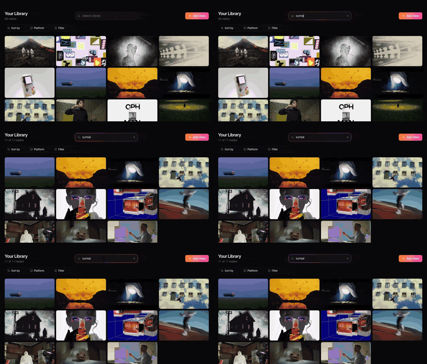
The reference hunt is where the time goes. The perfect shot you half remember from a perfume ad two years ago is somewhere in a Slack thread, a camera roll or a tab you closed. A searchable reference library turns that hunt from an evening into a couple of minutes.
Once you've won, the treatment stops being the reference document. The rules that keep the look consistent across the shoot, the edit and forty cutdowns belong in a visual style guide.
Building the look pages in Spark
This is how we do it ourselves. Every reference for a pitch goes into one Spark collection: the Absolut Tabasco volcano for colour, Salomon's ridge for weather, whatever's relevant. We pull frames and GIFs from the exact moments we mean, put them on a board, and Create Moodboard lays them out as slides.
If you're writing a feature or TV treatment
A story treatment for a feature, series or film fund is a prose document: the story told in the present tense, start to finish, with the main characters, the world and the tone. Length varies wildly, from a couple of pages to twenty or more, and funders and broadcasters often set their own format, so read their guidelines before you write a word. A few well chosen images can help with tone, but the writing carries it. Same principle as a commercial, though. Page one has to make someone want page two.
Spark won't write your opening letter. What it will do is keep every reference you've ever saved searchable by what happens in it or what someone says, so the frames on page five are the ones you meant, found well before 1am.
FAQs
How long should a director's treatment be?
For a commercial or brand film, 10 to 20 horizontal pages is typical, mostly images with short text. Music video treatments are usually five to ten pages. What matters more than length is that the idea is clear in the first three pages.
What should a commercial treatment include?
A cover, an opening letter, the idea in a sentence or two, the story beats, look and feel references, casting, camera, locations and design, wardrobe, edit and music, and a closing image. Agencies sometimes specify sections, and their brief always wins over a template.
What's the difference between a treatment and a moodboard?
A moodboard shows the look through references. A treatment is the whole pitch: the idea, the story, the performance and the craft approach, with a moodboard section inside it. The moodboard is a chapter; the treatment is the book.
Should a treatment be written in first person?
For director's treatments, yes. First person and present tense ("we open on", "we see her") reads like the film playing and makes the director's voice clear. Feature story treatments are usually written in the third person present tense instead.
Can I use film stills in a treatment?
Yes, using film stills as references in a pitch document is standard practice, and stills libraries like ShotDeck and Frame Set exist for it. Credit the film lightly, use them only in the pitch rather than anything published, and make clear which quality each one is there to show.
What software do directors use to make treatments?
Keynote and InDesign are the most common for design control, with Google Slides, Figma and Canva close behind. The references usually come from a separate library, such as a stills site or a tool like Spark for video references, and get exported into the deck as frames or a ready-made moodboard.
Can a treatment include moving images?
Yes, if you send it as Keynote, PowerPoint or Google Slides, where GIFs and video play in the slideshow. A PDF shows only the first frame of a GIF, so for a PDF, add a link to the moving references or send a short reel alongside.
Keep reading
All articles
How to Make a Creative Moodboard for UGC Ads
Nobody ever shot a better UGC ad because the moodboard was beautiful. Here's how we build one around hooks and first seconds, so a creator can film it in their kitchen.
How to Create a Fashion Campaign Moodboard
Fashion boards fail when one page tries to do everything. Split it into mood, styling, and casting and set, keep the clothes the hero, and the stylist will thank you.
How to Make a Moodboard in Keynote
Keynote is the Mac pitch favourite for a reason. Masks, looping clips and Magic Move make a board that feels like a film. Here's the build, and what breaks on export.