
Wong Kar-wai's Colour and Cinematography: A Reference Guide
Smeared neon, green fluorescent rooms, rain on cobbles. What Christopher Doyle and Philippe Le Sourd did, what the frames measure, and how to brief it without making a parody.
By the Spark team ·
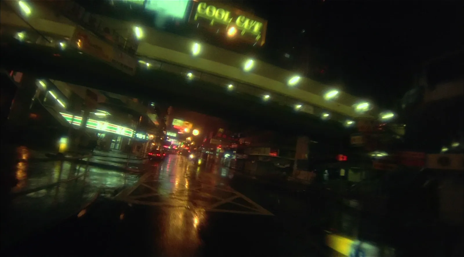
Wong Kar-wai's cinematography comes down to a handful of repeatable techniques: step printing (footage shot at a low frame rate, then stretched back to real time so motion smears and stutters), very wide lenses held close to the actors, a handheld camera, light from whatever is in the location (fluorescent tubes, neon, shop signs, desk lamps) and a green or teal cast in the shadows. Christopher Doyle shot most of it, from Days of Being Wild to In the Mood for Love, with Andrew Lau on half of Chungking Express. Philippe Le Sourd shot The Grandmaster, and it looks different: slower, darker and amber.
Below we go film by film through the twelve stills in our set, with the palette of each frame measured by the engine behind our free colour palette extractor. Where we describe a technique, we link the interview or review it comes from; where we don't, we're describing what the frames show. We make Spark, and Wong's films turn up on music video and fashion boards more than almost anyone's. This is the guide to hand a DoP before a shoot.
The techniques at a glance
| Technique | What it looks like | Where to see it | Source |
|---|---|---|---|
| Step printing | Motion at about normal speed that smears, then snaps into focus | Chungking Express, Fallen Angels, The Grandmaster's rain fight | Jump Cut, Sight and Sound |
| Wide lenses, close | Big faces, bent rooms, people who feel far away | Fallen Angels | Sight and Sound, 1995 |
| Handheld, few lights | Loose, physical camera; faces falling into shadow | Days of Being Wild, Fallen Angels | Sight and Sound, 1995 |
| Green cast | Teal and green through shadows and walls | Days of Being Wild | TCM |
| Black and white inserts | Key moments drained of colour | Fallen Angels | Reverse Shot |
Days of Being Wild (1990): green before the neon
Days of Being Wild was Wong's first film with Christopher Doyle, and according to TCM Doyle tried different filters and lighting set ups to get the greenish tint Wong wanted. In a 1995 Sight and Sound interview with Tony Rayns, Wong said he was after a nearly colourless, monochrome film, a reaction against the neon of his first feature, and that it took many filters and few lights.
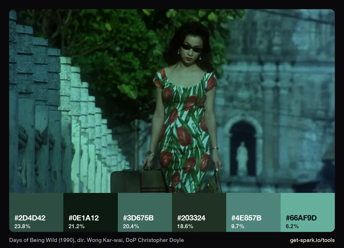
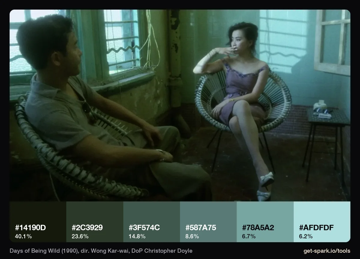
The frames bear that out. In the balustrade still, all six swatches are green or teal, from #0E1A12 up to #66AF9D, and the red tulips on her dress are too small to register. In the wicker chair scene the window light measures #AFDFDF, a cyan white, and 40% of the frame is a green black, #14190D. Monochrome here doesn't mean grey. It means one colour, and the colour is green.
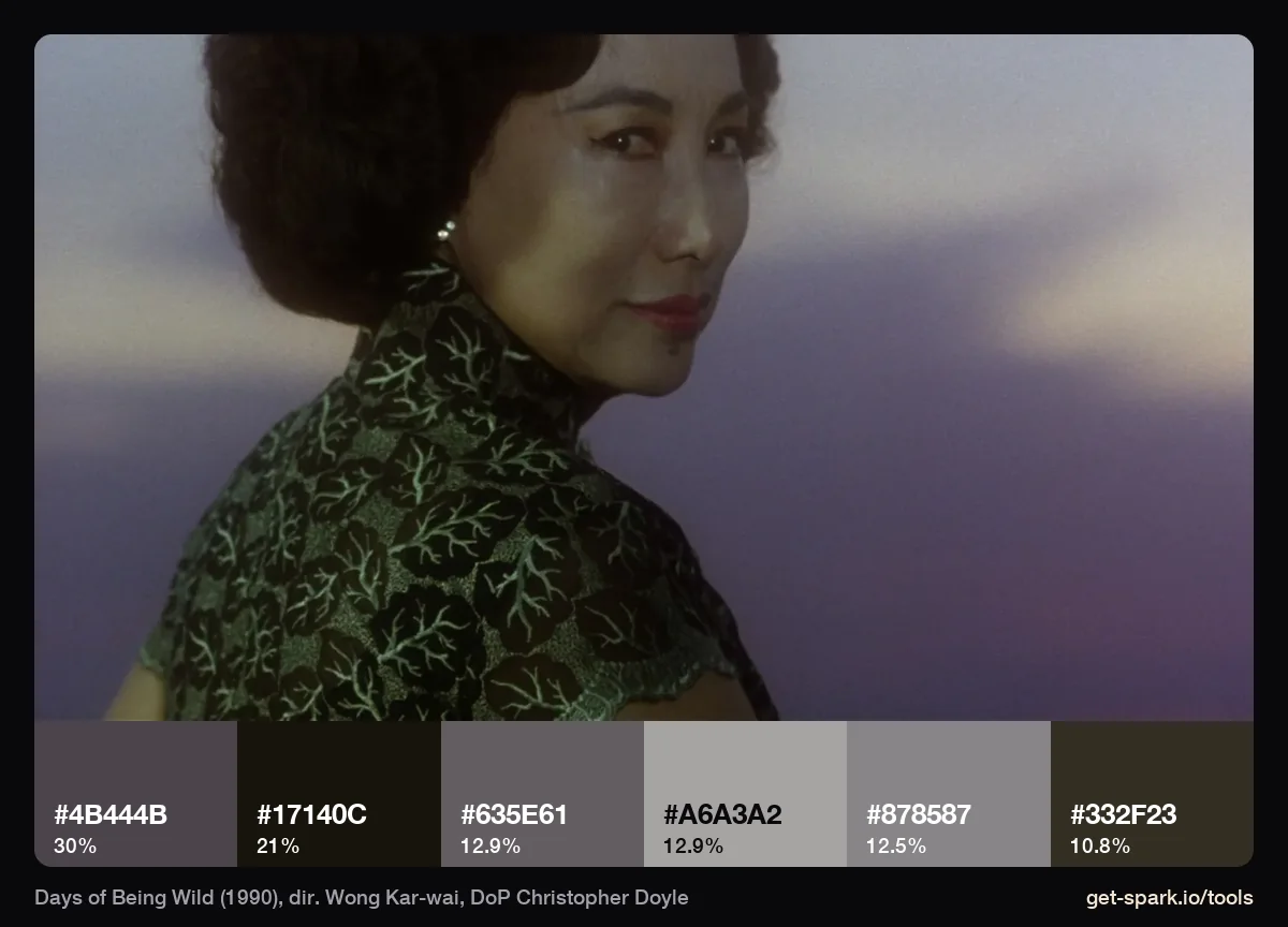
The exception proves how tight the rule is. This dusk shot is the one Days of Being Wild frame in our set with no green at all: soft lilac greys, from #17140C to #A6A3A2. Even then, nothing is saturated.
Chungking Express (1994): smear, fluorescent and neon
Chungking Express was shot in 23 days during a break from Ashes of Time, with Andrew Lau shooting the first story (Brigitte Lin and Takeshi Kaneshiro) and Doyle the second (Tony Leung and Faye Wong), according to Doyle's interview with the BFI. He describes the shoot as fast and improvised, in busy parts of Hong Kong where they took what they could get.
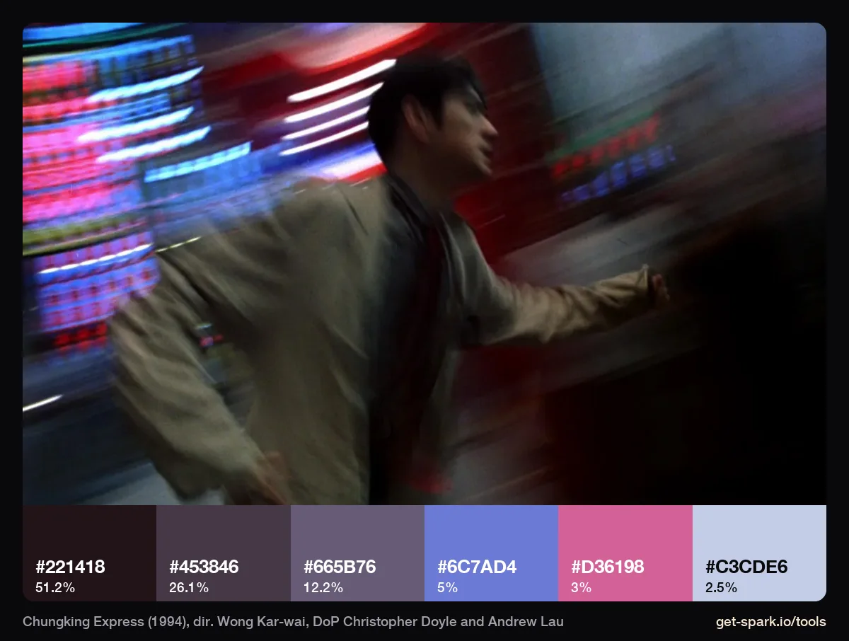
This is the famous step printed chase. Half the frame (51%) is a dark plum black, #221418, and the neon has been smeared into soft streaks: a violet blue (#6C7AD4, 5%), a hot pink (#D36198, 3%) and a pale lavender. Notice there's no green in this one. The smear is the look here, not the cast.
What step printing is
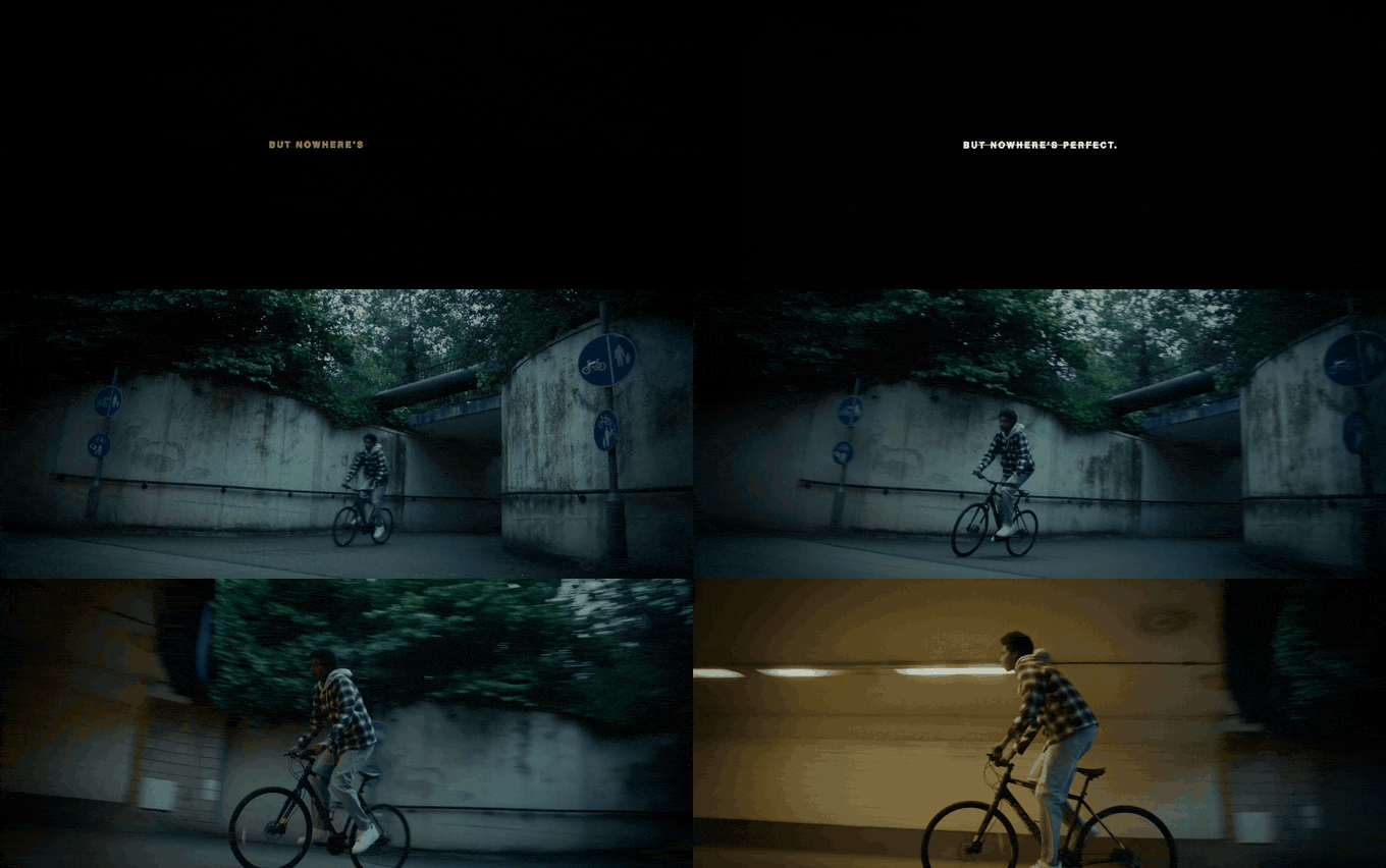
Robert M. Payne describes it in Jump Cut: scenes are undercranked (shot at a slower frame rate, so the action would look sped up) and then step printed, each frame repeated as it's printed so the action plays back at its real duration. Combine that with a slow shutter and moving things blur into streaks, then lurch, then blur again. To show what that does to motion, we ran a stretch of our own launch film through a rough version of the same process.
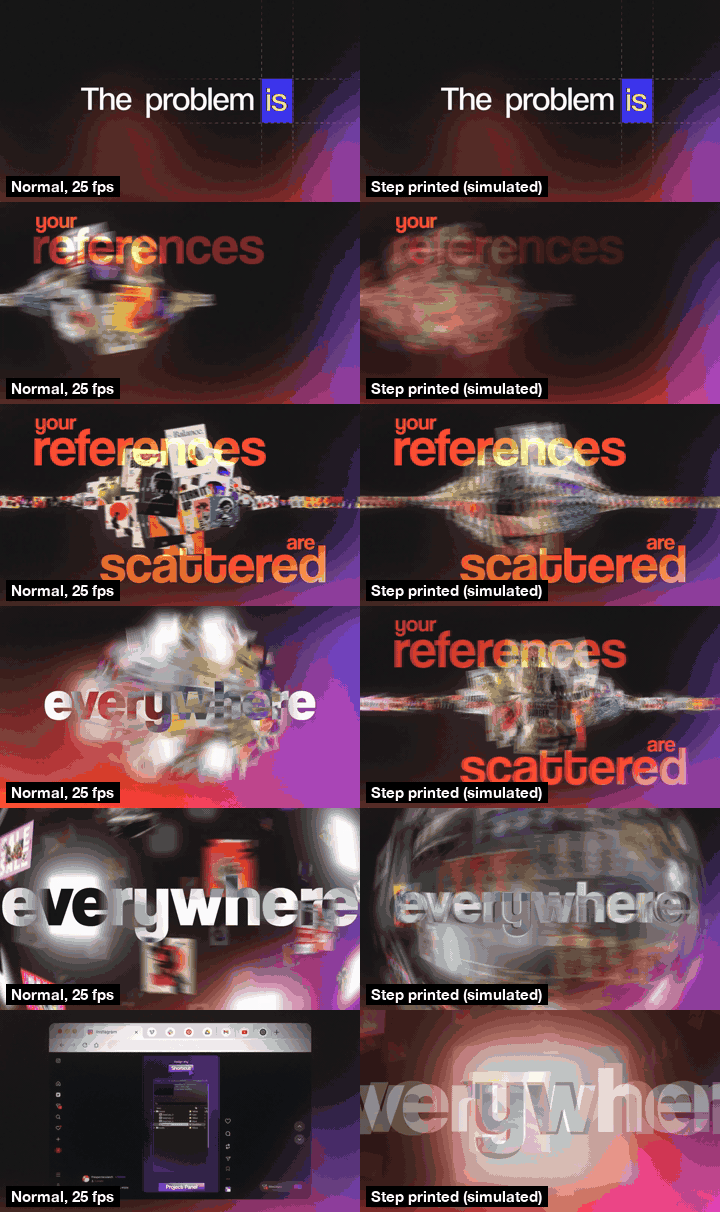
Our version is a post production approximation: four consecutive frames averaged into one, as if the shutter stayed open four times as long, then held on screen for four frames. On film it happens in camera and in the lab, and it reacts to real light, but the rhythm is the same: 6 new images a second, playing at normal speed.
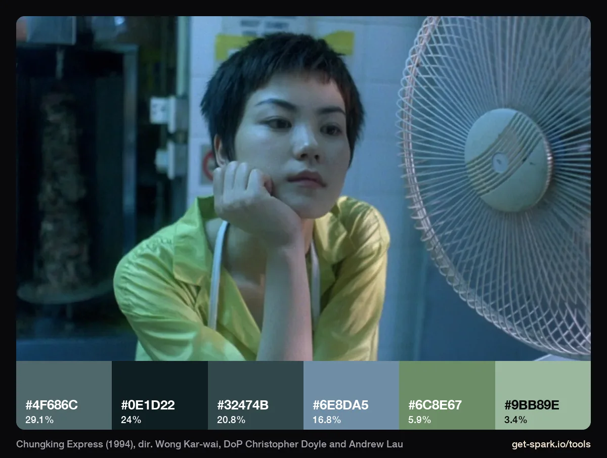
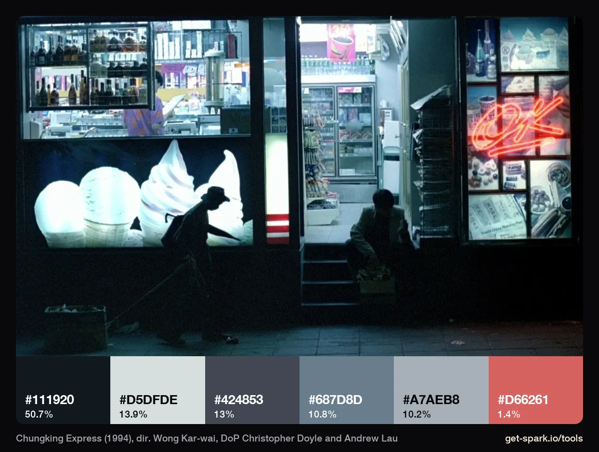
The two other frames show the colour of the light. The yellow top in the fan scene comes out as a green, #6C8E67, against teal walls (#4F686C, 29%): the room's light has changed the costume, and it was left that way. The shopfront is half dark (#111920, 51%), and its fluorescent glow measures #D5DFDE, a white with cyan in it, with the red neon sign down at 1.4%. Uncorrected fluorescent and practical light is where most of the famous Wong colour comes from.
Fallen Angels (1995): wide lenses and sickly colour
Wong told Rayns that Fallen Angels was shot almost entirely on wide angle lenses, with the actors very close to the camera, so that characters feel distant even when they fill the frame, and with very few lights, so faces kept falling into shadow (Sight and Sound, 1995).
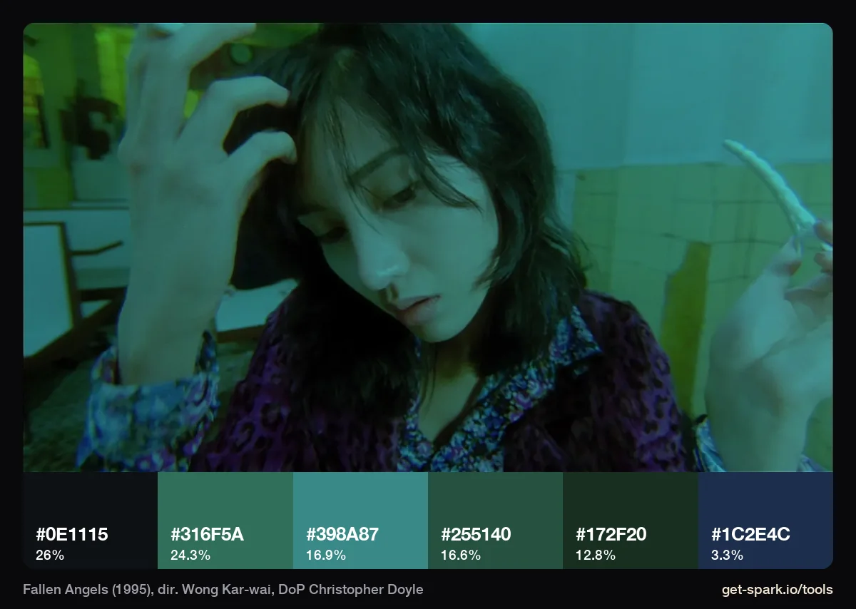
The teal room is the clearest example of both: the lens close enough to bend the walls, and four of six swatches in teal or green (#316F5A at 24%, #398A87, #255140, #172F20). Her skin goes with the room. There's no attempt to keep it neutral.
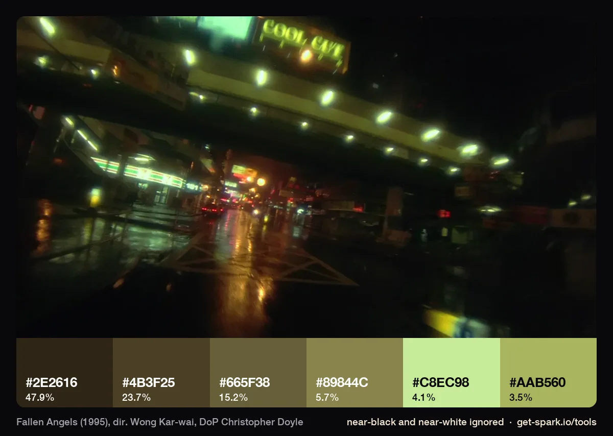
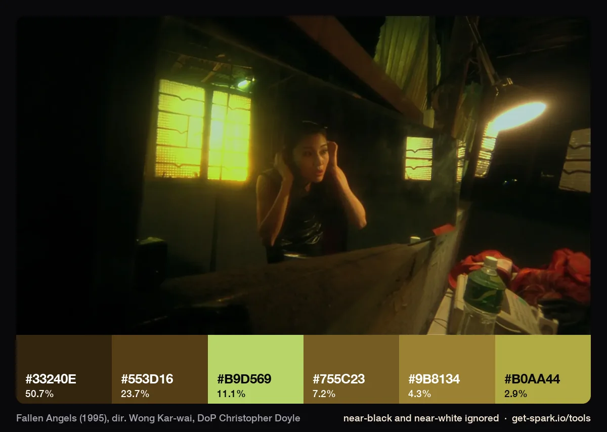
Both night frames are more than 60% near black, so we ran them with near black and near white ignored to see the light. The street becomes olive and gold browns with a lime green neon (#C8EC98) at 4%. The apartment is amber brown with a sickly lime window, #B9D569, at 11%. Green and yellow together is not a combination a colourist would choose to make anyone look well, which is the point.
Some of the film is black and white, and Doyle has said that started as a fix. In a Reverse Shot interview he explains the stock was old and gave foggy colour, so they made the most important moment of each scene black and white and turned the accident into a system. Also worth knowing: the 4K restoration presents Fallen Angels in CinemaScope, which Wong called his original intent (The Film Stage). Frames from older releases may be framed differently from newer ones.
The Grandmaster (2013): Philippe Le Sourd, rain and amber
The Grandmaster was shot by Philippe Le Sourd, who was nominated for the cinematography Oscar for it, alongside a costume nomination for William Chang, Wong's long time designer (Oscars.org). Le Sourd told The Playlist that a six month job stretched to about two years of work, and that he kept a daily diary of his light positions and colours to match scenes shot up to two years apart.
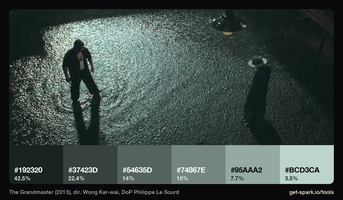
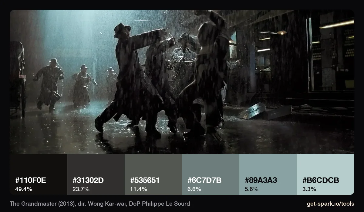
The rain fight is where Le Sourd's film meets the Doyle years. Sight and Sound's review notes step printing and high frame rate slow motion in the opening downpour (Sight and Sound). The palette is different, though. The cobbles frame is six steel teal greys from #192320 to #BCD3CA, and the downpour is half near black (49%) with the backlit rain giving pale blue greys. Cold, controlled and dark, with none of the smeared neon.
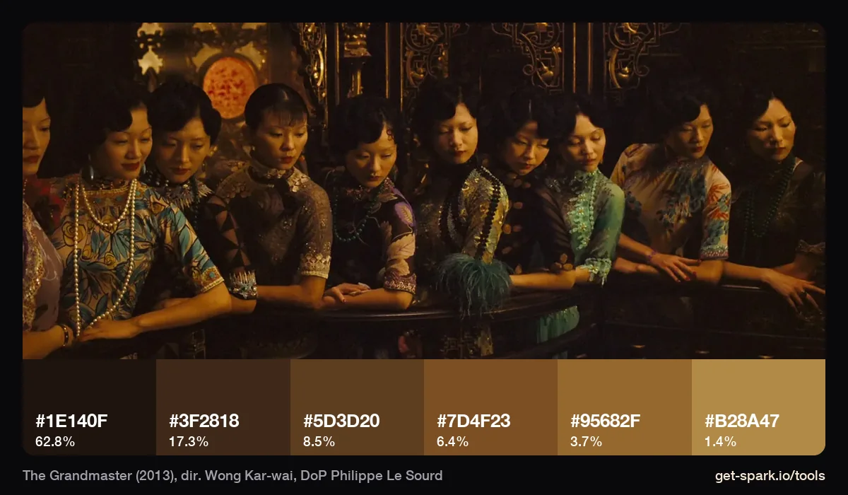
Indoors, the film goes amber. The brothel balcony is 63% brown black (#1E140F), with the rest in amber and gold: #5D3D20, #7D4F23, #95682F, #B28A47. It's the warmest frame of our twelve, and the least like the green Doyle films.
In the Mood for Love, without pictures
In the Mood for Love (2000) isn't in our stills set, but it's the film people mean most often, so here's what's documented. Wong told Sight and Sound in 2025 that Doyle shot about 80% and set the tone, and Mark Lee Ping-bin finished it with a more controlled style: Doyle's energy in the corridors, Lee's stillness in the close ups. Doyle told Reverse Shot that red had been left out of Wong's films until this one. And the 2021 restoration returned it to 1.66:1 and gave it a yellow leaning grade that upset many fans; Wong said that was how he'd always wanted it to look.
So when someone sends In the Mood for Love as a reference, ask which version. A DVD frame and a 2021 restoration frame will give you different palettes, and different grade notes.
What the four films share
Run the twelve frames together and two things stand out. First, darkness: in eight of the twelve, a single very dark swatch covers 40% or more of the picture. Second, the light is allowed to colour everything, skin and costume included. A yellow top turns green, a dress loses its red, a face goes teal with the walls. Nothing is corrected back to neutral.
What changes is the source. Doyle's films take their colour from fluorescent tubes, neon and filters, and it smears. Le Sourd's take it from fewer, harder sources, rain and amber practicals, and it holds still.
How to brief the look for a music video or fashion film
Wong's work has always crossed into advertising and fashion. He directed The Follow for BMW Films in 2001 (BMW Group) and was artistic director of the Met's 2015 exhibition China: Through the Looking Glass, with William Chang supervising the styling (the Met's press release, as reposted by Enfilade). That's partly why his frames travel so well onto music video and fashion boards. Here's how we'd brief it without making a parody.
- Pick two techniques, not five. Step printing plus green fluorescent is a look. Step printing, green, wide lenses, black and white inserts and rain is a pastiche.
- Light from the location. Doyle told MovieMaker he chooses locations for the light they already have and then pushes it. Scout corner shops, stairwells and kitchens for tubes and signs, and leave them uncorrected.
- Let the light take the skin. Tell the colourist up front that faces should go green or teal with the room. Otherwise they'll protect skin by default, which is the opposite of this look.
- Get step printing in camera if you can. Shoot at a low frame rate with a long shutter and conform to normal speed, and test it on the actual camera first. A post simulation like ours is fine for a pitch, but in camera it reacts to real light.
- Go wide and close for intimacy that feels lonely. A very wide lens a foot from the face, handheld, says more than any colour.
- Use the dark. Most of these frames are mostly black. Brief the darkness as carefully as the neon.
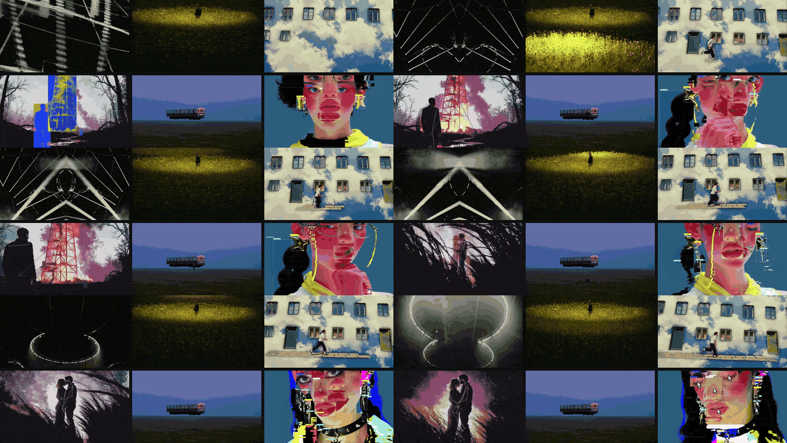
Write it up in the treatment with the frames beside each note. Our music video treatment template has a references page built for this, and the lighting reference library guide covers briefing practicals to a gaffer. For the grade, our guide to colour grading references explains how to write the note on skin and blacks. Wong's editing is a reference in its own right too, and our round up of match cuts and creative transitions is a good place to start collecting edit references.
Measure your own references
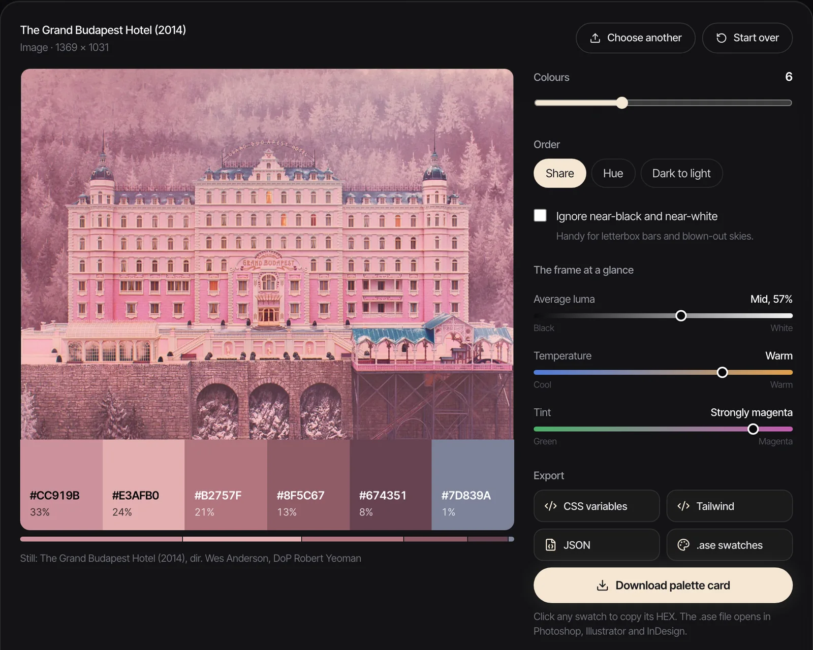
Every palette above came out of the same engine as our free extractor. Drop in a frame, or a video and scrub to the shot, choose how many colours, and tick Ignore near-black and near-white for night frames like Fallen Angels. For more films measured the same way, see our movie colour palettes.
For finding frames and clips in the first place, our list of the best websites for commercial film inspiration covers stills libraries and music video archives. Use what you find as internal reference: credit the film, and keep other people's frames out of anything you publish.
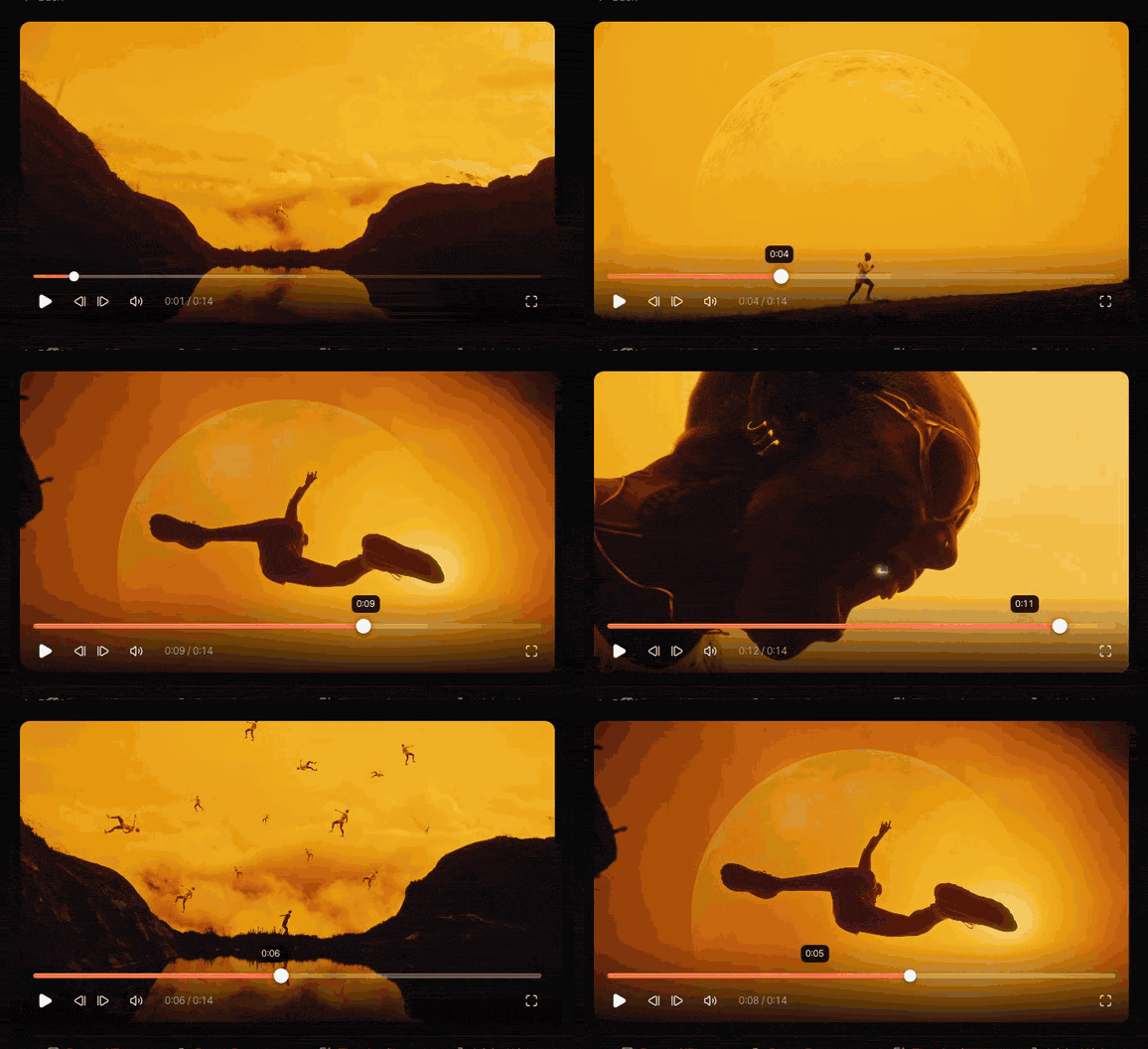
In Spark we keep the clip and the frame together: paste a YouTube or Vimeo link for the trailer or the music video, jump through it five seconds at a time with the arrow keys, step frame by frame with comma and full stop to find the exact moment, then Export Frame. The still lands in Frames with a five colour palette of its own, so a search for "green" finds it later.
FAQs
Who was Wong Kar-wai's cinematographer?
Christopher Doyle shot most of his best known films, starting with Days of Being Wild (1990) and including Chungking Express (with Andrew Lau), Fallen Angels and most of In the Mood for Love (finished by Mark Lee Ping-bin). Philippe Le Sourd shot The Grandmaster (2013) and was Oscar nominated for it.
What is step printing?
Step printing means shooting at a low frame rate, then printing each frame several times so the action plays back at about its real speed. With a slow shutter, movement smears into streaks between moments of sharpness. Wong Kar-wai and Christopher Doyle used it in Chungking Express and Fallen Angels, and it returns in The Grandmaster's rain fight.
Why do Wong Kar-wai films look so green?
Partly by design and partly by light. For Days of Being Wild, Doyle tested filters and lighting to get the green tint Wong wanted. Later films lean on uncorrected fluorescent and practical light, which often records green or teal, and skin and costume are allowed to take the colour of the room.
What lens was used for Fallen Angels?
Wong has said the film was shot almost entirely on wide angle lenses with the actors very close to the camera. That combination makes faces big and rooms bend while the characters still feel isolated. Exact focal lengths quoted online come from second hand analysis, so treat them with care.
How do I get the Wong Kar-wai look in a music video?
Choose two techniques and commit: for example, step printing and uncorrected fluorescent light, or wide lenses and night neon. Light from the location, let skin take the colour of the room, and brief the darkness as carefully as the colour. Test step printing on your camera before the shoot.
Did the 2021 restorations change the colour of Wong Kar-wai's films?
Yes, for some. The 2021 restorations changed aspect ratios, returning Chungking Express and In the Mood for Love to 1.66:1 and presenting Fallen Angels in CinemaScope, and In the Mood for Love got a yellow leaning grade that many fans disliked. Wong said the restorations follow his original intentions, so check which version a reference frame comes from.
Keep reading
All articles
How to Build a Video Ad Swipe File That Your Team Actually Uses
Saving an ad takes ten seconds. The swipe files that get used are the ones where someone can find the right opening months later, without remembering who made it.
How to Use ChatGPT and Claude for Creative Research (and With Your Reference Library)
An AI chat is a brilliant vocabulary partner and an unreliable librarian. Use it for the first job and it saves hours. Trust it with the second and you'll be hunting for films that were never made.
How to Make a Ripomatic (or Mood Film) for a Pitch
A good ripomatic lets a room feel the film before it exists. A careless one turns up online with other people's footage and your client's logo on it.