
Movie Colour Palettes: 20 Films and How to Pull a Palette From Any Frame
Twenty films, six colours each, measured from a frame rather than picked by eye. Plus the one minute method for getting the palette out of any shot you love.
By the Spark team ·
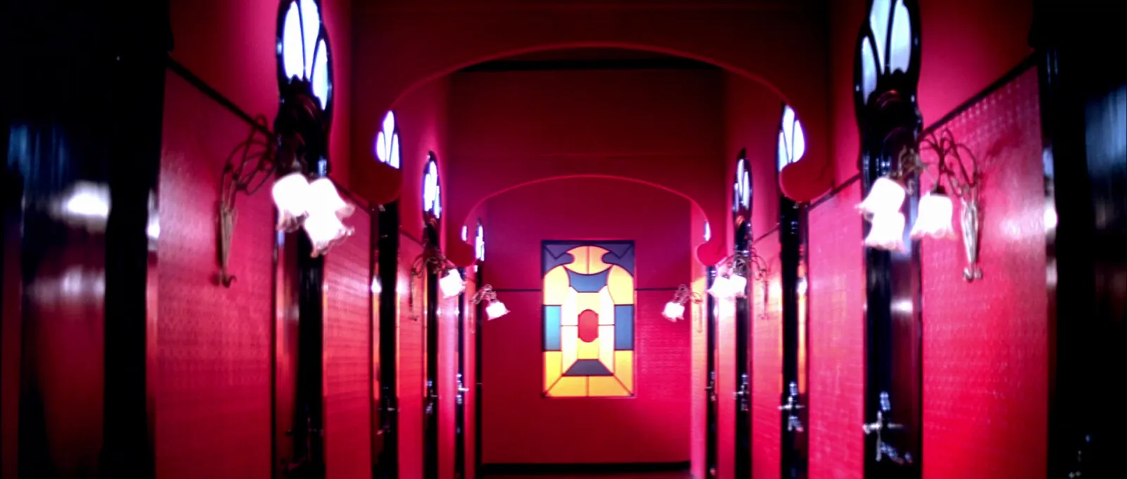
A movie colour palette is the handful of colours that covers most of a film's frames: usually two or three families of colour plus one accent. Below are 20 films, grouped by the kind of palette they use (pastel and symmetrical, neon night, desaturated, single colour, natural light), each with six colours measured from one frame and a note on what those colours are doing. At the end is the method for pulling a palette from any frame yourself, still or video, in about a minute.
We make Spark, a reference library for video, and palettes like these go in front of clients, colourists and art departments all the time. Every HEX code here was measured, not picked by eye, with the same engine that runs our free colour palette extractor. The percentage under each swatch is how much of the frame that colour covers. People skip that number, and it's usually the more useful one.
One frame isn't a whole film. We chose frames that carry each film's look, but a palette describes a shot, so read these as a starting point for your own.
Pastel and symmetrical: colour built into the set
These are designed worlds. The colour is painted, papered and sewn in before anyone lights it, and the camera sits square on so you see all of it.
The Grand Budapest Hotel (2014)
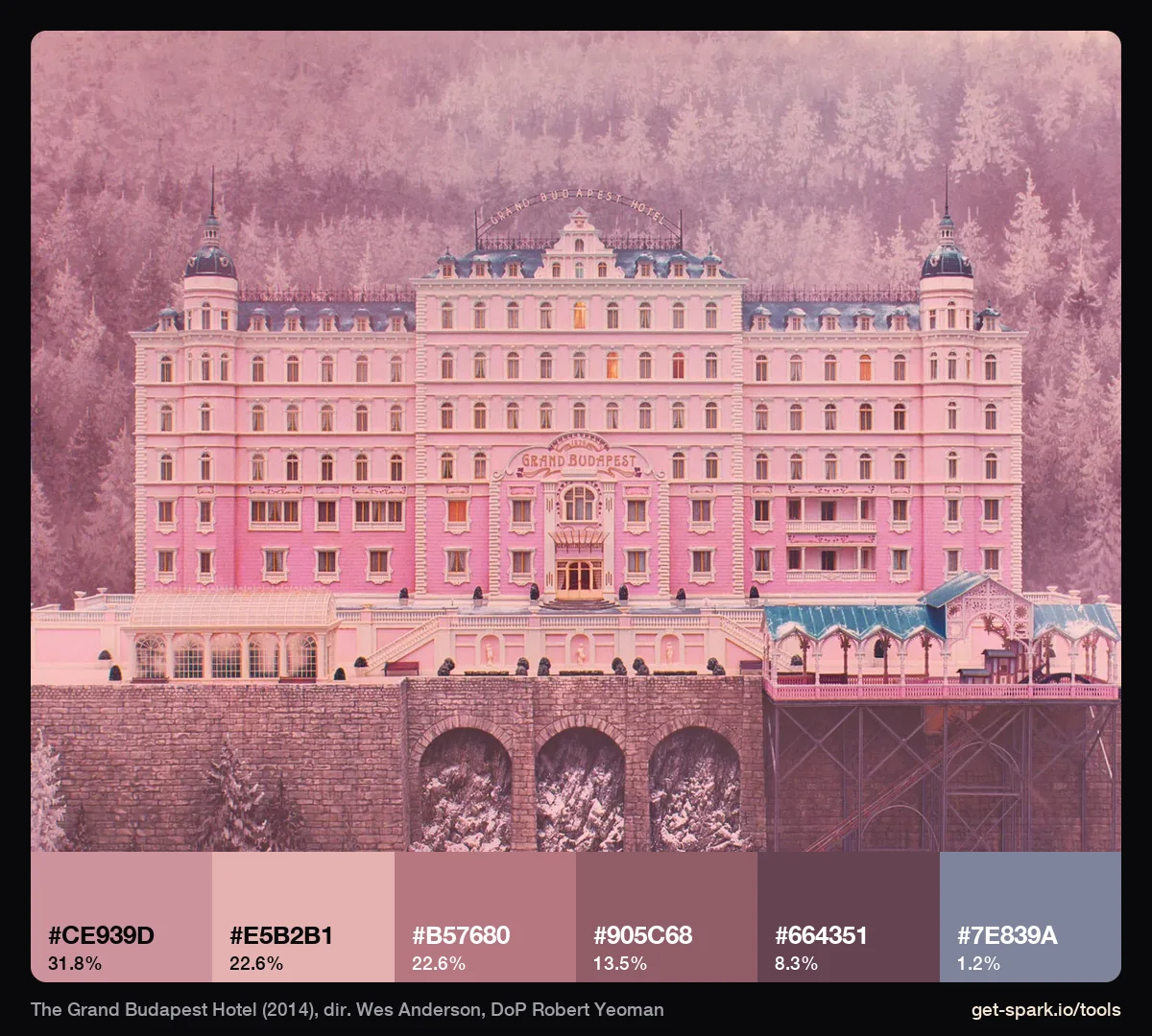
Five of the six swatches are the same pink at different lightnesses, from #E5B2B1 down to #664351. The only other colour is a blue grey, #7E839A, at 1.2%: the roofs. That small cool note is what keeps a pink frame from looking like a sweet wrapper. We go through all five Anderson films in our stills set, swatch by swatch, in the Wes Anderson colour palette, film by film.
The Umbrellas of Cherbourg (1964)
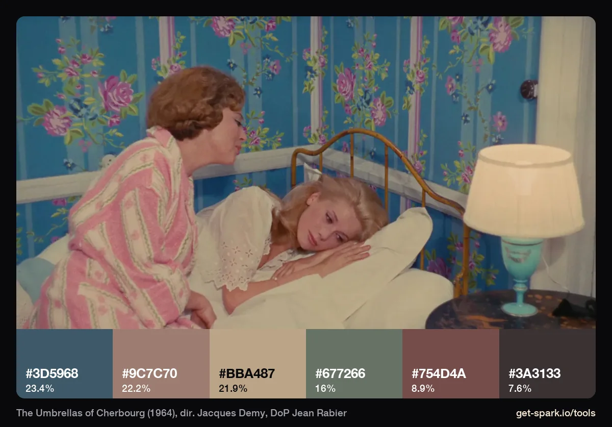
Wallpaper and bedding do the work: a dusty blue (#3D5968, 23%) against a pink beige (#9C7C70), a cream (#BBA487) and a sage green (#677266). The film feels saturated in memory, but this frame is four soft colours of similar lightness side by side. That's the trick to borrow: keep the values close and the hues can wander.
The Shape of Water (2017)
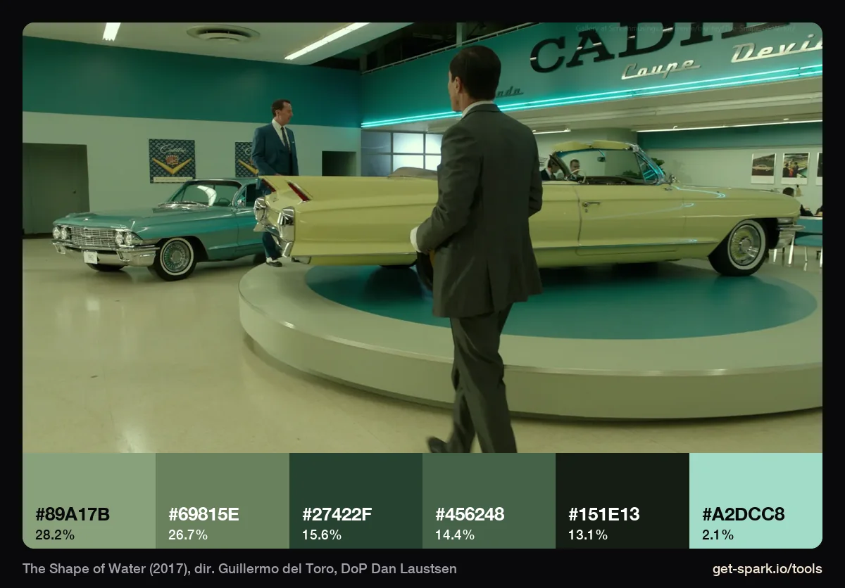
Every swatch is a green: mint, sage, bottle, and a near black with green in it. #89A17B and #69815E cover 55% of the frame between them, and the brightest note is a pale aqua strip light, #A2DCC8, at 2.1%. The cream convertible on the turntable, the thing your eye goes to first, doesn't make the six. A showroom in sea green ties a dry land scene to the film's underwater world without a word of dialogue.
2001: A Space Odyssey (1968)
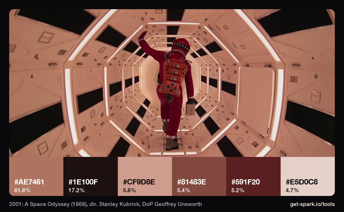
One point perspective, perfect symmetry, and a lesson in how light colours a set. The corridor is built from white panels, yet 62% of this frame measures #AE7461, a warm salmon. Hand that HEX code to a production designer as a paint colour and you'd get a very different film. Pull palettes from the frame, but brief paint from the set and light from the light.
Neon and night: colour that comes from the lamps
Night palettes are mostly dark. That's the first thing the numbers tell you, and the reason a brief that just says "lots of neon" so often disappoints.
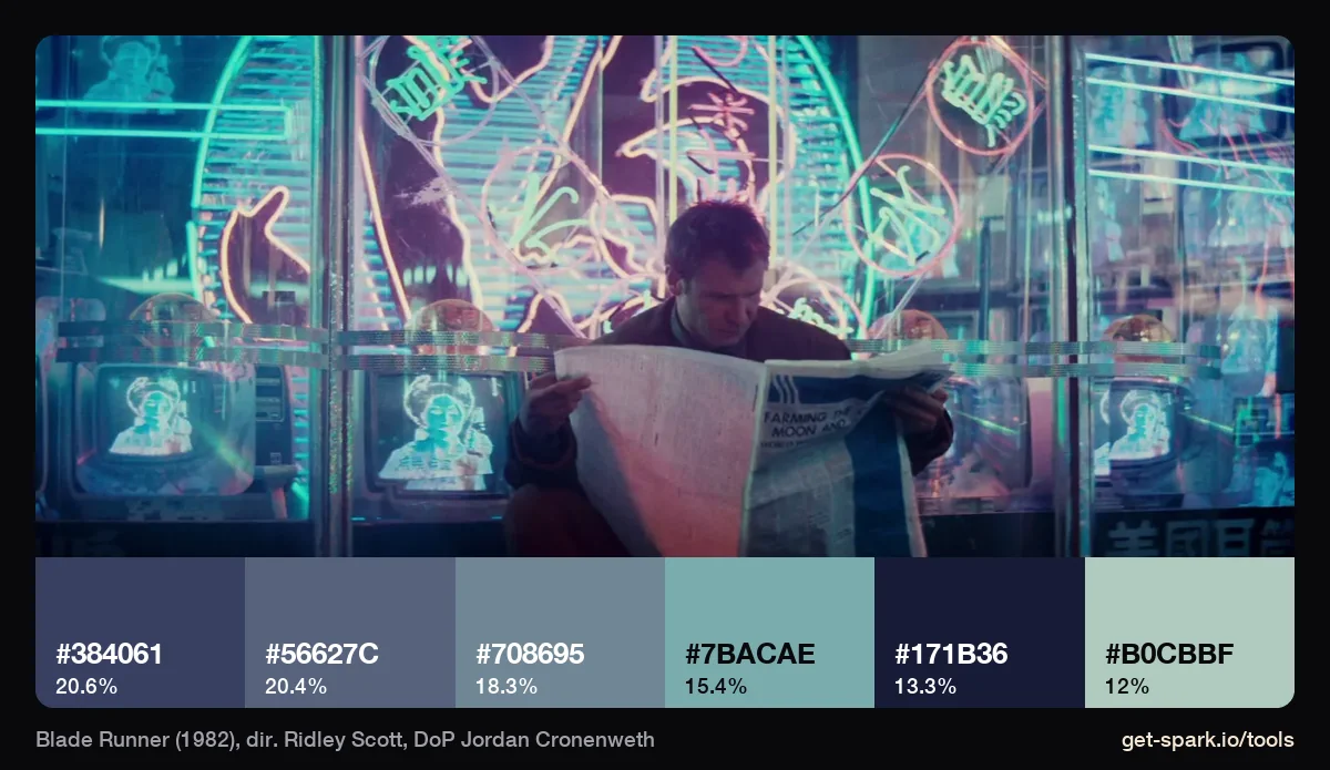
Blade Runner (1982)
Only 13% of this frame is near black, and even that swatch is a navy (#171B36). The rest is slate, steel blue, a cyan from the signs (#7BACAE) and a pale mint (#B0CBBF, 12%). The pink neon is there, but too small to make the six. It's a night scene that is mostly light, tinted cold.
Only God Forgives (2013)
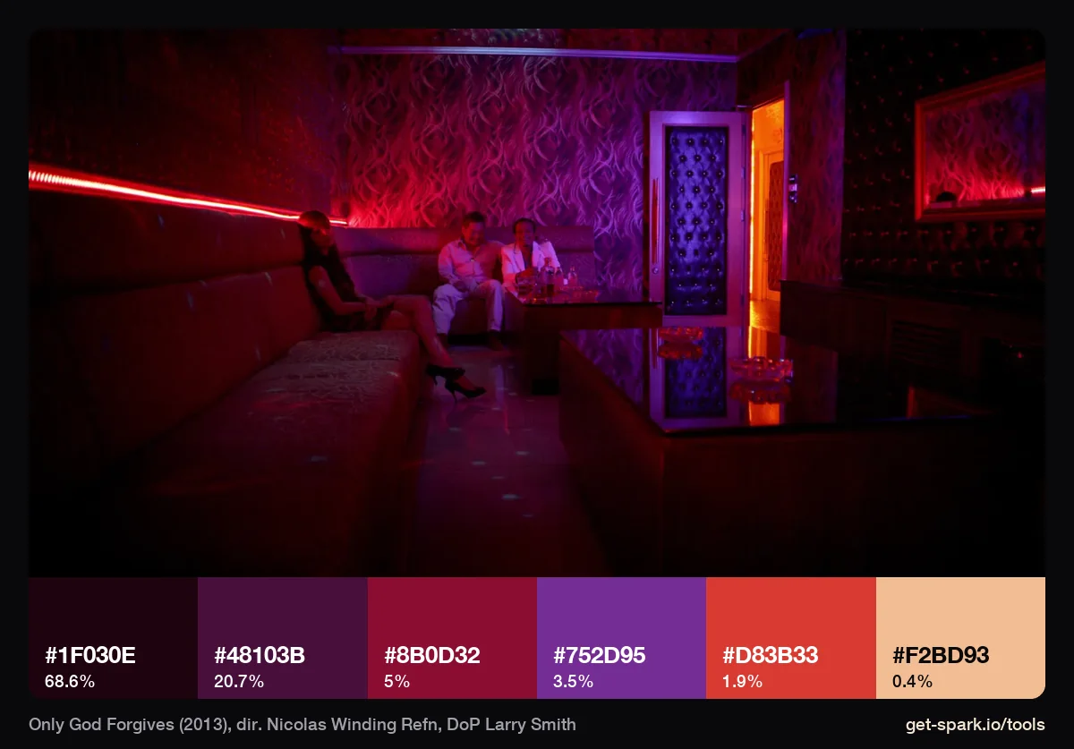
The opposite of Blade Runner. 69% of the frame is one near black wine, #1F030E, and another 21% is a dark plum, #48103B. The neon itself, red #8B0D32, violet #752D95 and a hot strip of #D83B33, adds up to about 10%. That ratio is the look. Brief this frame and nine tenths of what you're asking for is darkness.
Last Night in Soho (2021)
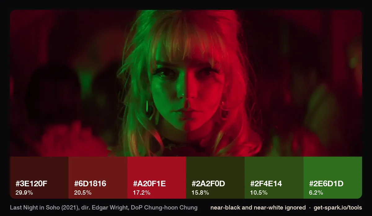
More than half this frame is shadow, so we ran it with near black and near white ignored to see the light. What's left splits cleanly: three reds (#3E120F, #6D1816, #A20F1E) covering 68%, and three greens (#2A2F0D, #2F4E14, #2E6D1D) covering 32%. Complementary colours, one per side of a face, make a character look divided, and it's an easy look to brief: two sources, two gels.
Moonlight (2016)
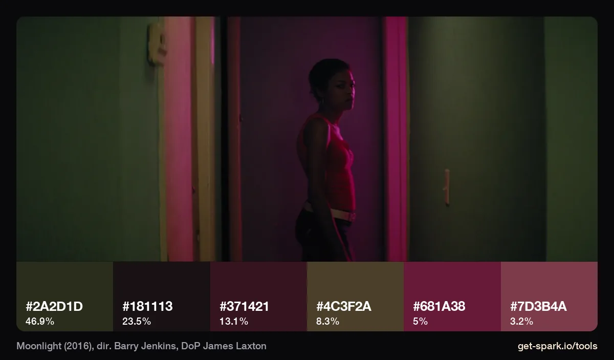
The pink you remember is 8% of the frame: #681A38 at 5% and a dusty rose, #7D3B4A, at 3.2%. Almost half is an olive green wall (#2A2D1D). It still reads as a pink frame, because the pink lands on the figure and everything around it is held back. An accent doesn't need area. It needs somewhere important to land.
Desaturated: colour taken away
These palettes are nearly all neutral. That doesn't make them colourless. The small tint left in the greys is the whole mood.
Dune (2021)
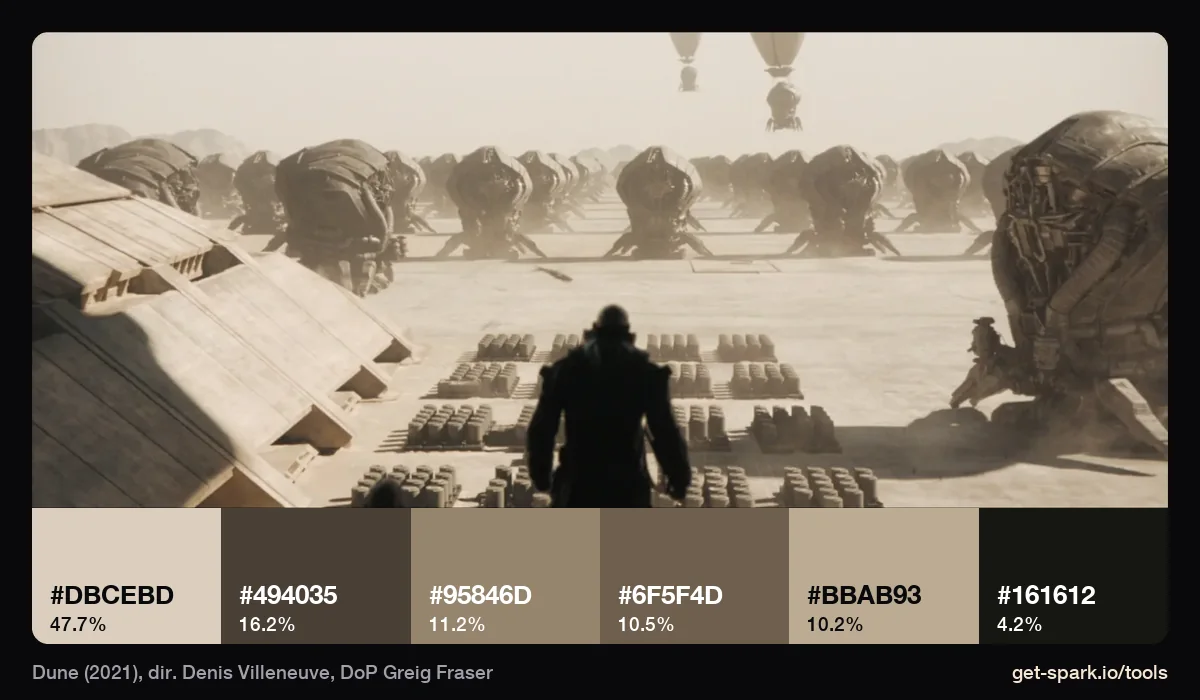
Bleached sand, #DBCEBD, covers 48% of the frame, and every other swatch is a warmer or darker relation of it, down to #161612 for the figure. There isn't a saturated colour anywhere, yet the frame reads as hot. When a client asks for "warm, but not orange", this is the reference to reach for.
1917 (2019)
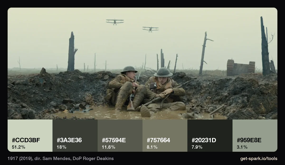
Half the frame (51%) is overcast sky, #CCD3BF, a grey with a little green in it. The mud is olive grey from #3A3E36 to #757664. There's no warm colour anywhere, and that absence is what makes it feel cold. Overcast daylight does most of this before the grade starts.
Carol (2015)
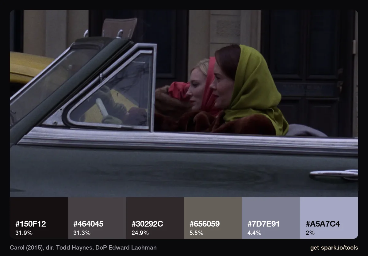
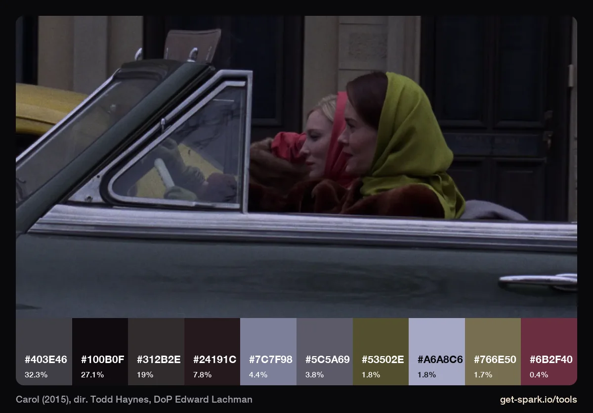
Three dark greys cover 88% of this frame. At six colours the red scarf and the mustard headscarf don't appear at all, because each is under 2% of the picture. At ten they turn up: olives at #53502E and #766E50, and a wine red, #6B2F40, at 0.4%. Muted greys with small doses of colour, and the doses are what a costume designer needs from you. When an accent matters, add colours until it shows.
The Lighthouse (2019)
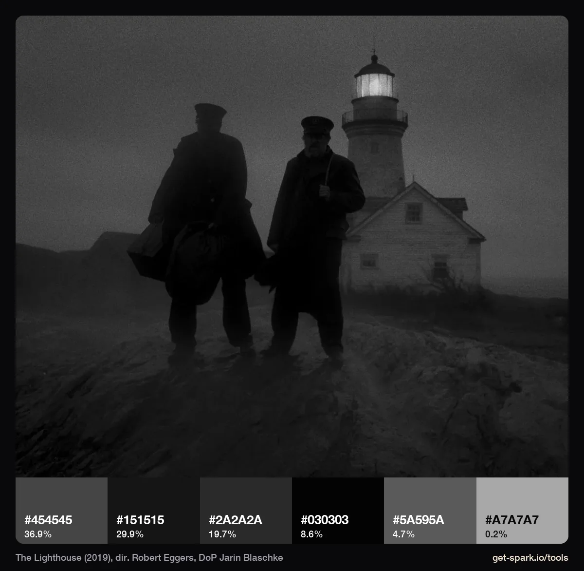
A black and white frame still has a palette: a ramp of greys, where the shares tell you the contrast. This one is low key. 38% of the frame sits at #151515 or darker, the brightest swatch (#A7A7A7, the lamp) is 0.2%, and nothing reaches white. That says more to a colourist than "moody".
One colour, all the way up
These frames commit to one hue and push it until every swatch belongs to it. Bold, and easy to break with one stray colour.
Suspiria (1977)
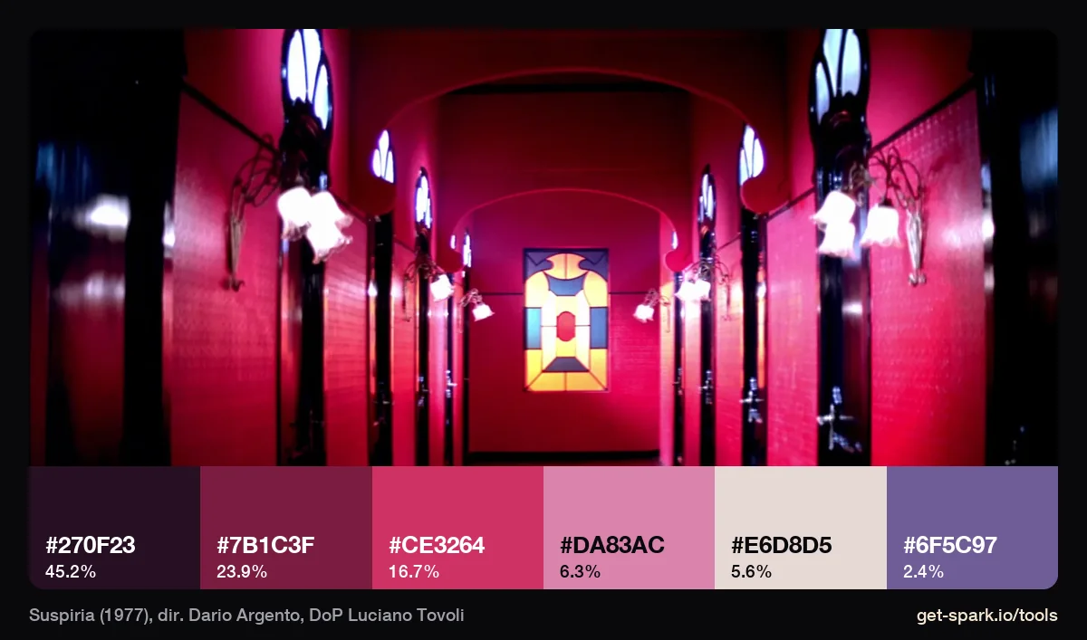
The famous red is a magenta red: #CE3264 and #7B1C3F, with a pale pink, #DA83AC, where the lamps glow. Under it, 45% of the frame is #270F23, a near black with red in it. The only cool colour is the blue violet of the windows, #6F5C97, at 2.4%. A little of the opposite colour makes the main one look stronger, which is why those windows feel so wrong.
Hero (2002)
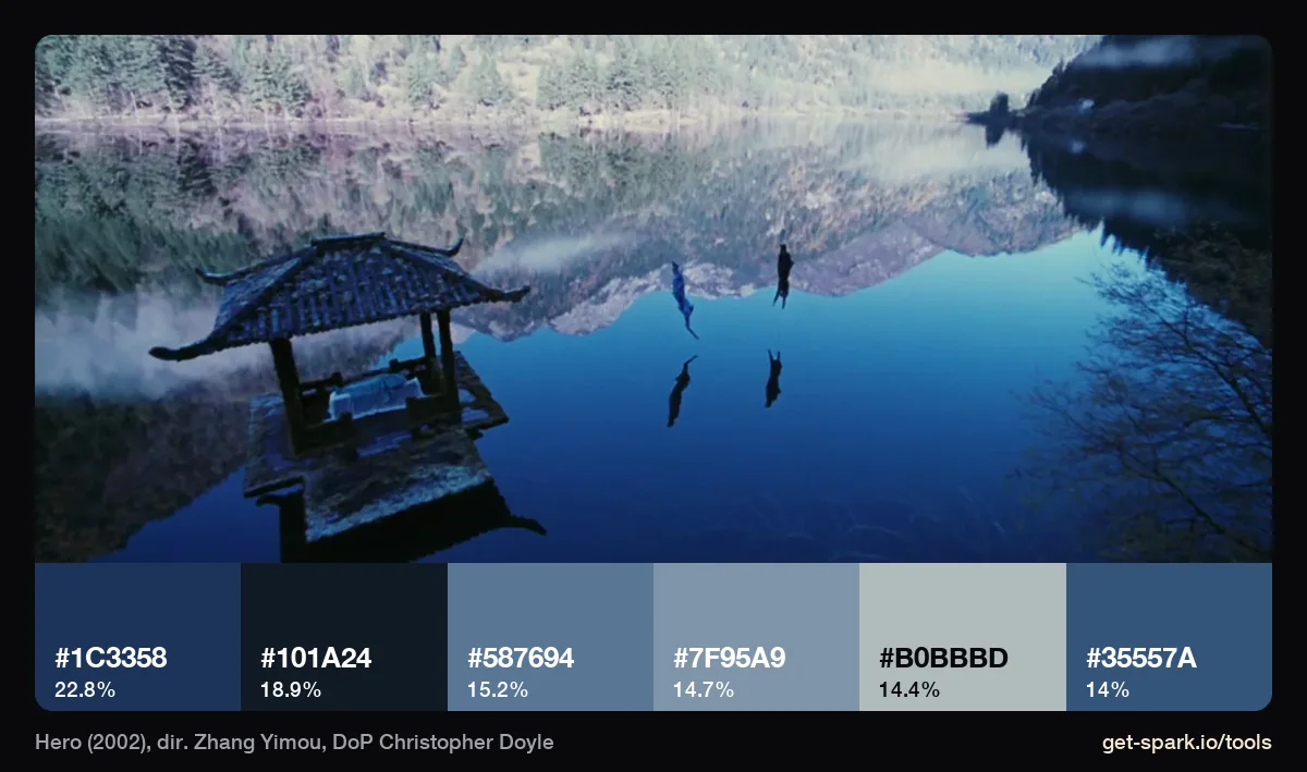
Zhang Yimou tells each version of Hero's story in its own colour, and this is the blue one: six swatches from navy #1C3358 to a pale blue grey, #B0BBBD, with nothing warm in the frame. Christopher Doyle has said the colours were shaped by the locations as much as by any theory, because a lake or a forest can't be repainted (Reverse Shot). His Hong Kong work with Wong Kar-wai is in our Wong Kar-wai cinematography guide.
Blade Runner 2049 (2017)
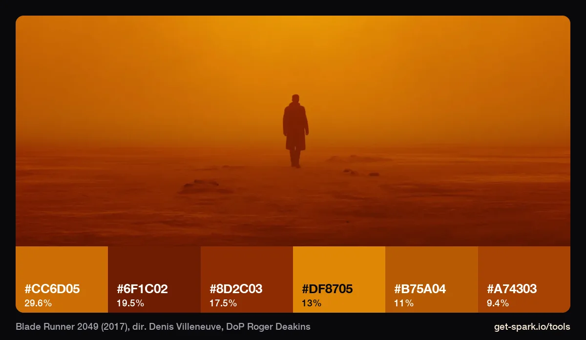
All six swatches are orange, from #DF8705 to a rust, #6F1C02, and none of them is near black or near white (running it with that setting on gave identical results). It still has depth because the lightness range is wide, and a monochrome reference only works if you keep the darks and lights apart.
Lost River (2014)
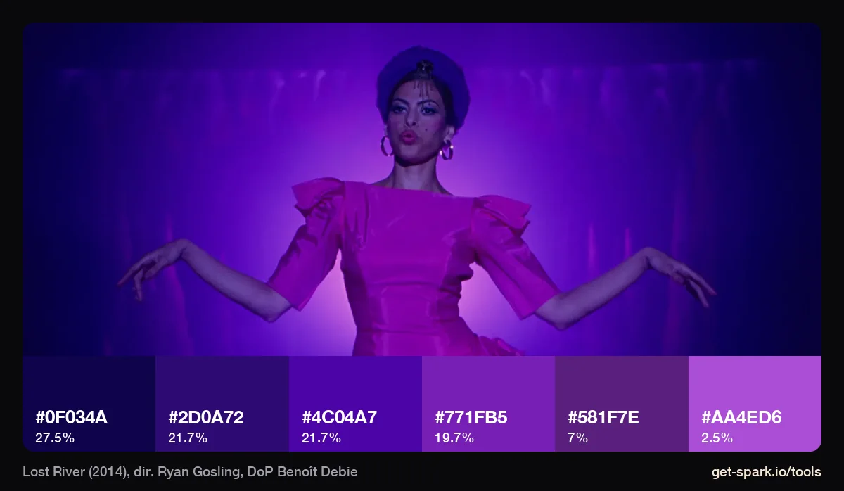
Violet, all six swatches, from #0F034A to #AA4ED6. The magenta dress, which looks like a second colour, gets pulled into the same family by the light. One strong gelled source makes costume and background one colour, which is worth knowing for a music video or fashion film.
Natural light: colour from the weather and the fire
Set by the sky, the season and the flames. Quieter, mostly neutral, and hard to fake.
The Revenant (2015)
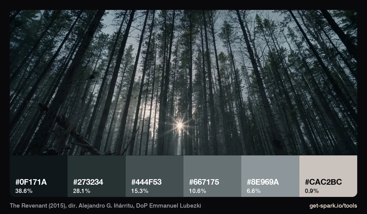
Alejandro G. Iñárritu said the film was shot with no electrical lighting, only natural light (Collider, February 2015). This frame of pines in low winter sun is six blue greys, from #0F171A to #8E969A, and the sun itself, #CAC2BC, is 0.9%. Natural winter light is mostly cool shadow with one small warm source, and the palette shows that ratio exactly.
The Tree of Life (2011)
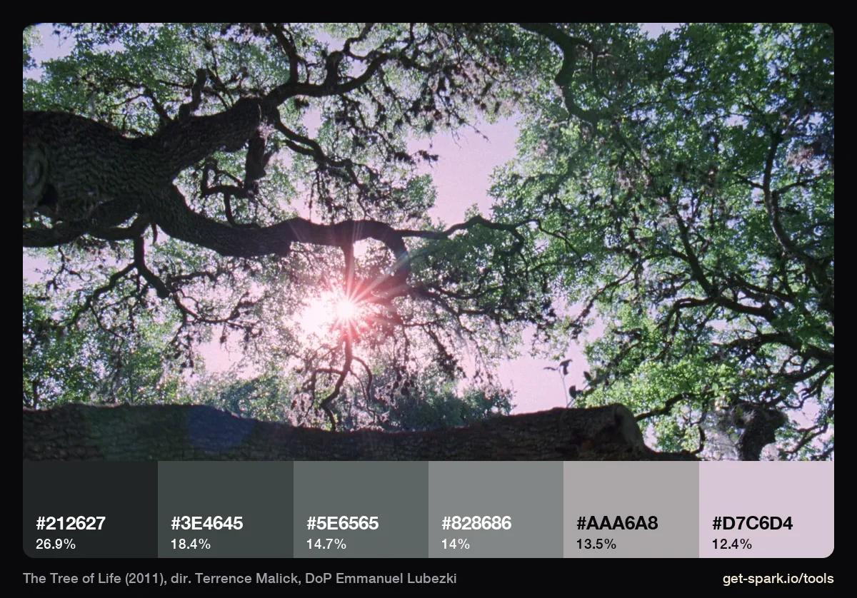
Looking up through an oak into the sun gives a ramp of neutral greys with a lilac sky at the top (#D7C6D4, 12%). The leaves are green, but they measure as grey because they're backlit. Worth knowing when a reference you'd describe as "lush and green" turns out to be mostly silhouette.
Portrait of a Lady on Fire (2019)
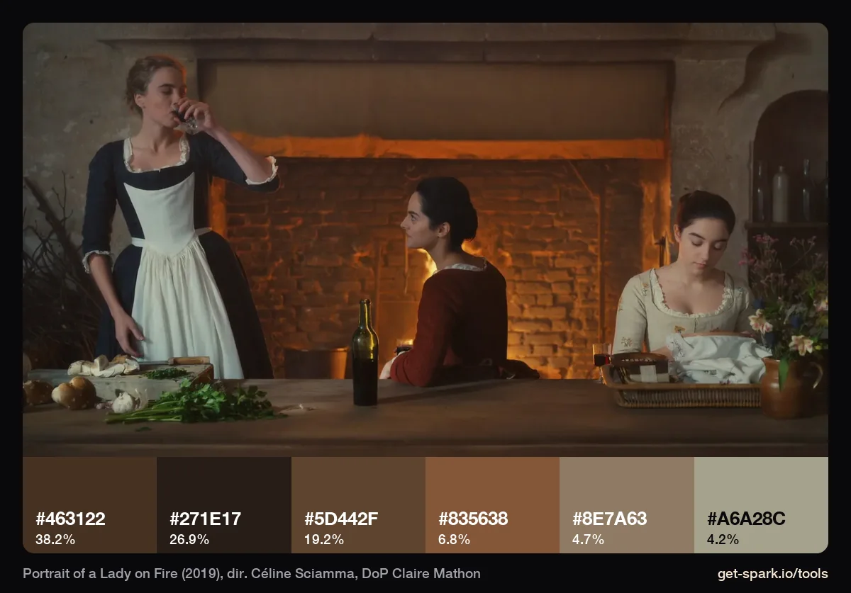
Firelight: every swatch is a brown, an amber or a tan, from #271E17 to #A6A28C. The kitchen is lit, or made to look lit, by fire and candles, and there's no blue in it at all. Same idea of natural light as The Revenant, opposite end of the colour wheel.
Interstellar (2014)
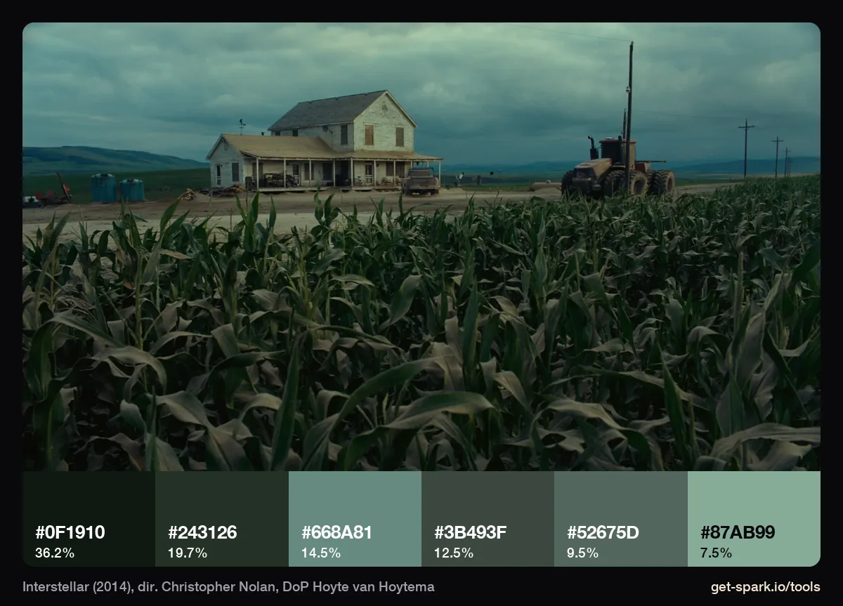
Heavy cloud over tall corn. 36% of the frame is a near black green (#0F1910), and the lightest swatch is a pale sage, #87AB99. Greens with no yellow in them usually mean overcast light: fertile, but sombre.
How to pull a palette from any frame
The method we used for every palette above. It works on a film still, a screenshot or a video file.
- Get the cleanest frame you can. A still from a stills site, a frame exported from the file, or a paused high quality stream. Heavy compression smears shadows and gradients, which shifts the darker swatches. Our guide to extracting a still frame from a video covers every app, or skip that step, because the extractor reads video too.
- Open the colour palette extractor and drop in the image, choose it from your computer, or paste a screenshot with Cmd+V (Ctrl+V on Windows). For a video, drop in the MP4, MOV or WebM and drag the scrubber to the shot. The arrow keys step one frame at a time (at 24 fps). Nothing is uploaded.
- Choose how many colours. Anything from 3 to 12. Six suits most frames. Go to ten or twelve when you're hunting for an accent, as with Carol.
- Decide about the extremes. Tick Ignore near-black and near-white for letterbox bars, deep shadow or a blown out sky. Leave it off when darkness is the look, as in Only God Forgives.
- Sort the strip by share, by hue, or dark to light.
- Take the colours with you. Click a swatch to copy its HEX code, copy the set as CSS variables, Tailwind or JSON, or download a palette card (a PNG of the picture with its strip) or an .ase file that opens in Photoshop, Illustrator and InDesign.
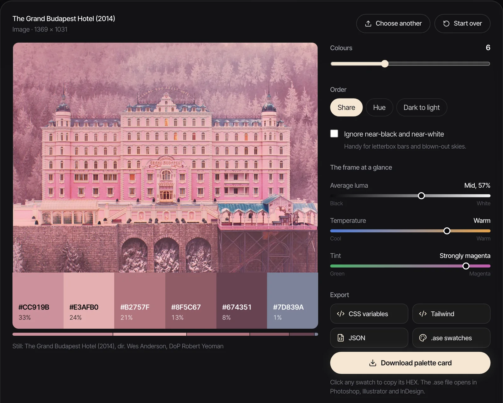
That caption matters if you compare numbers. Run the same frame in two browsers, or on the command line as we did, and a HEX code can move by a few units. The palette and its shares stay the same to within a couple of percent.
Where to find good frames
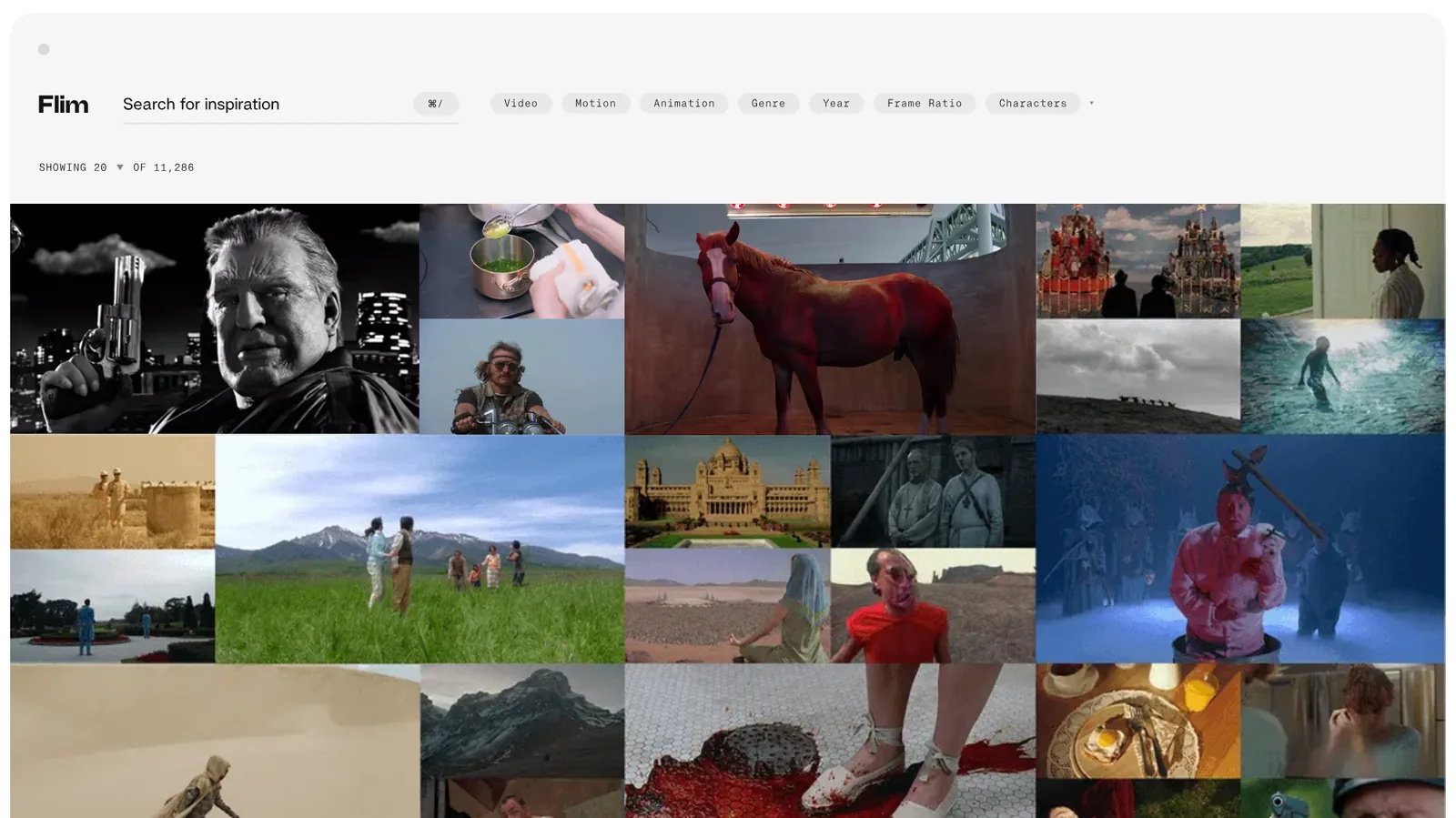
Palettes are only as good as the frame. FILMGRAB is free and posts careful frame sets one film at a time. ShotDeck is a paid library that lets you filter stills by colour, lighting and time of day. Flim is a search engine for film stills with filters for genre, year and frame ratio. We compare the three main options in ShotDeck vs FILMGRAB vs FRAMESET.
Putting a palette to work
On a moodboard, put the strip under the frame and write one line on what the colours are doing. Our method for a moodboard for a video project gives colour its own section, and the free moodboard maker lays the frames out as slides when you need a deck quickly.
For the colourist, a palette is half the note. The other half is skin, blacks and highlights, which we go through in finding and saving colour grading references. The shares help here: "45% of the frame sits in a red black" is a grade note, where "very red" isn't.
For the art department and wardrobe, the HEX codes belong in the visual style guide, with the warning from 2001: a palette measured under coloured light isn't a paint chart.
For the gaffer, the night and natural light palettes are really lighting notes. Last Night in Soho's split is two sources and two gels; The Revenant's is one low sun and a lot of shade. Our guide to building a lighting reference library covers reading the light itself.
A note on rights: the frames belong to the films. Use them as internal reference and in pitches, credit them, and ask before putting one anywhere public.
Keeping palettes with the references
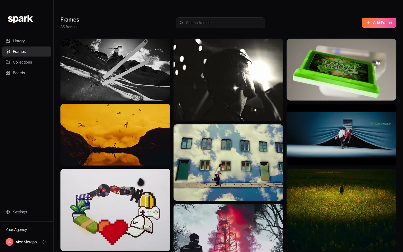
The trouble with palettes is that they get separated from the shot they came from. Ours live with the references in Spark. Export Frame pulls a clean still from a saved video into Frames, and every frame there gets a five colour palette of its own, so typing a colour word like "teal" or "red" into search finds the frames that carry it.
FAQs
What is a movie colour palette?
A movie colour palette is the small set of colours that dominates a film or a scene, usually two or three colour families plus an accent. It comes from production design, costume, lighting and the grade working together. Palettes are often shown as a strip of swatches with HEX codes under a frame.
How do I find the colour palette of a movie?
Take a clean frame from the scene you care about and run it through a palette extractor. Our free colour palette extractor works on images and on video files, where you scrub to the exact frame, and gives each colour's HEX code and its share of the picture. Do it for three or four frames across the film to see what stays constant.
How many colours should a film palette have?
Six is a good default for one frame. Use three to five for a simple brand or title palette, and push to ten or twelve when you're looking for a small accent, such as a red scarf in a grey scene. More colours never change the main families, they only split them finer.
Why are the HEX codes different from another palette of the same film?
Different frame, different source, different tool. A Blu-ray frame and a streaming screenshot can differ, and two extractors group colours differently. Even the same tool can drift a unit or two between browsers, because each resizes the image slightly differently before measuring.
Can I use a film's colour palette for my own project?
A set of HEX codes is just colours, and borrowing a palette for a brand, a shoot or a moodboard is common practice. The frames are another matter: they belong to the film, so use stills as internal reference and in pitches, credit them, and ask before publishing them.
Keep reading
All articles
How to Build a Video Ad Swipe File That Your Team Actually Uses
Saving an ad takes ten seconds. The swipe files that get used are the ones where someone can find the right opening months later, without remembering who made it.
How to Use ChatGPT and Claude for Creative Research (and With Your Reference Library)
An AI chat is a brilliant vocabulary partner and an unreliable librarian. Use it for the first job and it saves hours. Trust it with the second and you'll be hunting for films that were never made.
How to Make a Ripomatic (or Mood Film) for a Pitch
A good ripomatic lets a room feel the film before it exists. A careless one turns up online with other people's footage and your client's logo on it.