
The Wes Anderson Colour Palette, Film by Film
Pink hotels and yellow raincoats are the cliché. Measure the frames and the palette turns out warmer, browner and far more disciplined than the memes suggest.
By the Spark team ·
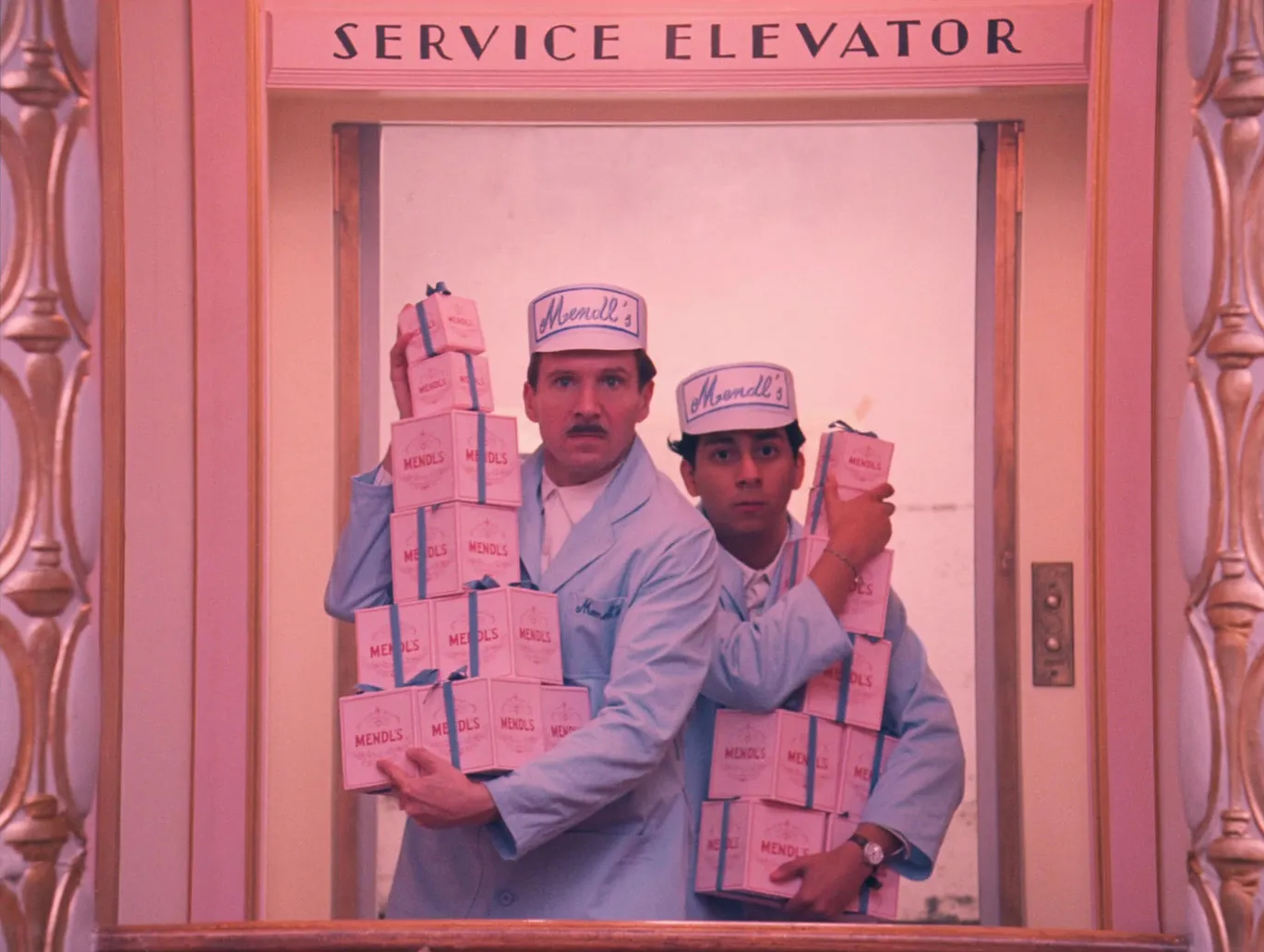
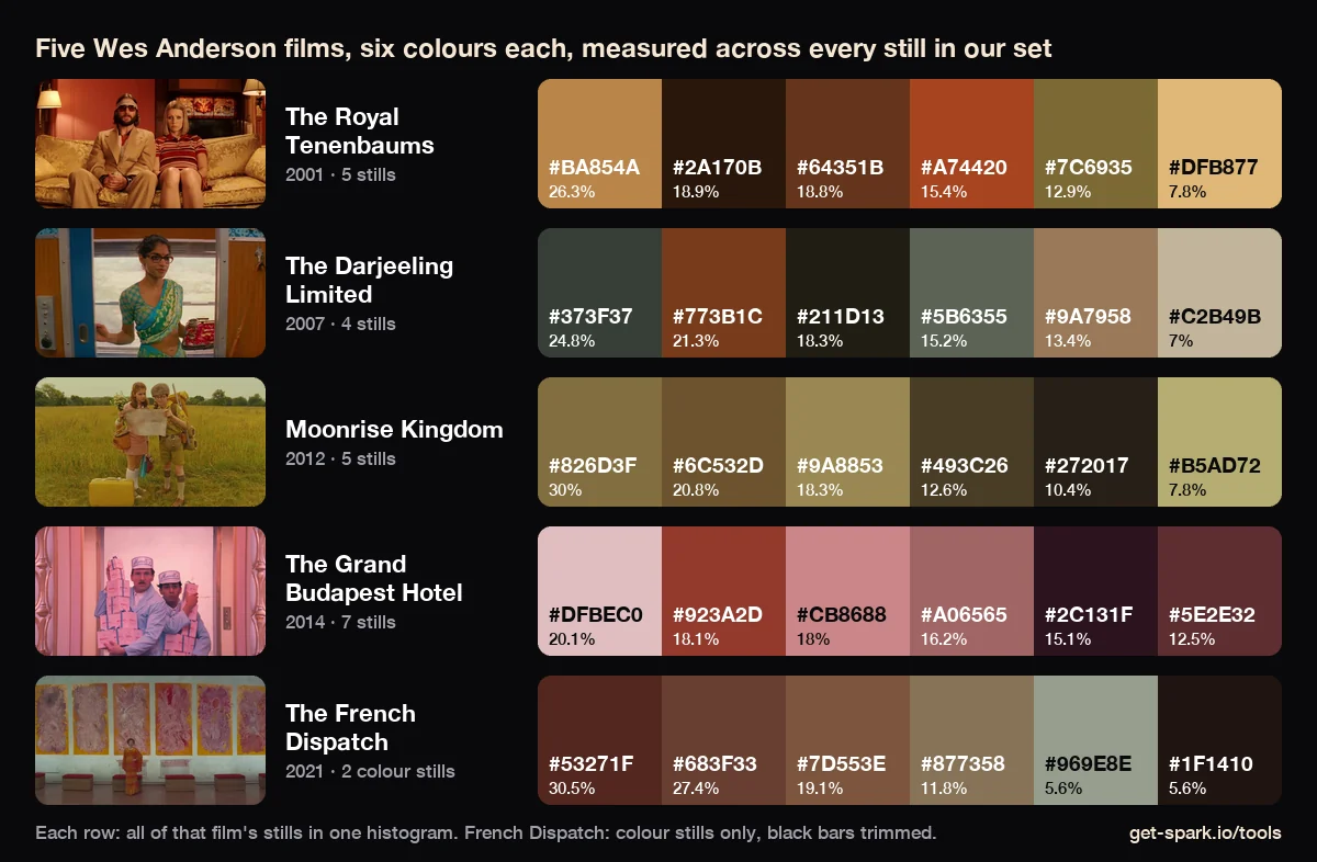
The Wes Anderson colour palette is warm, mid toned and strict. Each film picks one family of colour and keeps nearly everything inside it: caramel and rust for The Royal Tenenbaums, rust and green grey for The Darjeeling Limited, khaki and mustard for Moonrise Kingdom, pink, red and aubergine for The Grand Budapest Hotel, muted browns plus black and white for The French Dispatch. Then one small opposing colour, usually under 10% of the frame, keeps the main one from going flat.
We measured that. We didn't guess it. Every HEX code below comes from running 24 stills from those five films through the engine behind our free colour palette extractor, and the percentage is how much of the frame each colour covers. We're the team behind Spark, and his are some of the most borrowed palettes in film, so we wanted real numbers behind them.
All five films were shot by Robert Yeoman, who has been Anderson's cinematographer on every live action feature from Bottle Rocket (1996) to Asteroid City (2023). The Phoenician Scheme (2025) was the first not shot by him: Bruno Delbonnel took over.
| Film | Main family (measured) | Darkest swatch | The opposing note |
|---|---|---|---|
| The Royal Tenenbaums (2001) | Caramel, rust, sand | #2A170B, a brown black | Olive and bus green |
| The Darjeeling Limited (2007) | Rust and green grey | #211D13, an olive black | A greyed train blue |
| Moonrise Kingdom (2012) | Khaki, mustard, straw | #272017, a brown black | Rust orange, under 6% |
| The Grand Budapest Hotel (2014) | Pink, brick red, rose | #2C131F, an aubergine | Blue grey roofs, 1.2% |
| The French Dispatch (2021) | Oxblood, tobacco, khaki | #1F1410, a warm black | Pale grey green walls |
Look at the darkest column first. Not one of these palettes has a neutral black in its top six. The shadows are brown, olive or aubergine every time, which is a big part of why the films feel warm even when nothing in frame is orange.
The Royal Tenenbaums (2001): caramel, rust and one green
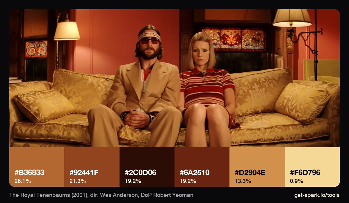
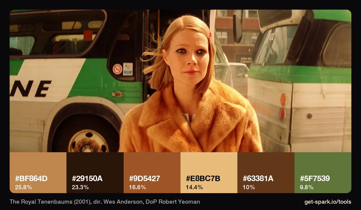
Across our five Tenenbaums stills the palette is caramel (#BA854A, 26%), chestnut, rust (#A74420), olive and sand. The sofa scene is almost one colour: gold and rust from #D2904E down to a brown black, #2C0D06, with the lamp shade as the only pale note at 0.9%. In Margot's bus scene her fur coat supplies three of the six swatches (#BF864D, #E8BC7B, #9D5427), and the bus behind her adds the one colour from the other side of the wheel: a green, #5F7539, at 9.8%. That pairing, warm character against a cooler world, is the oldest trick in the film.
The Darjeeling Limited (2007): the blue train is greyer than you think
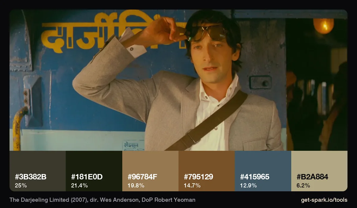
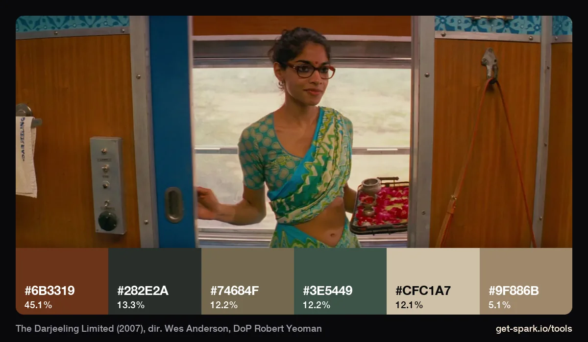
Ask anyone for Darjeeling's colours and they'll say sky blue and turquoise. The extractor says otherwise. The train's painted blue measures #415965, a greyed blue at 12.9%, and the stewardess's turquoise sari comes out as a teal grey, #3E5449. What really owns the corridor is the orange brown woodwork: #6B3319, 45% of the frame. Across the four stills, a green grey (#373F37) and a rust (#773B1C) lead. The blues read as bright because they sit next to all that rust. Saturation is relative, and this film proves it.
Moonrise Kingdom (2012): everything khaki, even the sky
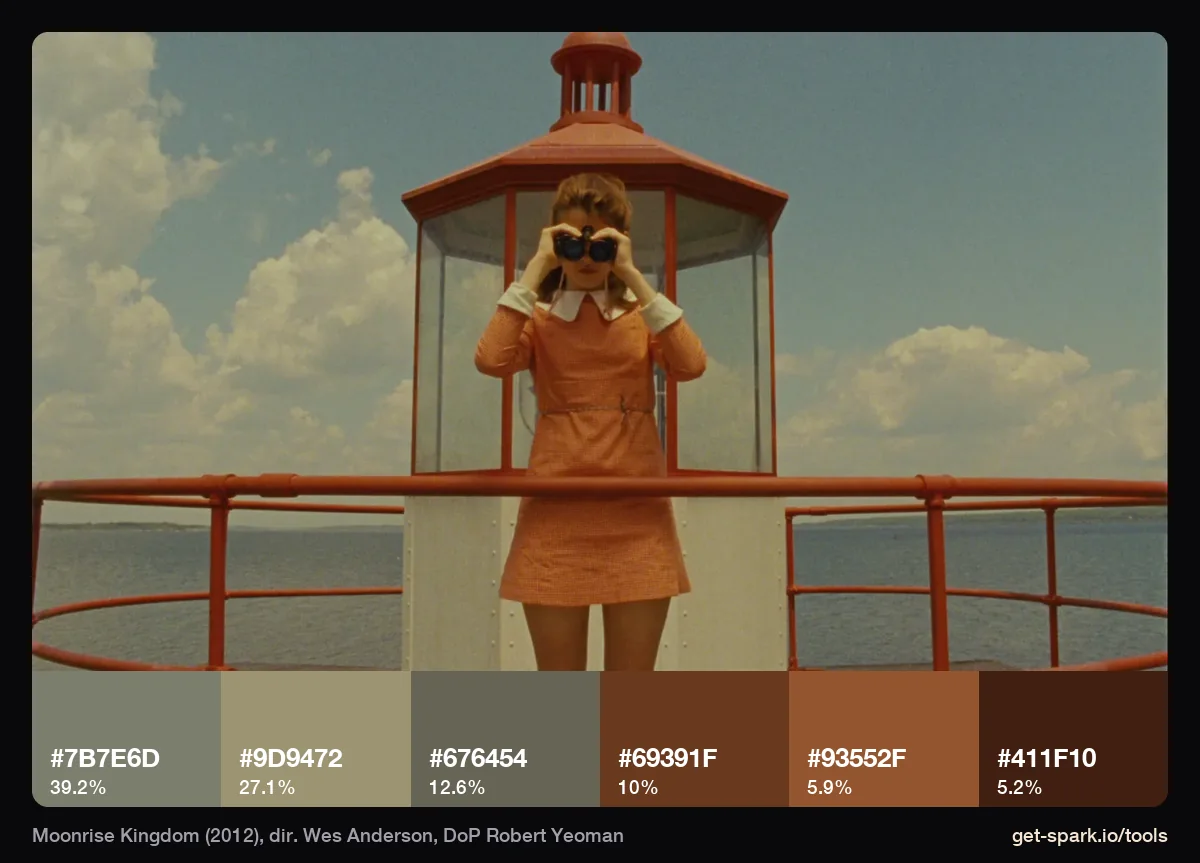
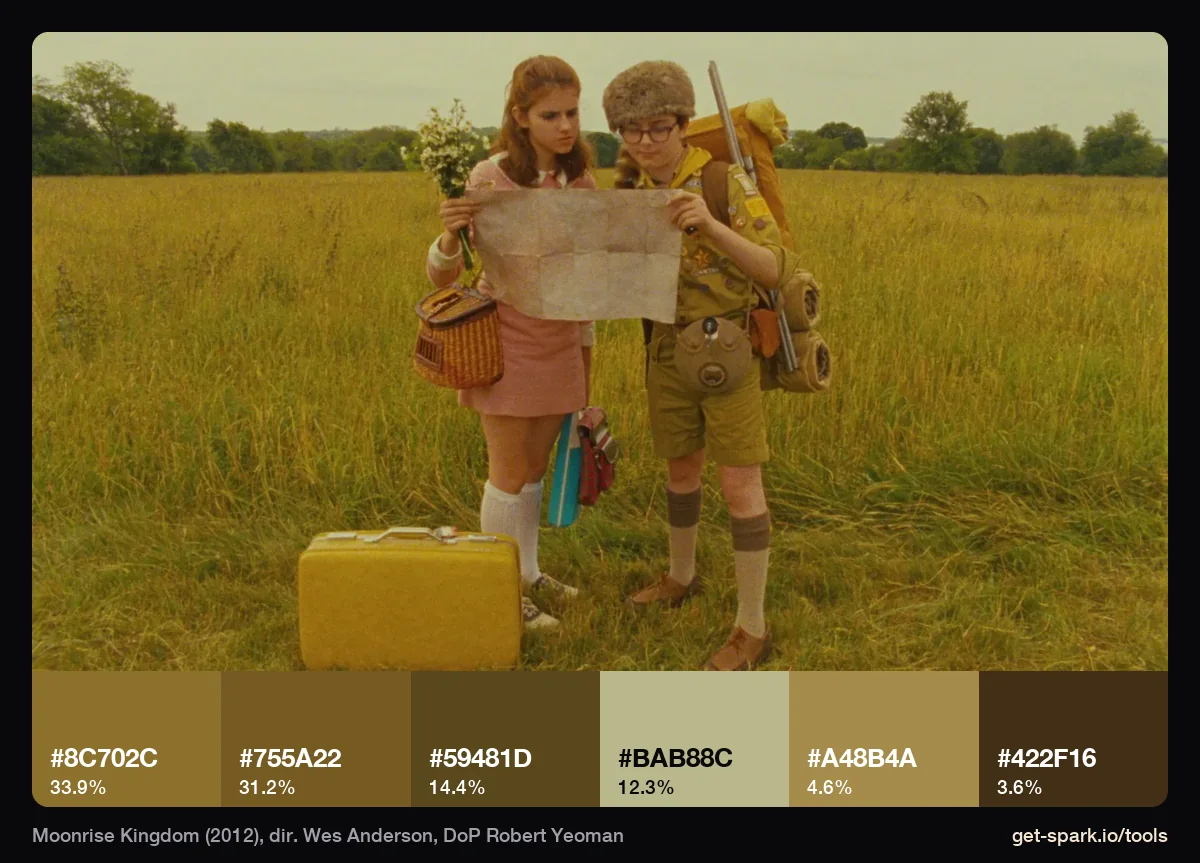
Moonrise Kingdom is the most single minded of the five. All six colours across our stills sit in one family, from straw (#B5AD72) through mustard (#9A8853) and khaki (#826D3F, 30%) to a brown black. In the lighthouse frame, the sky you'd call pale blue measures #7B7E6D, a khaki grey at 39%, and the red balcony comes out as rust, #69391F and #93552F. The warm cast reaches all the way into the sky. The film was shot on Super 16, not 35mm, so the grain and softness are part of the look too, and no grade will add that to a sharp digital image on its own.
The Grand Budapest Hotel (2014): pink, red and aubergine
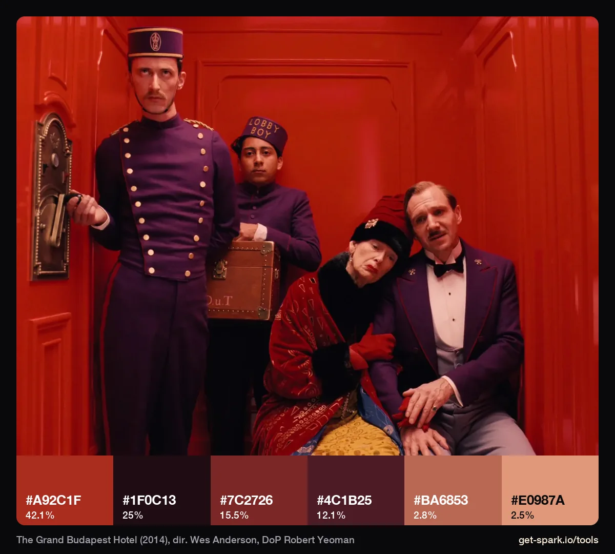
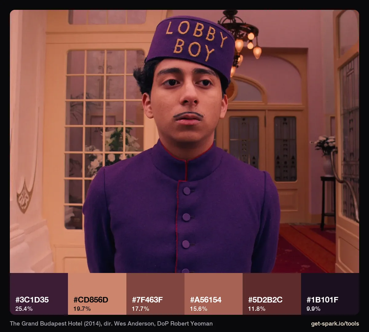
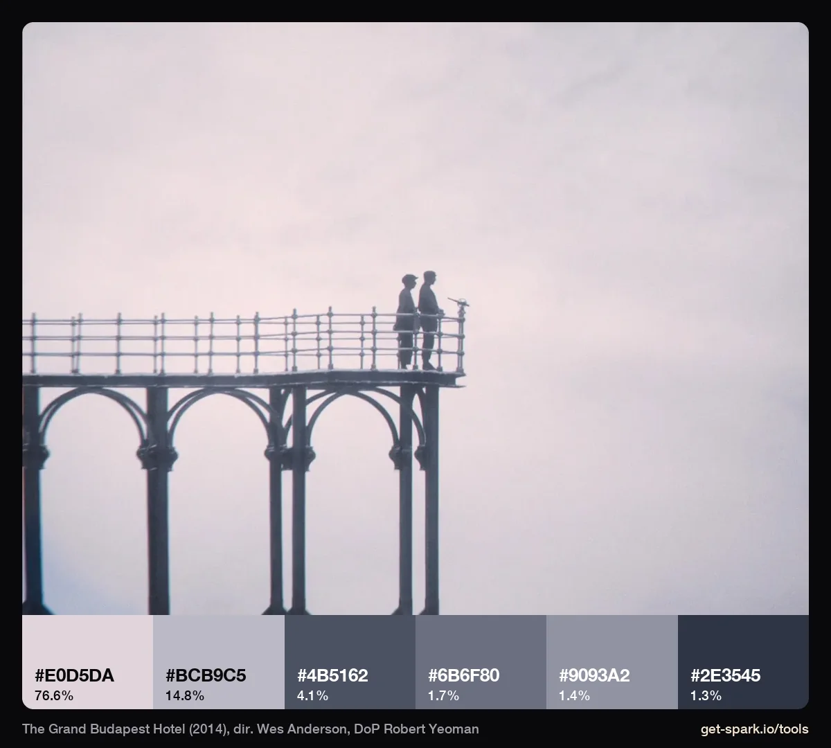
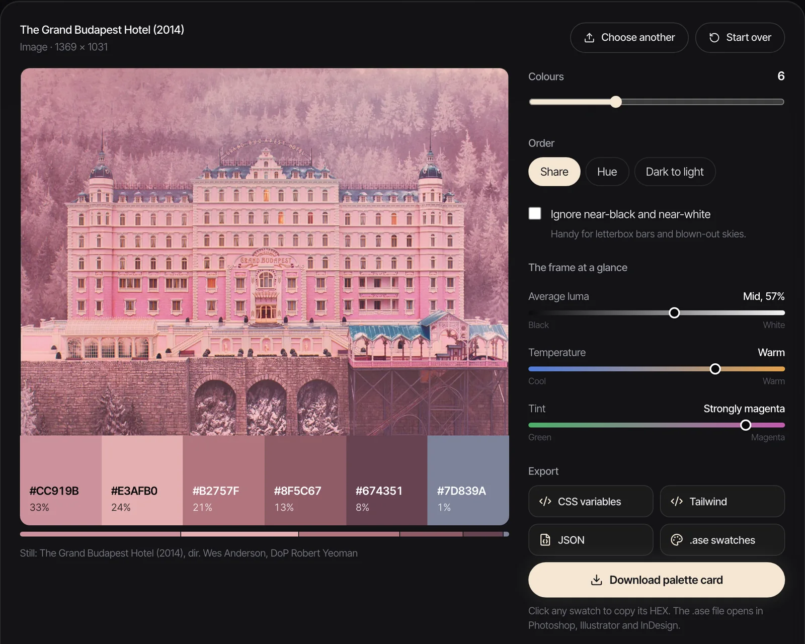
The film everybody means. Our seven stills give a pale pink (#DFBEC0), brick red (#923A2D), rose (#CB8688), dusty rose, aubergine (#2C131F) and wine. The red lift is 42% brick red (#A92C1F) with the purple uniforms collapsing into aubergine shadow. The lobby boy frame puts a purple (#3C1D35) dead centre against salmon pink walls (#CD856D). Even the fog is pink: in the viewing platform still, 77% of the frame is #E0D5DA, a white with lilac in it.
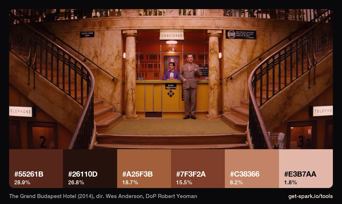
Two things make this film different from the others. First, it changes format with its time periods: 1.37:1 for the 1930s, 2.35:1 for the 1960s and 1.85:1 for the present day (Slate). Our narrower stills are the 1930s hotel; the wide lobby below is the 1960s, and its pinks have turned to orange and brown.
Second, the colour was built, then polished. In postPerspective's account of the grade, colourist Jill Bogdanowicz worked to separate details that were put in during production, such as the red rugs, pink walls and purple suits. The grade sharpened colour that was already there. The Academy agreed where the credit lay: the film won Oscars for Adam Stockhausen and Anna Pinnock's production design and Milena Canonero's costumes, and Yeoman was nominated for cinematography (Oscars.org).
The French Dispatch (2021): half in black and white
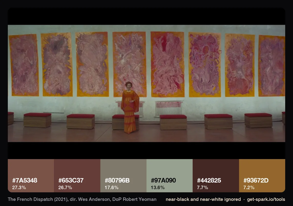
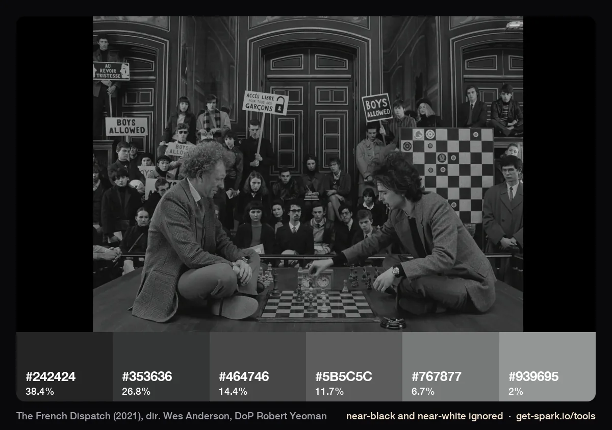
Our French Dispatch stills have black bars, so we ran them with near black and near white ignored. The pink canvases come out as dusty rose browns (#7A5348, #653C37), framed in ochre (#93672D), against a pale grey green wall (#97A090). It's the most muted of the five palettes. The other big change is that colour often isn't there at all. According to Kodak, Yeoman shot colour scenes on Vision3 200T and black and white on Eastman Double-X, the film ended up roughly half and half, and most of it is framed in Academy 1.37:1 with a few anamorphic scenes for emphasis.
What changes between films, and what doesn't
What changes is the family. Pink and red belong to Grand Budapest alone. Khaki belongs to Moonrise Kingdom. Rust runs through Tenenbaums and Darjeeling. Saturation moves too: The French Dispatch, the most recent here, is the greyest of the five.
What stays is the discipline. Across all five:
- One family covers most of every frame, and a single opposing colour sits under about 10%.
- The darkest swatch is always tinted: brown, olive or aubergine, never neutral.
- The bright colours you remember (the train blue, the sari, the red balcony) measure greyer than memory says. They look bright because of what surrounds them.
- The camera faces the set square on and the subject sits in the middle. That's in the frames above as clearly as the colour is, and it's half of what people read as "Anderson".
A contrast: Jojo Rabbit
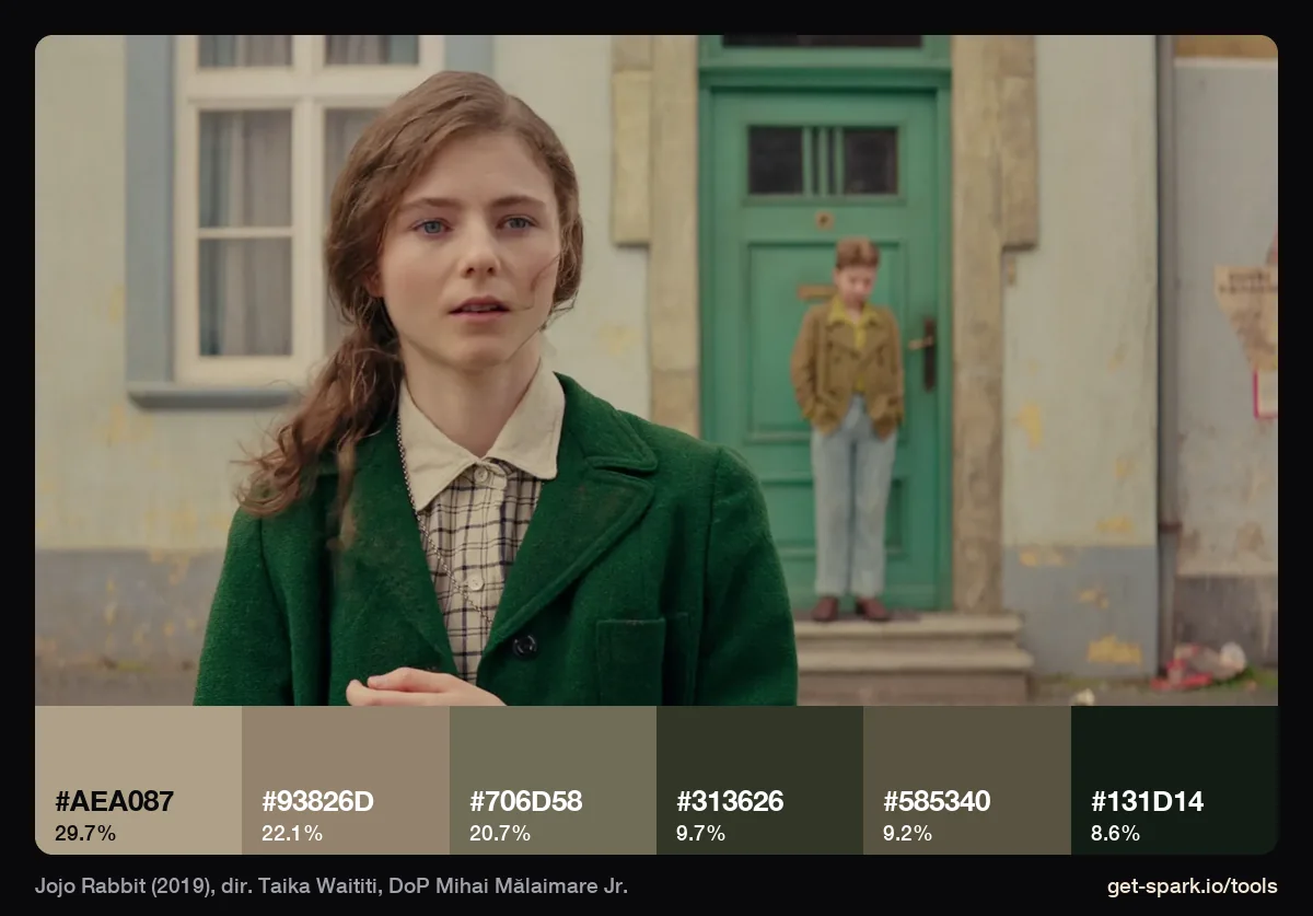
Our stills registry calls Taika Waititi's Jojo Rabbit "Anderson adjacent", and the palette shows why. Khaki and olive again (#AEA087, #93826D, #706D58), a green coat, a pastel house. But it's greener and greyer than Moonrise Kingdom, the darkest swatch is a cool green black (#131D14), and the frame isn't built around the centre: the girl stands left, the boy stands in a doorway to the right. Same family of colour, different geometry, and it reads as its own film. The palette alone doesn't make a frame look like Anderson.
How to borrow it for a brand or fashion shoot without copying
Copying a still shot for shot gets you a parody, and clients notice. Borrowing the rules gets you something that feels considered and still looks like your brand.
- Borrow the ratios, not the HEX codes. Pick one family for the whole shoot and let it cover 70 to 80% of each frame. Choose one opposing colour and keep it under 10%. If the brand colour is green, green can be the family. It doesn't have to be pink.
- Tint your blacks. Ask wardrobe for brown, navy or plum instead of black, and ask the colourist to keep the shadows warm. Every film above does this.
- Put the colour in the set and the clothes. The Grand Budapest colours were built in production and separated in the grade. Spend on paint, fabric and props before you spend on a look.
- Decide your geometry. Centred and square on reads as Anderson faster than any colour. If you don't want the comparison, keep the palette and move the camera.
- Scout for it. Accidentally Wes Anderson, which started in 2017, maps 2,643 real places that look like his sets (as of October 2026). Real buildings already carry the look, which is cheaper than building it.
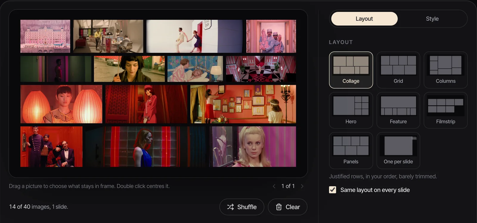
Build the board around one family before the shoot. Our fashion campaign moodboard guide splits it into mood, styling and casting, and the moodboard examples post shows boards built on one palette. Write the ratios down in a visual style guide so the art department and the grade work to the same numbers, and give the colourist frames with notes on skin and blacks, as in our guide to colour grading references. If you're pitching it, the palette page belongs in the treatment next to the frames that inspired it.
A note on rights: these stills belong to the films. Use them as internal reference and in pitch decks, credit them, and keep them out of anything you publish.
Measure your own frames
To get the palette from any still, drop it into the extractor, or drop in a video and scrub to the frame. Choose 3 to 12 colours, tick Ignore near-black and near-white for frames with black bars, and copy the HEX codes, CSS variables, Tailwind config or an .ase file for Photoshop and Illustrator.
For more films measured the same way, from Suspiria to The Revenant, see our movie colour palettes guide.
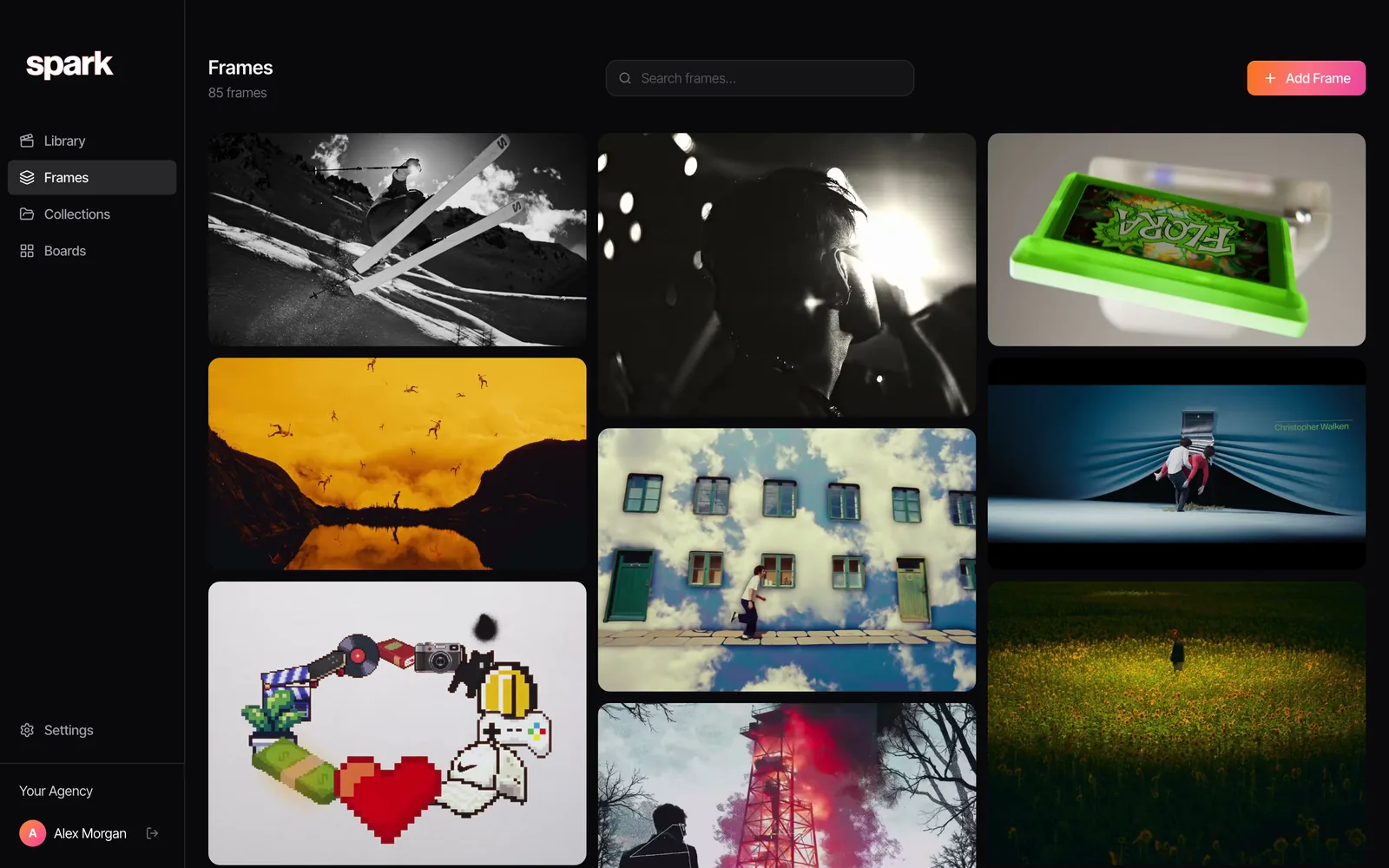
In Spark, every frame you save or export gets its own five colour palette, and typing a colour word like "pink" or "khaki" into search finds the frames that carry it. Export Frame takes a clean still from any saved video, so the frame and its palette stay next to the clip they came from.
FAQs
What colours does Wes Anderson use?
It depends on the film, which is the point. Measured from our stills, The Grand Budapest Hotel is pink, brick red and aubergine; Moonrise Kingdom is khaki, mustard and straw; The Royal Tenenbaums is caramel and rust; The Darjeeling Limited is rust and green grey; The French Dispatch is muted browns plus black and white. What they share is one dominant family per film, a small opposing colour and tinted, never neutral, blacks.
What are the HEX codes for The Grand Budapest Hotel palette?
Across seven stills from the film, our extractor gives #DFBEC0 (pale pink), #923A2D (brick red), #CB8688 (rose), #A06565 (dusty rose), #2C131F (aubergine) and #5E2E32 (wine). The pink facade alone gives #CE939D, #E5B2B1, #B57680, #905C68, #664351 and a blue grey #7E839A.
Who is Wes Anderson's cinematographer?
Robert Yeoman shot every Wes Anderson live action feature from Bottle Rocket (1996) to Asteroid City (2023), and was Oscar nominated for The Grand Budapest Hotel. The Phoenician Scheme (2025) was shot by Bruno Delbonnel.
Why do Wes Anderson films look so distinctive?
Mostly production design, costume and framing, then the grade. Sets and wardrobe carry a limited palette, the camera faces the set square on with the subject centred, and the colourist separates the colours that are already there. The Grand Budapest Hotel won Oscars for both production design and costume.
How do I make a shoot look like a Wes Anderson film without copying one?
Borrow the rules, not the shots: one colour family across 70 to 80% of each frame, one small opposing colour, warm or tinted blacks, colour built into the set and clothes. Then decide whether you want centred, square on framing, because that is the fastest route to the comparison.
Keep reading
All articles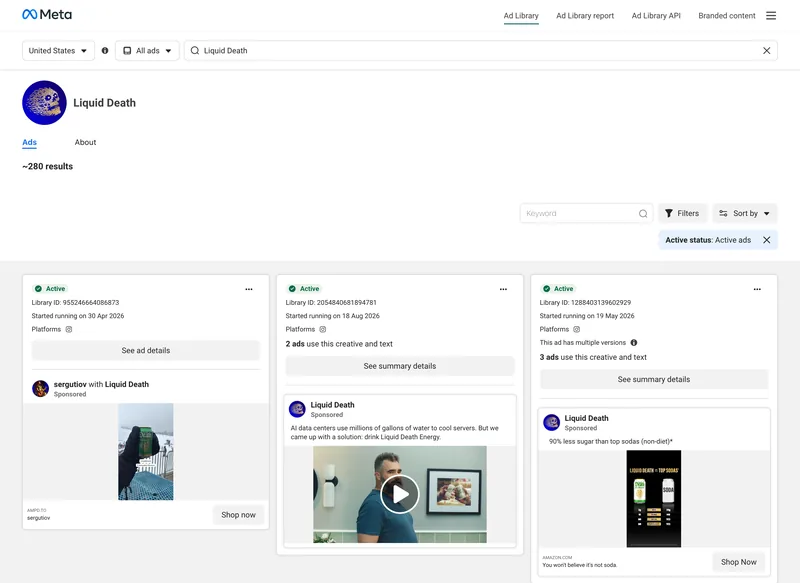
How to Build a Video Ad Swipe File That Your Team Actually Uses
Saving an ad takes ten seconds. The swipe files that get used are the ones where someone can find the right opening months later, without remembering who made it.
How to Use ChatGPT and Claude for Creative Research (and With Your Reference Library)
An AI chat is a brilliant vocabulary partner and an unreliable librarian. Use it for the first job and it saves hours. Trust it with the second and you'll be hunting for films that were never made.
How to Make a Ripomatic (or Mood Film) for a Pitch
A good ripomatic lets a room feel the film before it exists. A careless one turns up online with other people's footage and your client's logo on it.