
Moodboard Examples for Film, Ads and Brand Work (and Why They Work)
Galleries of pretty boards teach you very little. These eight come with the reasoning: the one rule each board follows, and the thing to copy into your next pitch.
By the Spark team ·
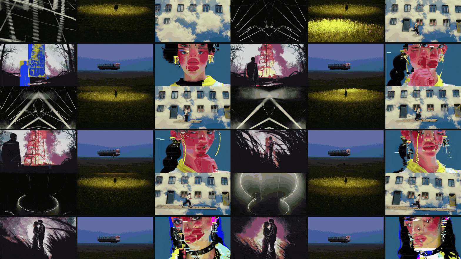
A good moodboard follows one rule you could say out loud. Small figure, huge world. Every frame breaks reality a different way. Darkness first, neon second. The eight moodboard examples below each follow one, and that rule is the reason they work, far more than the taste of any single picture. Most of them move, because the jobs they were made for (brand films, music videos, animation, food) are about motion, and a still can't show a camera move or a cutting rhythm.
We make Spark, a reference library for video, and these notes are written the way you'd brief a DoP or a client from each board: what it says, why it lands, and what to steal for yours.
1. Cinematic brand film: small figure, huge world
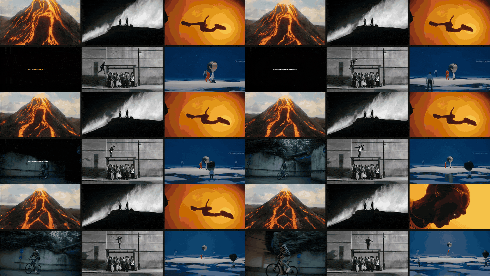
Why it works. Look past the subjects and nearly every clip makes the same move. A volcano pours lava with nobody in frame. Skiers are specks on a ridge. A runner leaps across a moon ten times their size. A cyclist slides through a concrete underpass. Tiny figures cross an ice field. The board isn't about volcanoes or skiing; it's about scale, and a client can feel that in two seconds.
It also mixes colour and black and white on purpose. Two of the six are monochrome, which tells everyone the grade is still open and the idea is the framing. If the board were all one grade, people would start discussing the grade.
Steal this. Write the rule as a caption before you pick a single clip. "One figure, a lot of world" is enough. Then every candidate either follows it or doesn't, and the board edits itself.
2. Experimental music video: each frame breaks reality differently
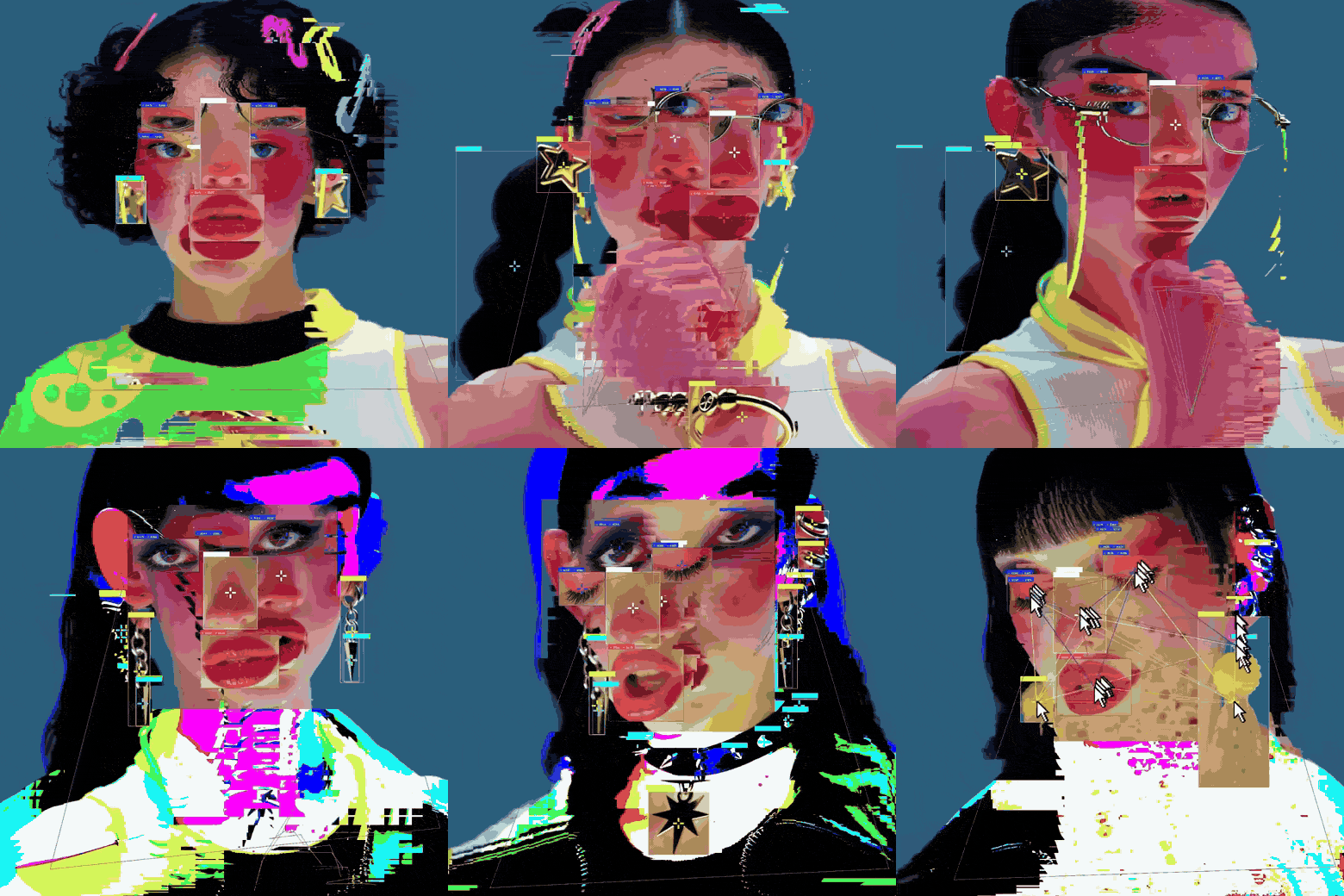
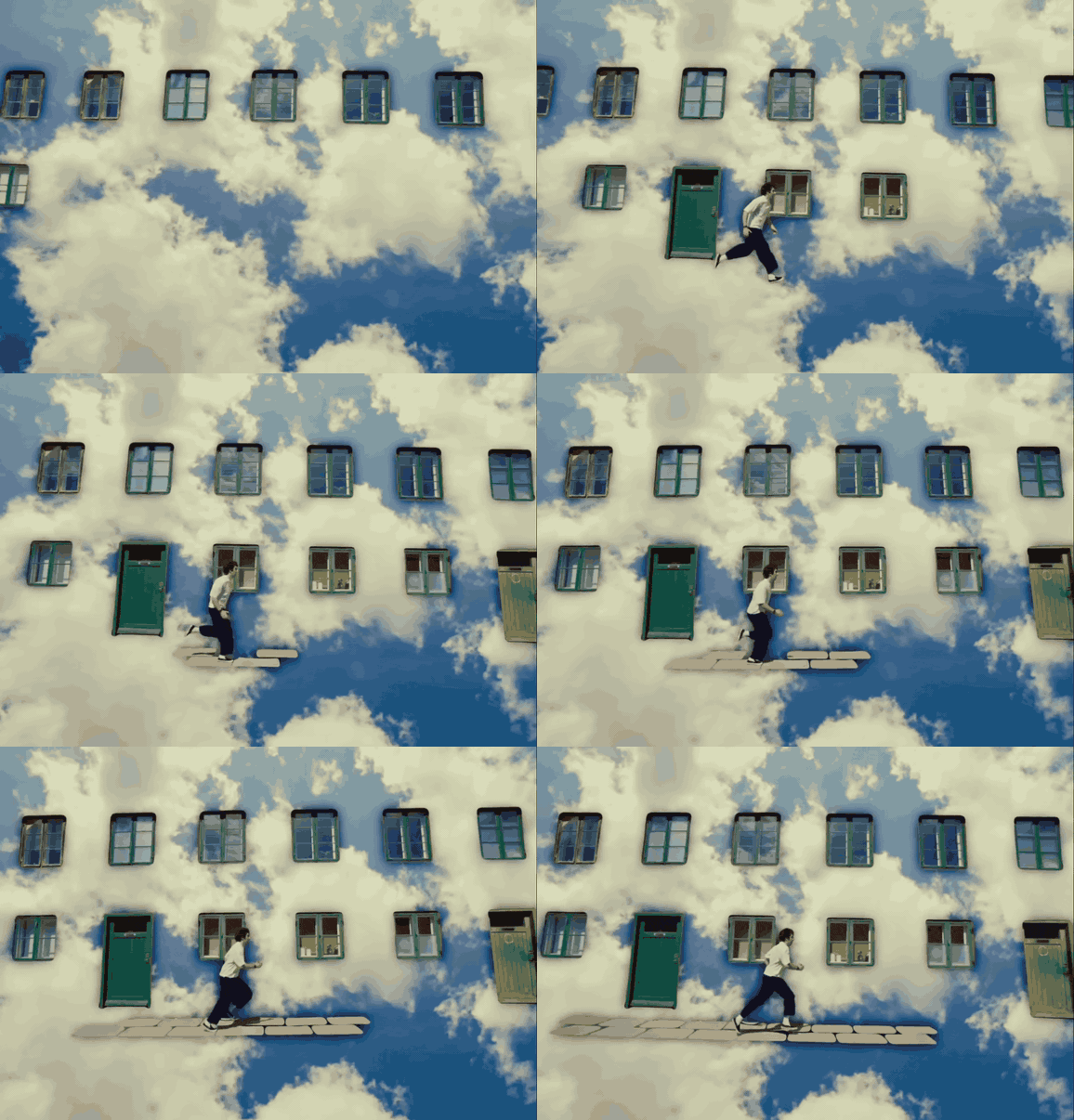
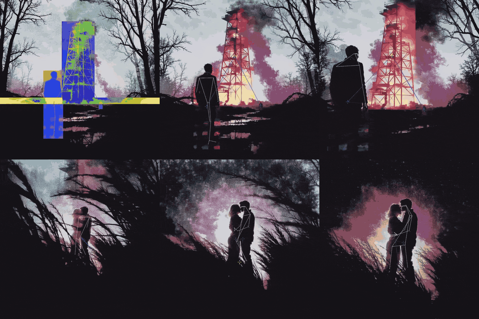
Why it works. A music video commissioner doesn't need to know what the shots are. They need to know how far the video will go. This board answers that: each reference bends the picture in a different way (a glitch, a composite, a collage of paint and footage), and they share saturated colour and a handmade edge. It promises a permission level, not a shot list. The strobing and flicker in clips like these only exist in motion, which is why this board would be pointless as stills; the full six clip version is at the top of the page.
Steal this. Label each reference with its technique, not its content: "composite", "datamosh", "rotoscope". A commissioner or a VFX lead can price a technique. Nobody can price a vibe.
3. Animation pitch: one motion language
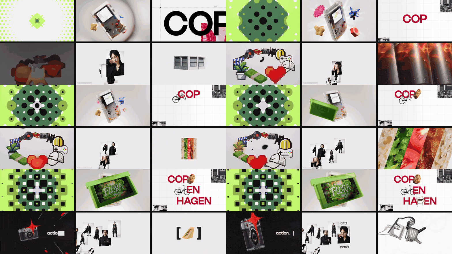
Why it works. An animation board sells timing: how things ease in, how long they hold, how type moves. Most of the clips sit on a clean ground (studio white, paper white, flat colour), so the eye goes straight to the movement. The kaleidoscope pulses outward, the Game Boy spins, the letters of Copenhagen build. Six different makers, one family of motion.
Steal this. Keep the backgrounds consistent. A board where half the references sit on busy photographic grounds reads as a mix of styles, even if the animation is similar. And keep every loop: if the reference pauses or cuts mid move, the motion is what gets lost.
4. Food: every clip is a verb
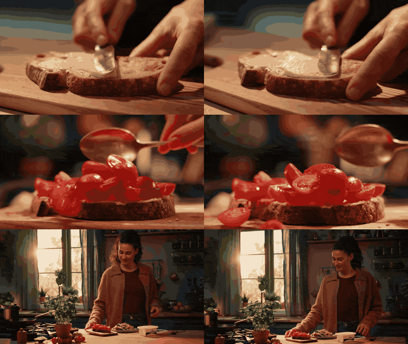
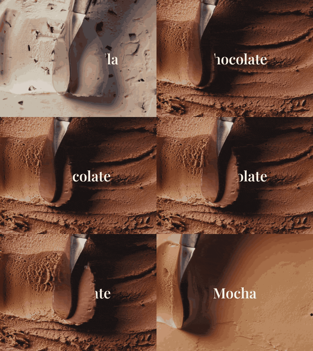
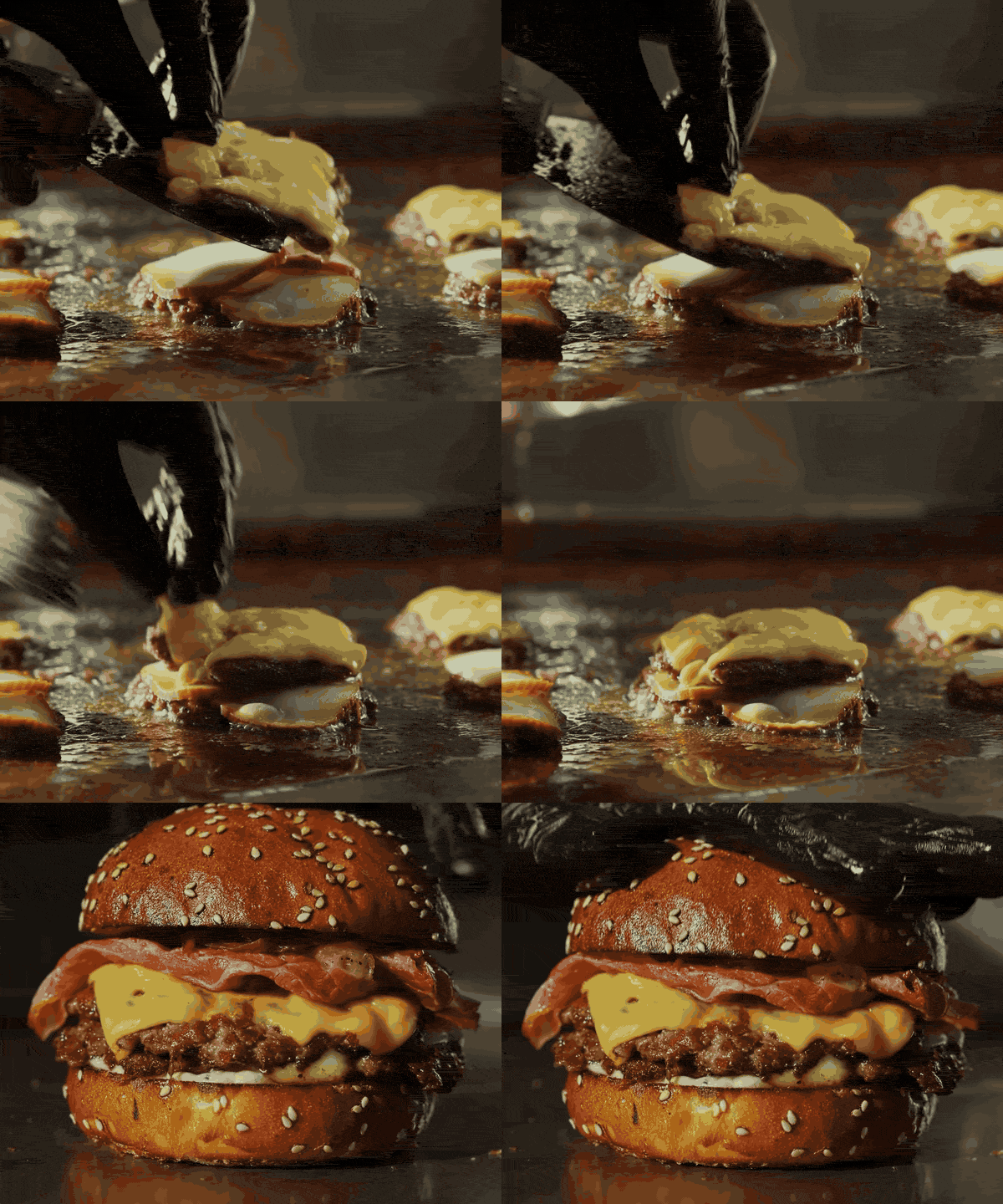
Why it works. Food films are sold on the moment of contact: the knife meeting toast, the scoop cutting into ice cream, cheese settling on a patty. Each of these clips is built around one action, shot close, in warm light. Together they tell a food director and a food stylist the most important thing: this is about process and texture, not plated hero shots.
Speed matters too. Real time and slow motion are different jobs for the camera department, and only a clip shows which one you mean.
Steal this. Caption each food reference with a single verb. If you can't name the verb, it's a plated shot, and it belongs on a different board.
5. Sport and outdoor: shape before face
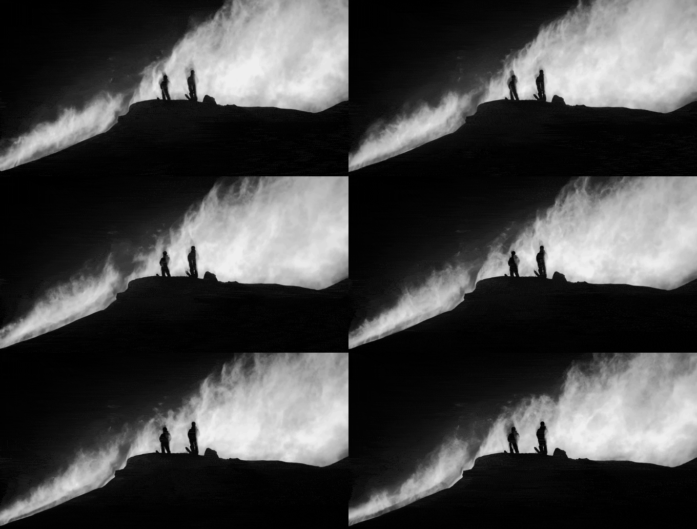
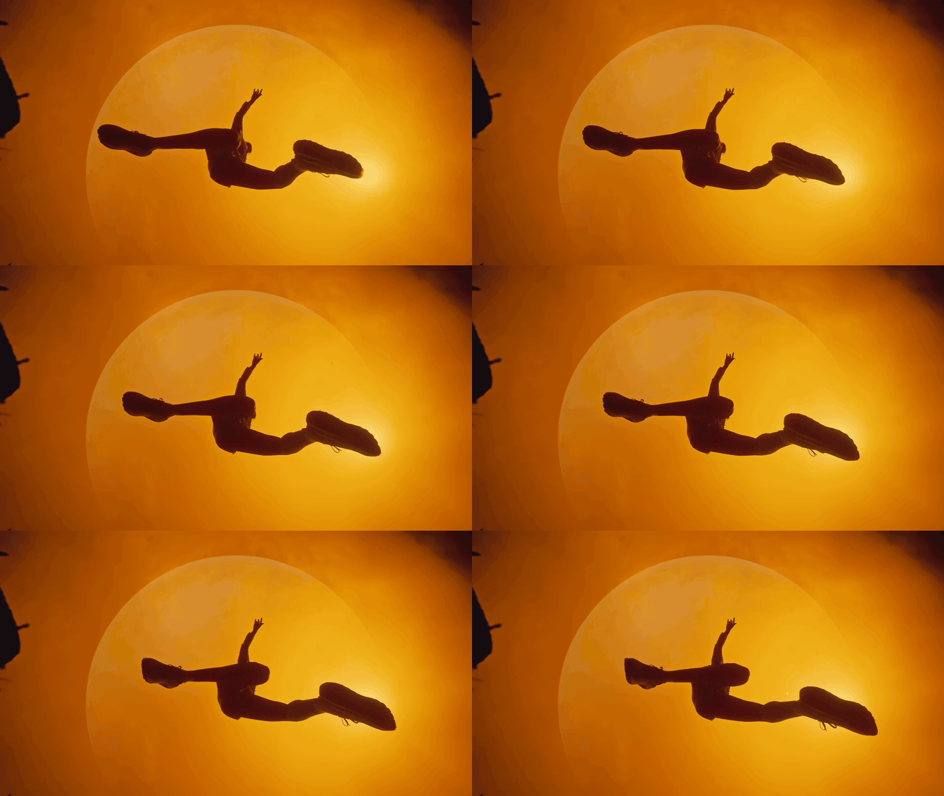
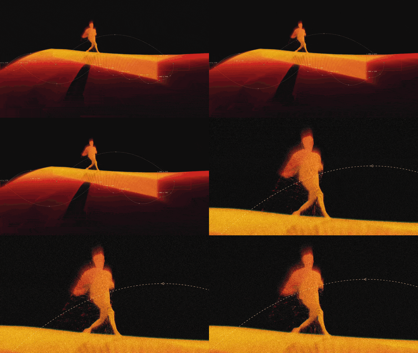
Why it works. None of these athletes has a readable face. Effort comes through posture, silhouette and the line of the horizon. Salomon's ridge is pure black and white; Nike ACG's leap is amber and black. Both reduce the frame to two tones, which is what makes the movement graphic enough to read on a phone screen. The point cloud sprinter goes one step further and keeps nothing but the posture.
Steal this. If every athlete on your board is a silhouette, you've just briefed your DoP to expose for the sky and shoot towards the light. That's a decision worth making on the board, not on the day.
6. Symmetry and colour: one hue family, dead centre
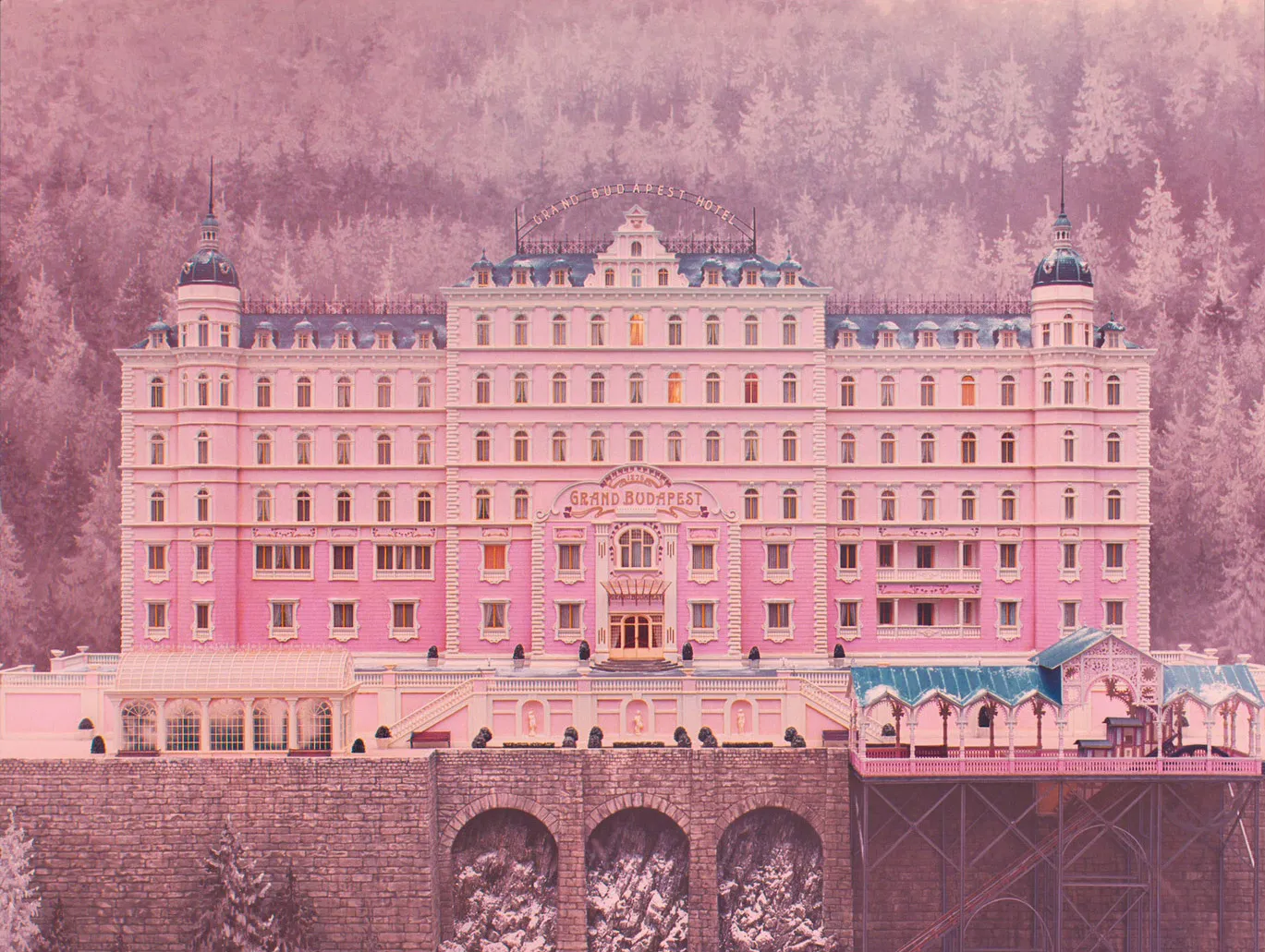
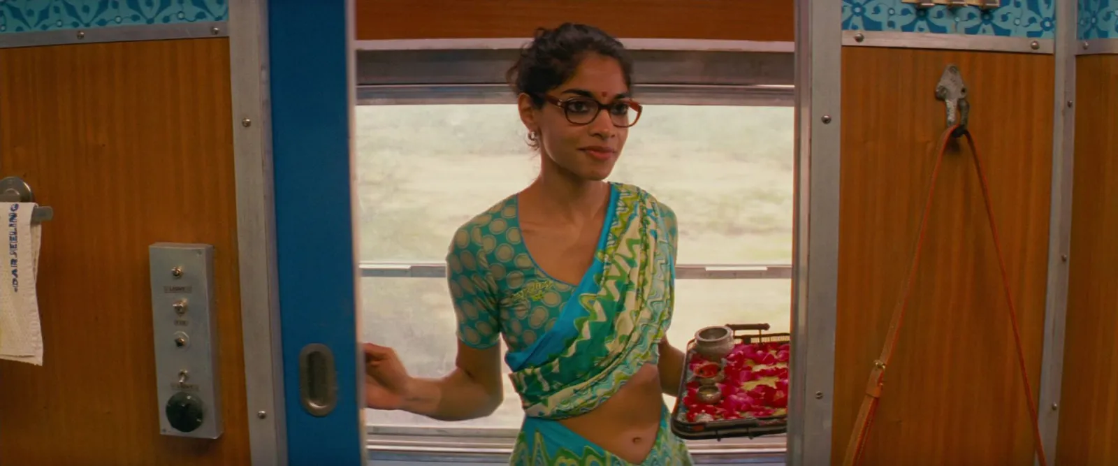
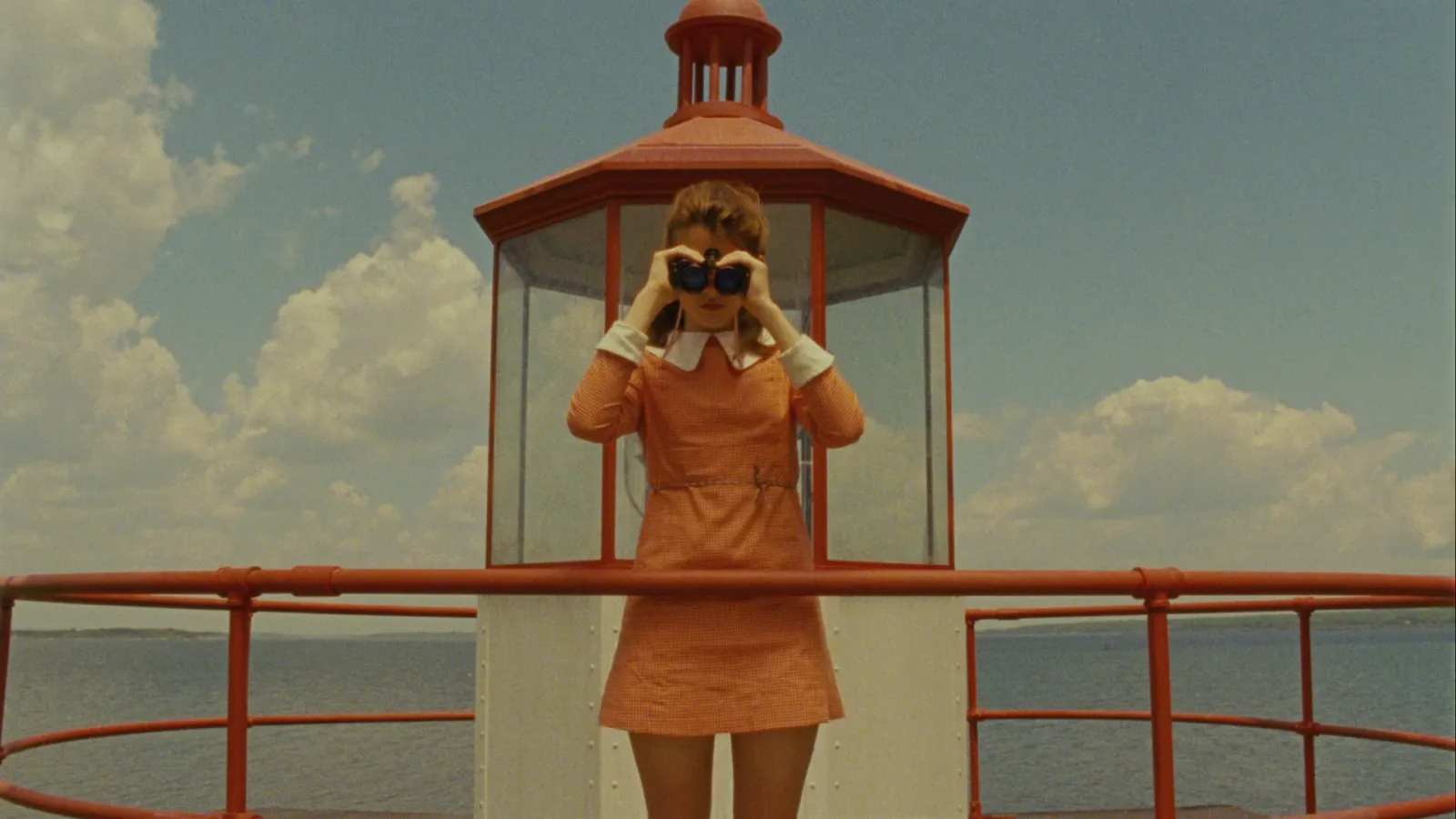
Why it works. Wes Anderson frames are easy to borrow from because the rules are visible. Subjects sit on the centre line, the camera faces them square on, and each frame lives inside one hue family. Run the Grand Budapest facade through our colour palette extractor at five colours and every swatch is a pink or mauve, from #E5B1B1 to #674352, with the three lightest covering about three quarters of the frame. A board built from frames like this tells a production designer exactly how disciplined the colour has to be.
Steal this. Pick a hue family per board, not a list of colours. Our Wes Anderson colour palette post goes film by film with HEX codes if you need them for a grade or a set build.
7. Fashion: one accent against a quiet set
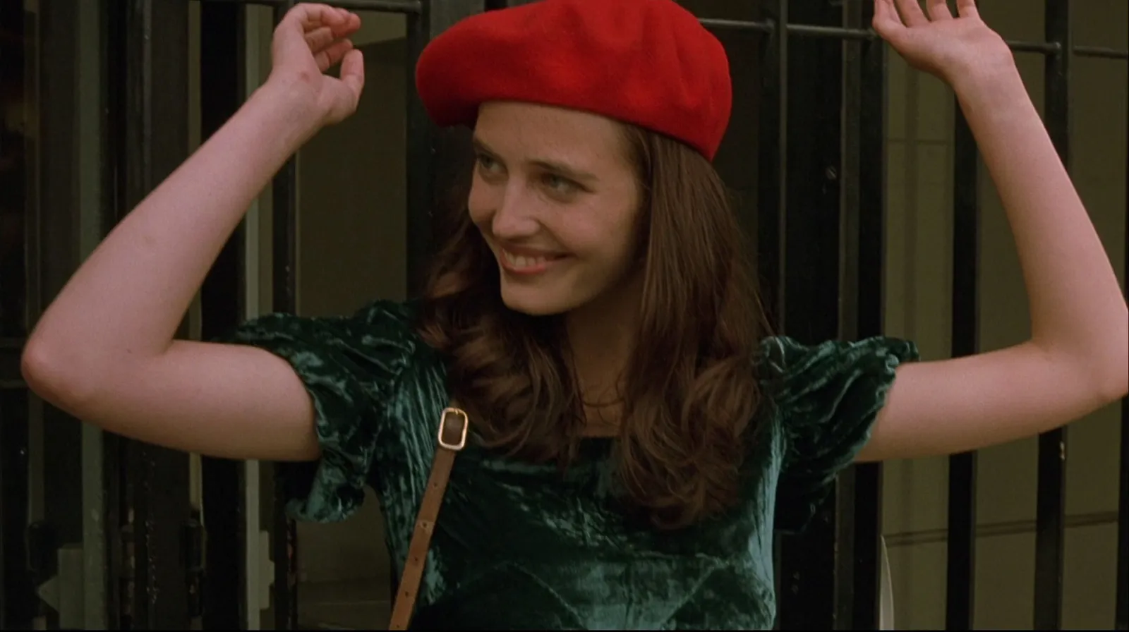
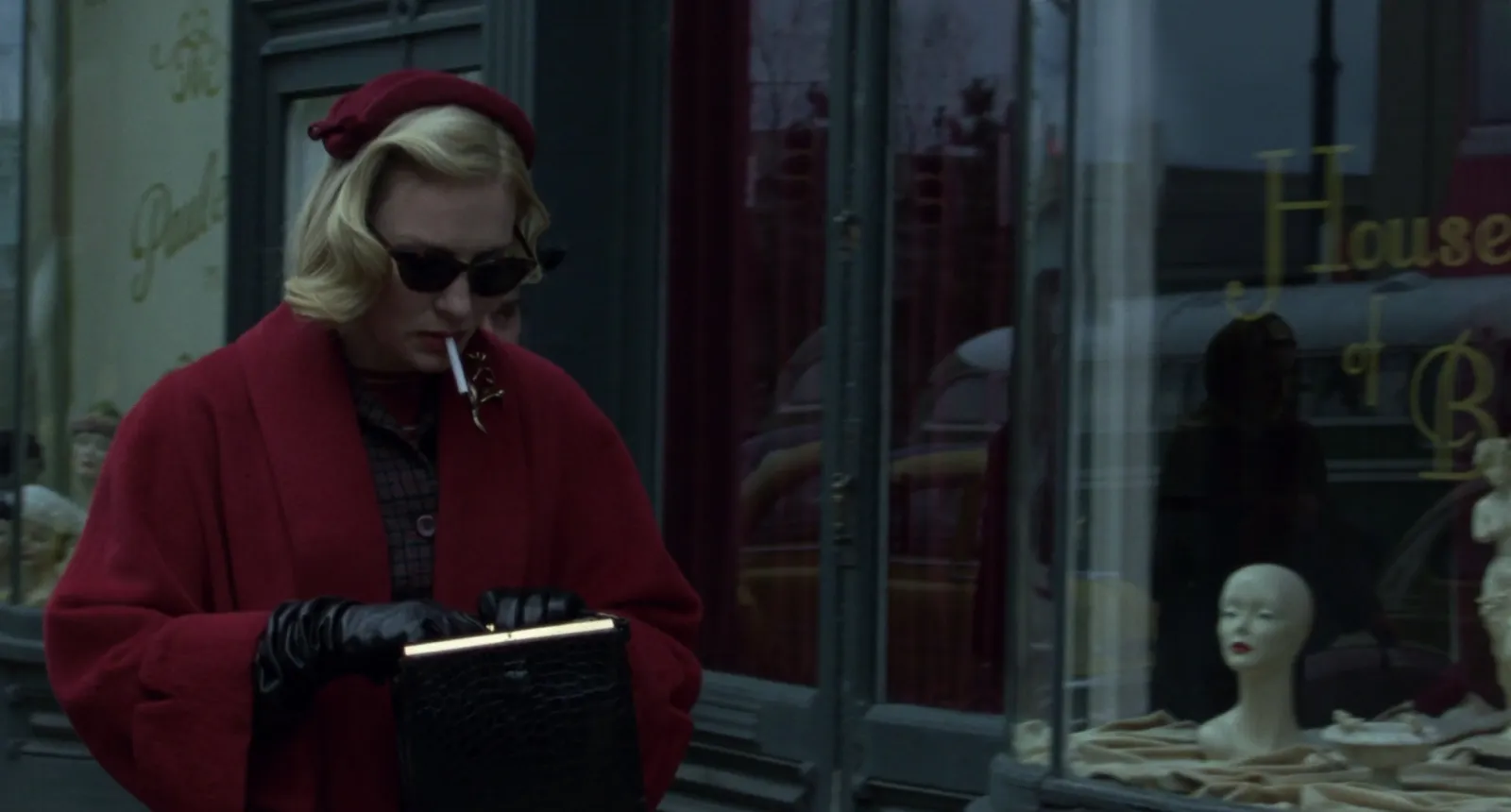
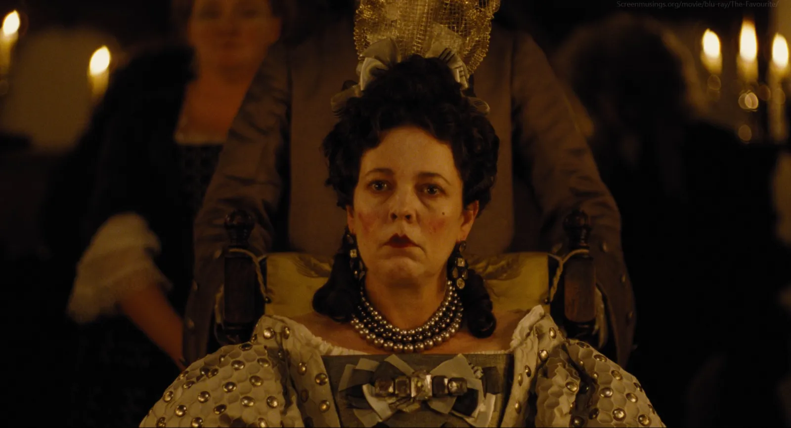
Why it works. A fashion board has to separate the clothes from the world they're in. These three frames do it with restraint. In The Dreamers frame the red is tiny: our palette run puts it (#7D1712) at 4.3% of the picture, against more than three quarters dark browns. Carol puts a red coat against slate grey. The Favourite goes the other way, with gown and room in the same gold, so the face carries the frame. Different strategies, one lesson: costume reads by contrast with the set, and you decide that contrast on the board.
Steal this. Note the share of the accent, even roughly. If the "accent" covers half the frame, it isn't one any more, and your stylist and designer will argue about it later. Our fashion campaign moodboard guide splits this into mood, styling, and casting and set boards.
8. Night and neon: darkness first, light second
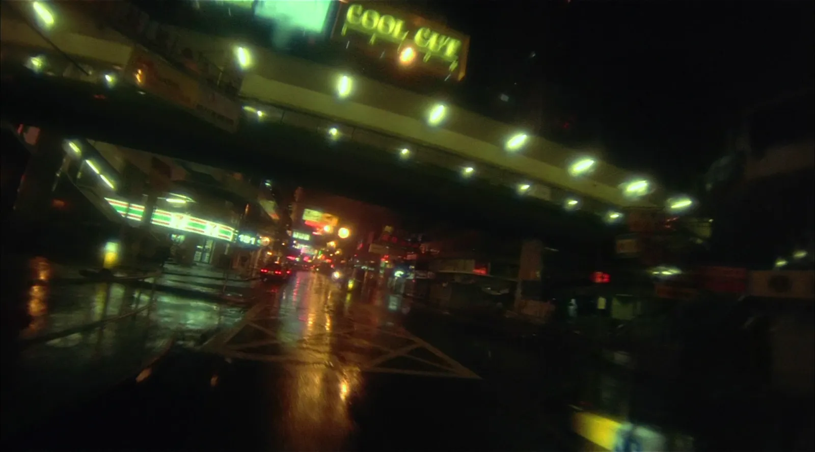
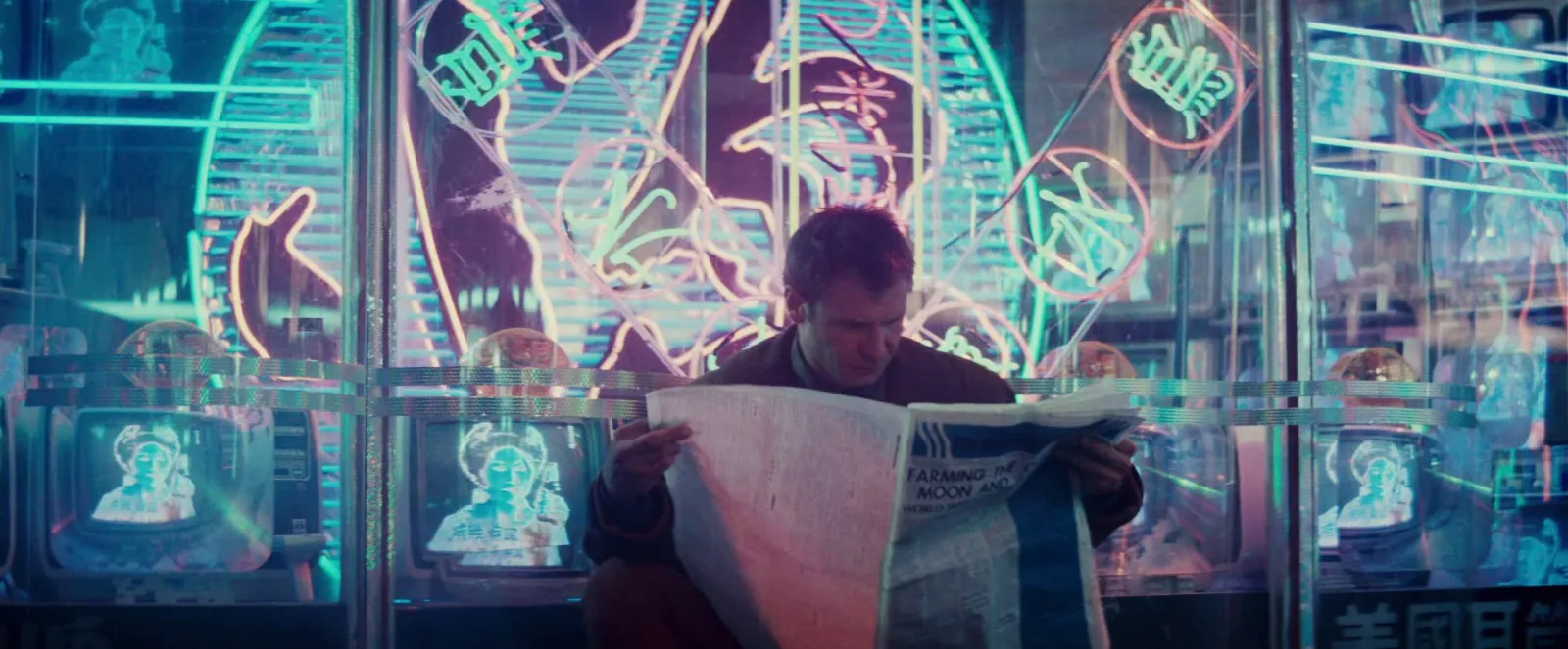
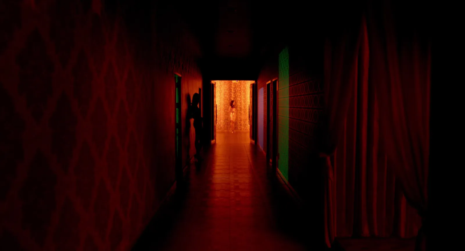
Why it works. Neon boards fail when they're full of neon. The good ones are mostly dark. That Fallen Angels street is 70.8% near black (#18150E) by our palette run, and the brightest green (#C4E18C) is just 2.1%. The light reads as intense because there's so little of it. The other shared trick is visible sources: signs, lamps, doorways in frame, often doubled by wet surfaces.
Steal this. A night board is really a brief about practicals and wet downs. Say so in the captions ("signs in frame, street wet, no fill"), and your gaffer and art department can price it. Christopher Doyle's work for Wong Kar-wai is the deepest well here; our breakdown of Wong Kar-wai's cinematography goes film by film, and the movie colour palettes post has more frames by colour.
What every good example here has in common
Put the eight side by side and the same habits show up.
- One idea per board. Scale, technique, motion language, verbs, silhouette, hue, accent, darkness. Each board answers one question.
- A rule you can say out loud. If you can't say it, the board will look like a pile of nice pictures.
- Every frame has a job. You could caption each one in a few words. Frames you'd have to explain get cut.
- Motion where motion is the point. Brand film, music video, animation, food and sport boards move. The colour and fashion boards are stills because colour and costume don't need to.
- A narrow range. Six frames is plenty for a single slide; eight to twenty across a whole board.
For the method behind boards like these, from the brief to the shoot, see our guide to making a moodboard for a video project. Social ads are a different animal: a UGC moodboard is about hooks, framing and on-screen text, and pretty frames matter much less. And if you're building one that moves, the video moodboard guide covers clip length and playback.
Making your own from these examples
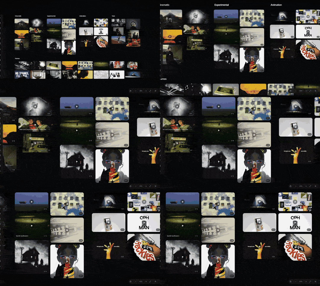
Each example maps onto a layout. Hero for the cinematic board, where one frame leads. Grid for symmetry and colour. Panels for fashion and casting. Collage for night and neon. Our free moodboard templates post shows all eight layouts in our browser tool, each built with real frames, and the tool itself takes stills and GIFs and exports slides for PowerPoint, Keynote, Google Slides or Canva.
The harder part is having the references to hand when the brief lands. Most of the clips above started life as an Instagram reel, a Vimeo film or a YouTube upload, and finding them again a month later is where boards stall.
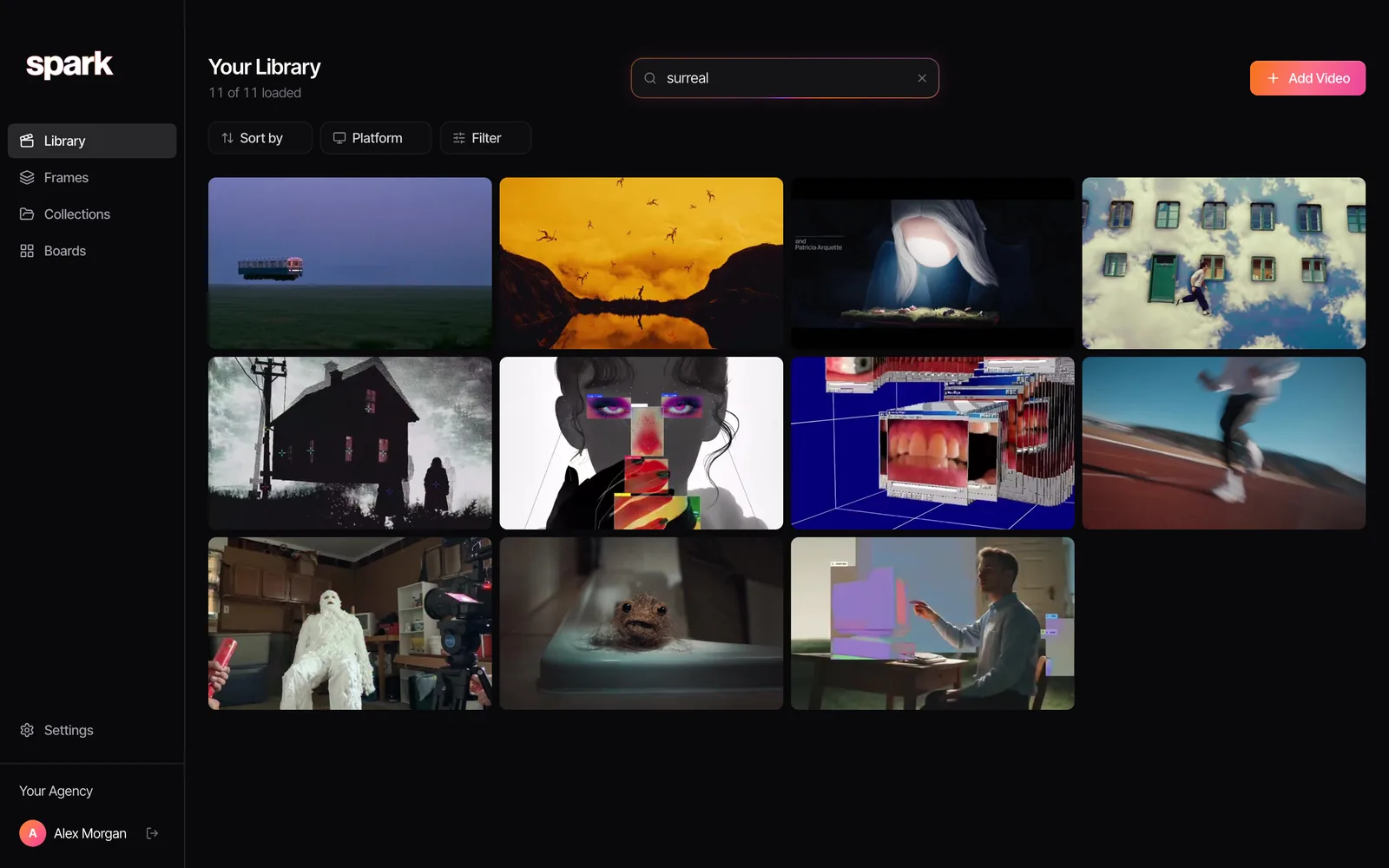
In Spark, you save the video itself from Instagram, TikTok, YouTube, Vimeo and the rest, and on Creator and Studio each one gets an AI description of what's in it and a transcript, so a search for "surreal" or "silhouette" finds the clip. Export a GIF from the exact moment you mean, put it on a board, and Create Moodboard turns the board into slides.
FAQs
What should a moodboard include?
Between eight and twenty references that all answer one question, such as the light, the colour or the scale of the film. Add a short caption under each saying what it's there for, and one lead frame that sums up the idea. For video work, include short clips or GIFs wherever motion is part of the brief.
What makes a good moodboard?
A rule you could say in one sentence, and frames that all follow it. The examples above each have one: small figure in a huge world, one accent against a quiet set, darkness before neon. Boards without a rule read as a pile of nice pictures and start arguments about taste.
How many images should be on a moodboard?
Six to twelve on a single slide, and eight to twenty across a whole board. Fewer than that and the idea doesn't come through; more and the idea gets lost in the crowd. If you have more good frames, split them into separate boards for light, wardrobe and location.
Can a moodboard have videos in it?
Yes, and for film, ads and animation it usually should. Short clips or GIFs of two to six seconds show camera moves, cutting rhythm and animation timing that stills can't. They play in Keynote, PowerPoint, Google Slides and Canva, but not in a PDF, which freezes them on the first frame.
Where can I find moodboard examples?
Film stills sites like FILMGRAB, Behance and Pinterest are all good for frames, and Vimeo and brand and agency Instagram accounts for moving references. The best examples, though, are the ones you save yourself with a note on why, because you'll remember the reason as well as the picture. For discovery without Pinterest's noise, see Cosmos vs Savee.
Keep reading
All articles
How to Make a Moodboard in Figma or FigJam
Figma gives you more control over a moodboard than any slide app. It also freezes your GIFs in the editor, which matters the moment your references move.
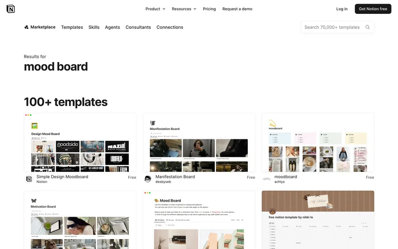
How to Make a Moodboard in Notion
Notion is very good at the notes beside the pictures. The pictures themselves, and especially the moving ones, need a bit more care, so here's how we'd set it up.
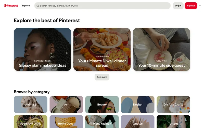
How to Make a Moodboard on Pinterest (and Turn It Into a Deck)
Pinterest is still the quickest place to fill a board. Getting that board in front of a client as a deck is where it stops helping, so here's the whole route, both halves.