
How to Make Style Frames for a Motion Design Pitch
A style frame is a promise that the film will look exactly like this when it moves. Here's how to make a set a client can say yes to, from the first reference to the animatic.
By the Spark team ·
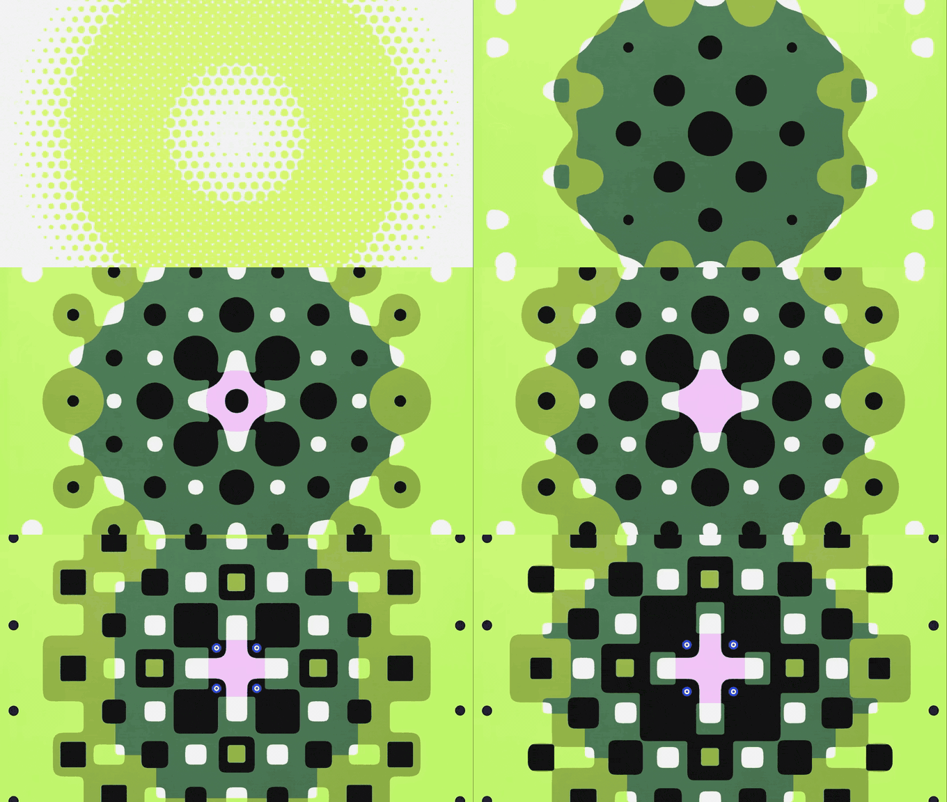
Style frames are finished looking stills that show exactly what an animated film will look like, made before anyone animates a single frame. For a pitch, make three to five per direction, one for each key moment, at the size the film will deliver (1920 x 1080 for a 16:9 film), and show no more than two or three directions. Build them from a references board and a fixed palette. Then present them one per slide with a line about the moment, each paired with a motion reference, so the client can picture it moving.
Those numbers are our working rule, not an industry standard, because there isn't one. Studios differ, budgets differ, and some pitches are won on a single frame. What follows is a process that works, with the reasoning, so you can bend it to your own brief.
What a style frame is, and what it's for
A style frame is design, finished to the standard of the final film: the real palette, the real type, the real texture and light, composed for the real frame. It isn't a sketch and it isn't a reference. Boords' explainer puts it well: storyboards lay out the sequence of events, style frames set the look. Behance even has a whole Styleframing gallery for them, where studios post the frames behind finished work and pitch documents for films that may never get made.
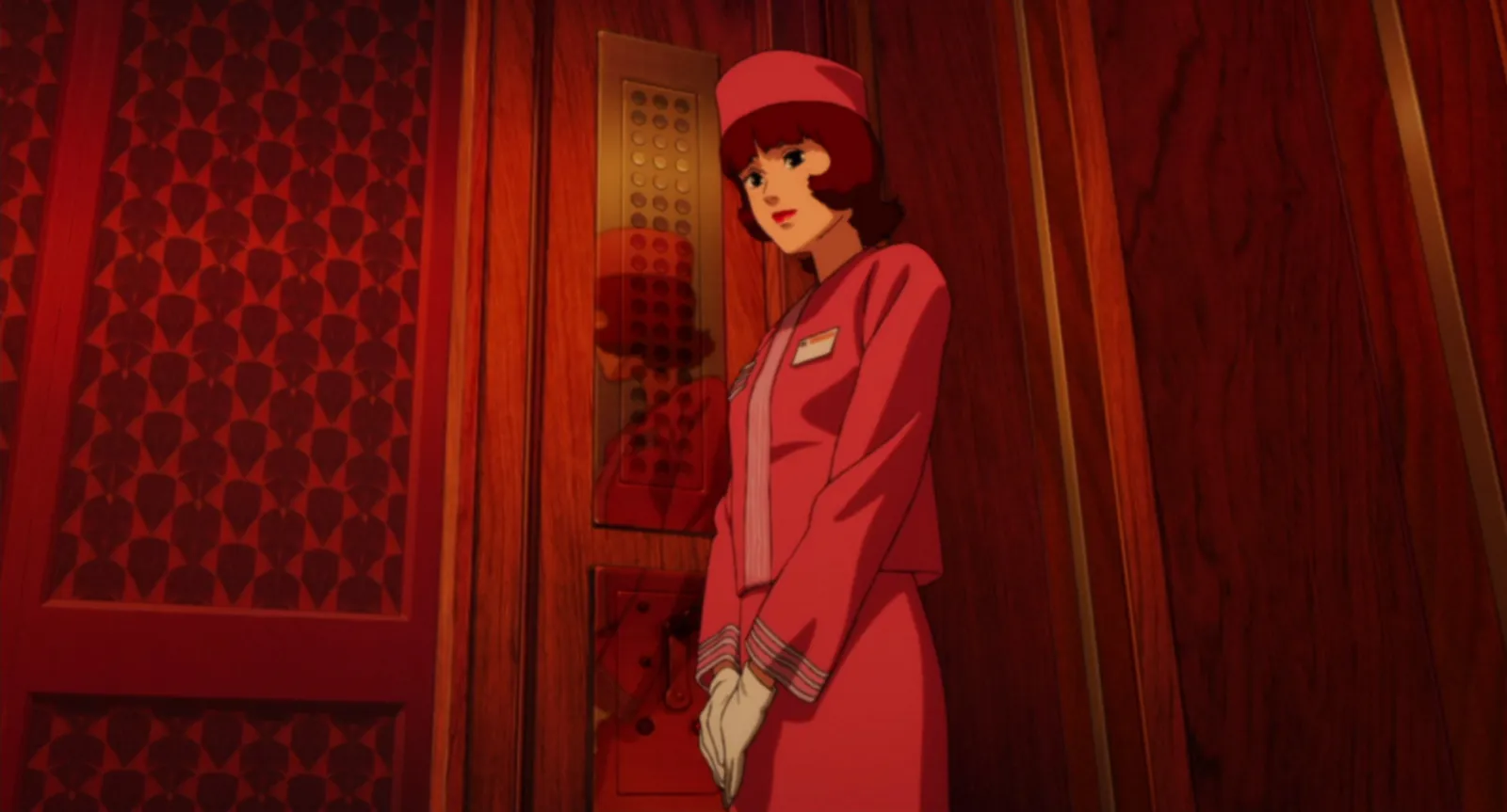
It does three jobs. It sells the look to the client before they've paid for animation. It gives the whole team, designers and animators alike, one picture to match. And it flushes out disagreements early, when changing the palette costs an afternoon, not a week of re-rendering.
Style frames vs moodboards vs storyboards
These three get mixed up, and the mix up costs money when a quote says one and the client expects another. A moodboard is other people's work. Style frames are yours. A storyboard is about order and action, not finish.
| Moodboard | Style frames | Storyboard | |
|---|---|---|---|
| Whose work | Other people's references | Yours, designed for this film | Yours, usually rough |
| Answers | What should it feel like? | What will it look like? | What happens, in what order? |
| Finish | Collected, not made | Final quality | Sketch or simple shapes |
| Typical count | 20 to 40 references | 3 to 5 per direction | A panel per shot |
| When | Before the pitch | The pitch itself | After the look is agreed, or alongside |
We go through the first and last in moodboard vs storyboard. A visual style guide comes later still: it's the rulebook you write once the style frames have been approved, so the look survives a team of ten and a second series.
How many style frames for a pitch?
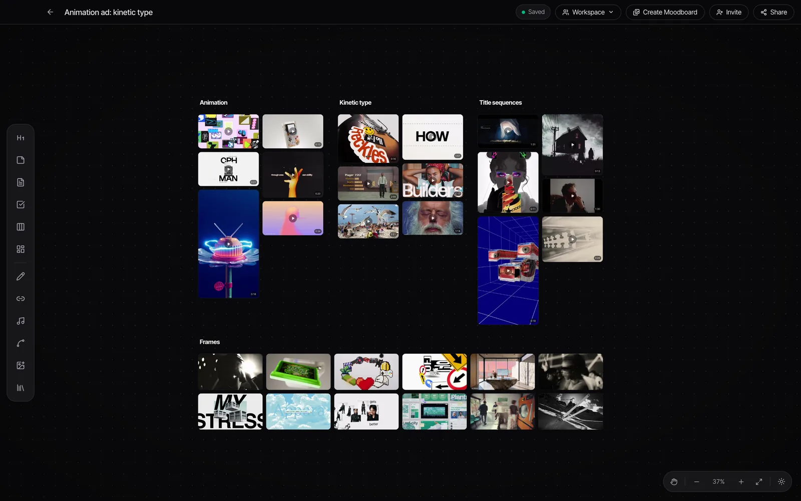
Our rule: one frame per key moment, three to five moments per direction, and two or three directions at most. Usually that means an opening frame, the frame that carries the idea, a product or character moment, and an end frame with the logo or title. Four frames done properly beat ten done in a hurry, because the client will judge the set by its weakest one.
One direction is enough when the client has hired you for a style they've already seen in your reel. Three is the most we'd ever show. Beyond that the client starts mixing and matching ("the colours from B with the type from A"), and you end up designing a fourth direction nobody asked for.
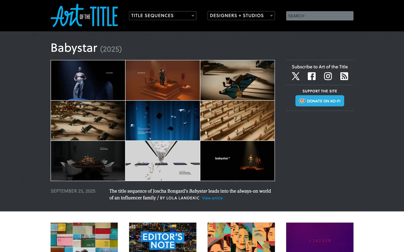
After the pitch is won, the frames turn into design boards: a finished frame for every shot or scene. That's a different job with a different budget, so make sure the quote says which one you're doing.
Size, aspect ratio and safe areas
Design at the delivery size. If the film delivers at 1920 x 1080, so do the frames. A 9:16 social cut means 1080 x 1920, and a 4:5 feed version is 1080 x 1350. If the campaign runs in more than one shape, make the hero frame in each, because a composition that works in 16:9 often falls apart when it's cropped to vertical, and the pitch is the cheapest place to find that out.
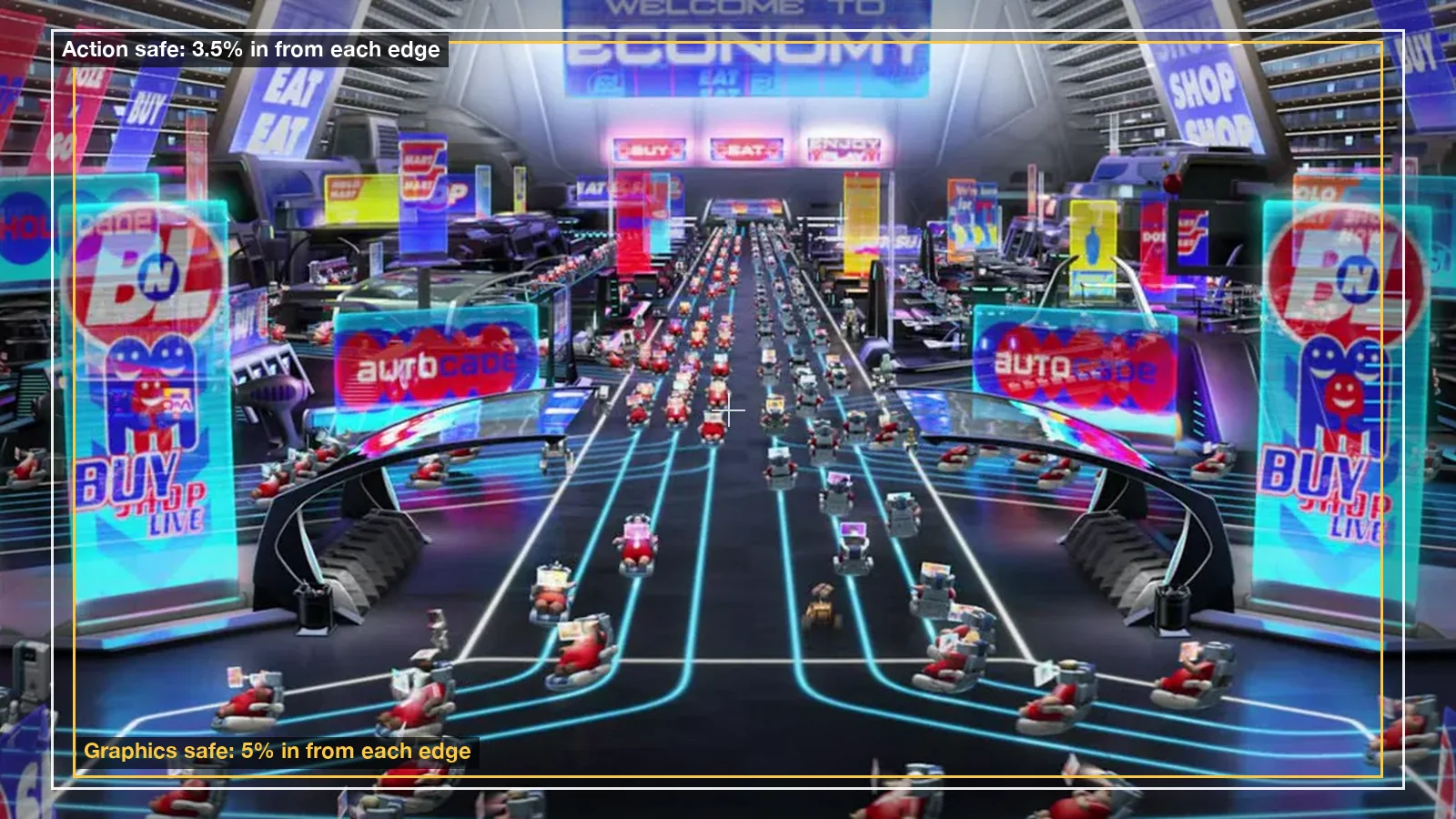
Then respect the safe areas. The EBU's R 95 recommendation keeps essential action 3.5% in from each edge of a 16:9 frame and graphics 5% in. On a 1920 x 1080 frame that's type and logos at least 96 pixels from the sides and 54 from the top and bottom. Social platforms add their own furniture (captions, buttons, the profile name), so check each platform's guidance for vertical frames and keep the bottom of the frame quiet.
Step 1: Start from the brief and a references board
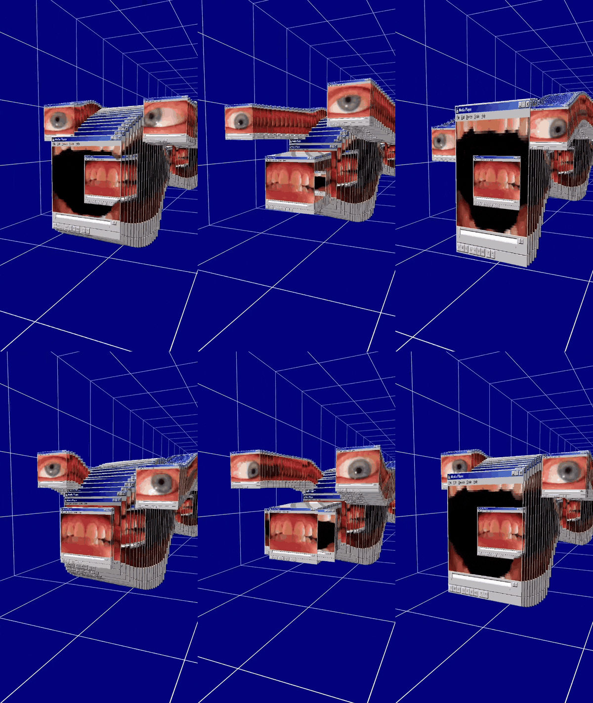
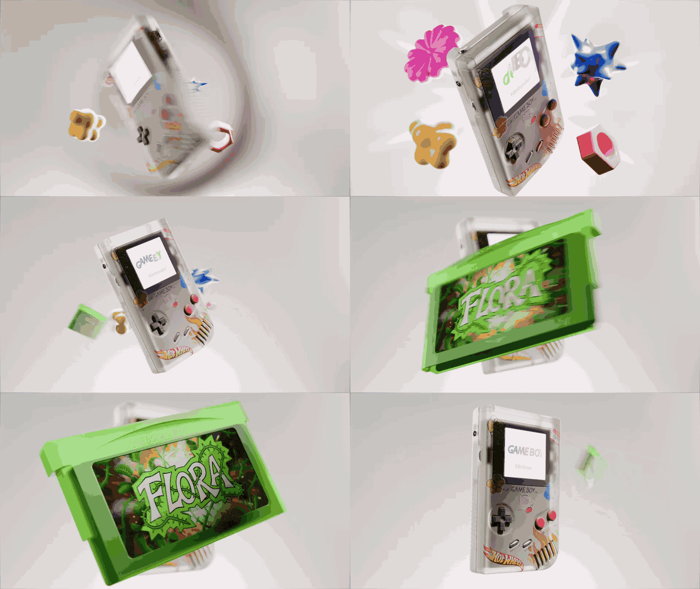
Read the brief for the feeling, the audience and the deliverables, then gather references. Twenty to forty is plenty. More than that and you're browsing, not deciding. Group them by job: look, light, texture, type, motion. If you need places to look, our list of motion design inspiration sites is where we'd start.
Give every reference one job and write that job next to it. "The grain on this one." "The way the camera pushes through the type." A board where each picture has a reason becomes the brief for your frames. Our guide to building a video moodboard goes deeper on boards that move.
Step 2: Fix the palette before you design anything
Pick the colours before you draw. It's the decision that changes every other one, and it's the easiest to argue about if you leave it until the end. Our rule is five colours per direction, plus one accent you use sparingly.
The quickest way to get there is to pull a palette from the reference that's closest to the feeling. Our free colour palette extractor does it in the browser: drop in a still (or a video and scrub to the frame), choose 3 to 12 colours, and copy the HEX codes, CSS variables or JSON, or download an .ase swatch file for your design app. Below are two directions for the same pitch, pulled with the extractor's own engine.
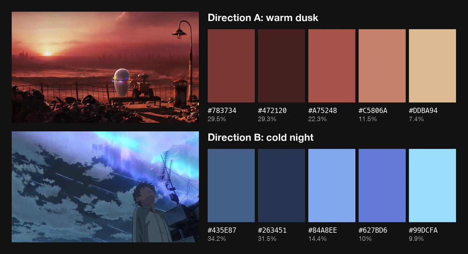
Treat the extracted colours as a starting point, not a law. Push the darks darker, add the accent, check the type colour has enough contrast against the background. Then lock it and stop fiddling.
Step 3: Thumbnail, then finish one hero frame
Start small. Thumbnails at stamp size, in greyscale, are about composition and value: where the eye lands, what's big and what's small. Do a dozen in the time it takes to finish one frame properly. Pick the moment that sells the idea and take that one to full finish first.
The hero frame is where you solve everything at once: type, texture, light direction, line weight, how the logo sits. Everything you decide here becomes a rule for the rest of the set. If the hero frame doesn't work, the other four won't rescue it.
Step 4: Build the rest of the set from the hero
Now make the remaining frames using only the rules the hero set. Same light direction, same palette, same texture, same line weight, same type. Vary everything else: shot size, angle, density, where the type sits. A set that's all wide shots looks like one frame repeated; a wide, a close-up, a type moment and an end frame look like a film.
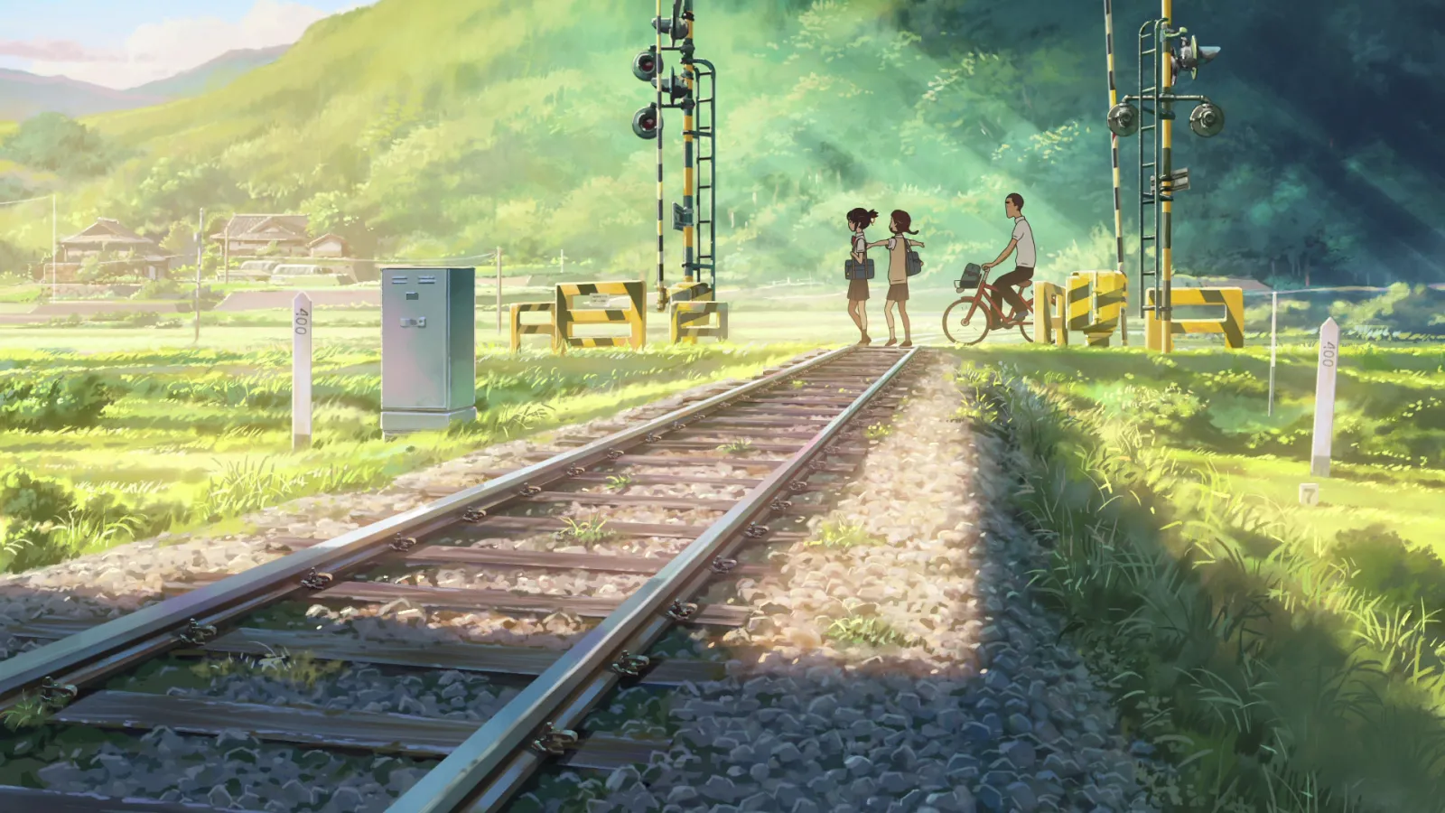
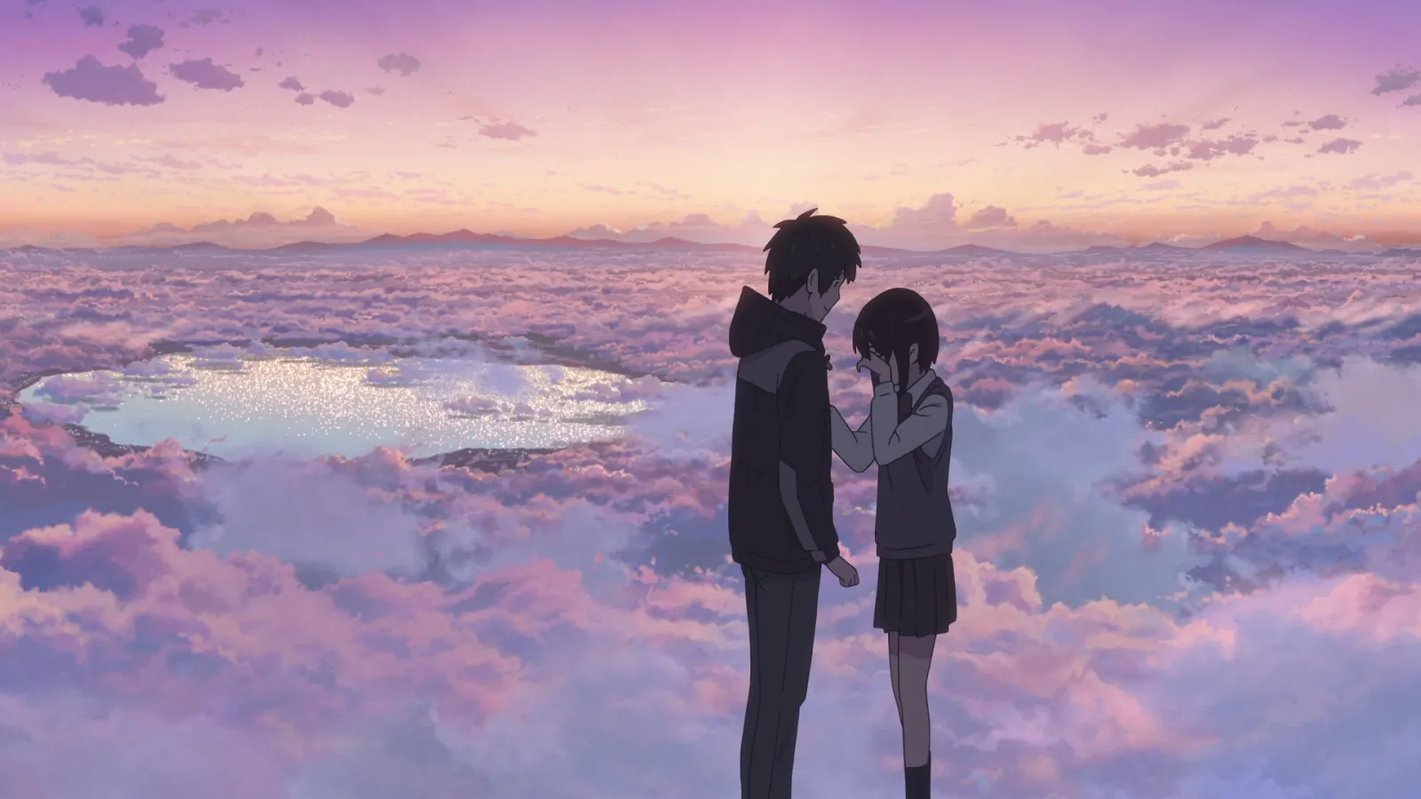
Lay the frames side by side at thumbnail size and squint. If one jumps out, it's breaking a rule. Fix that one, not the others.
Step 5: Give every frame a motion reference
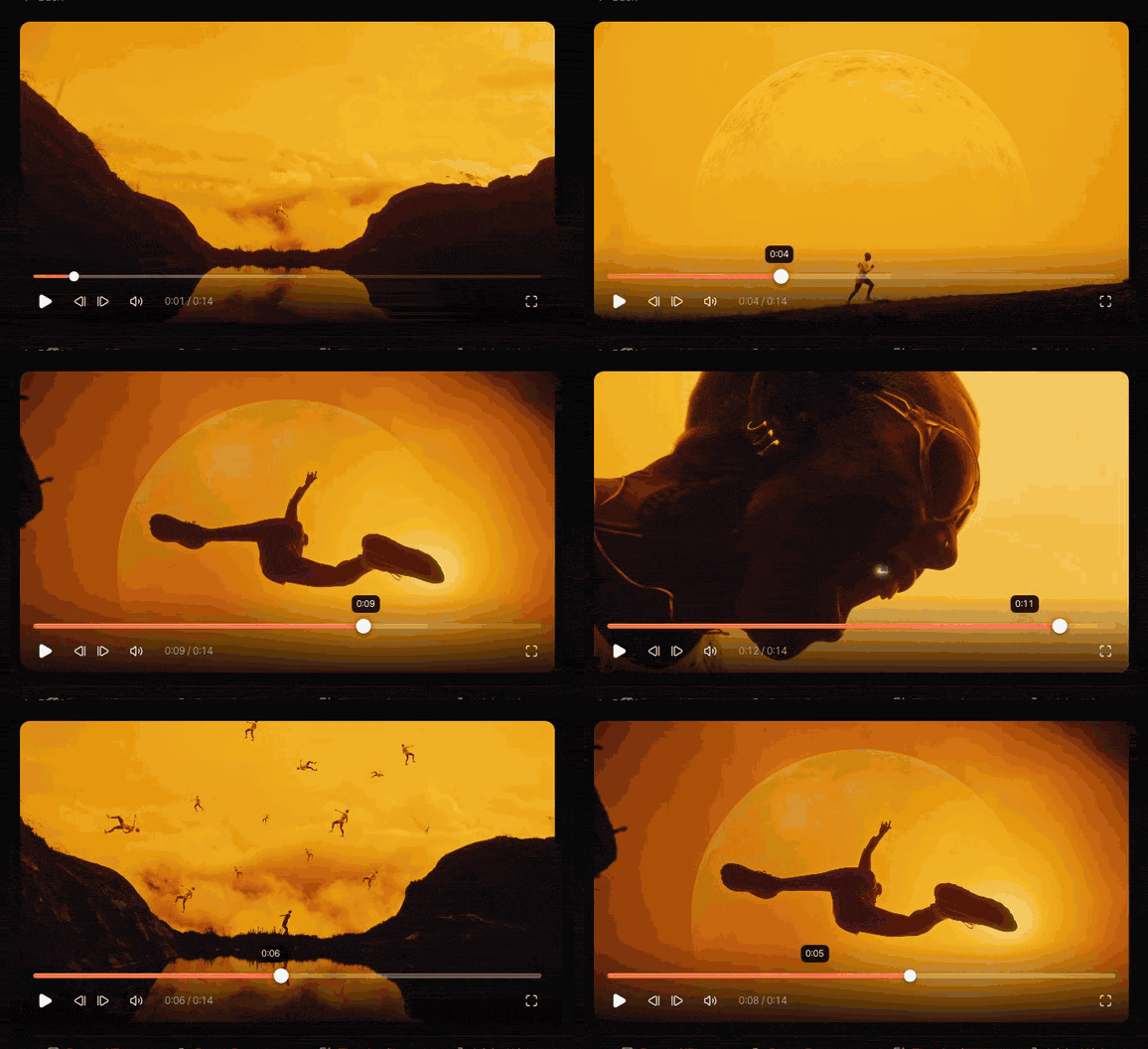
Style frames don't move, and it's hard to imagine motion from a still. So pair each frame with a short loop that shows the motion: the camera move, the transition into the next frame, how the texture behaves. Two to four seconds is enough.
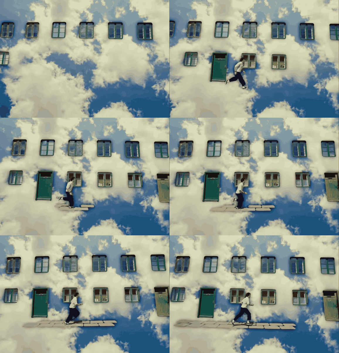
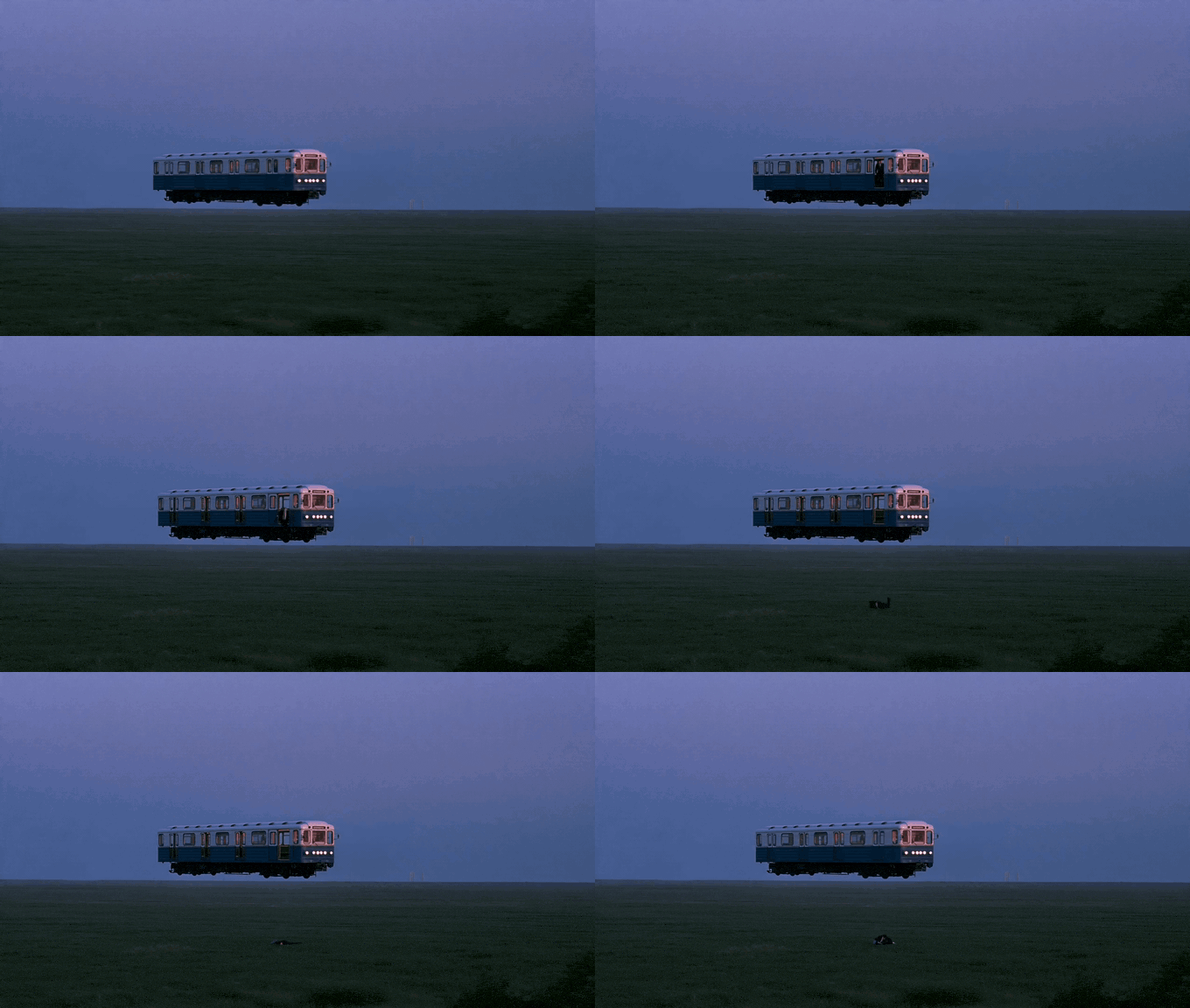
Those loops can come from your own tests (our guide to exporting a GIF from After Effects covers the settings) or from references. For a reference you've saved, step through it a frame at a time to find the exact move, then trim just that moment into a loop. For files you're allowed to use, the free video to GIF converter does it in the browser, with in and out points you can nudge by a single frame.
How to present style frames
One frame per slide, full bleed, with one line under it: the moment, and what moves. Run them in story order, so the client reads the film, not a gallery. Open each direction with its palette and a one line name ("Warm dusk", "Cold night"), and put the motion reference next to the frame it belongs to, small, so it supports the frame without upstaging it.
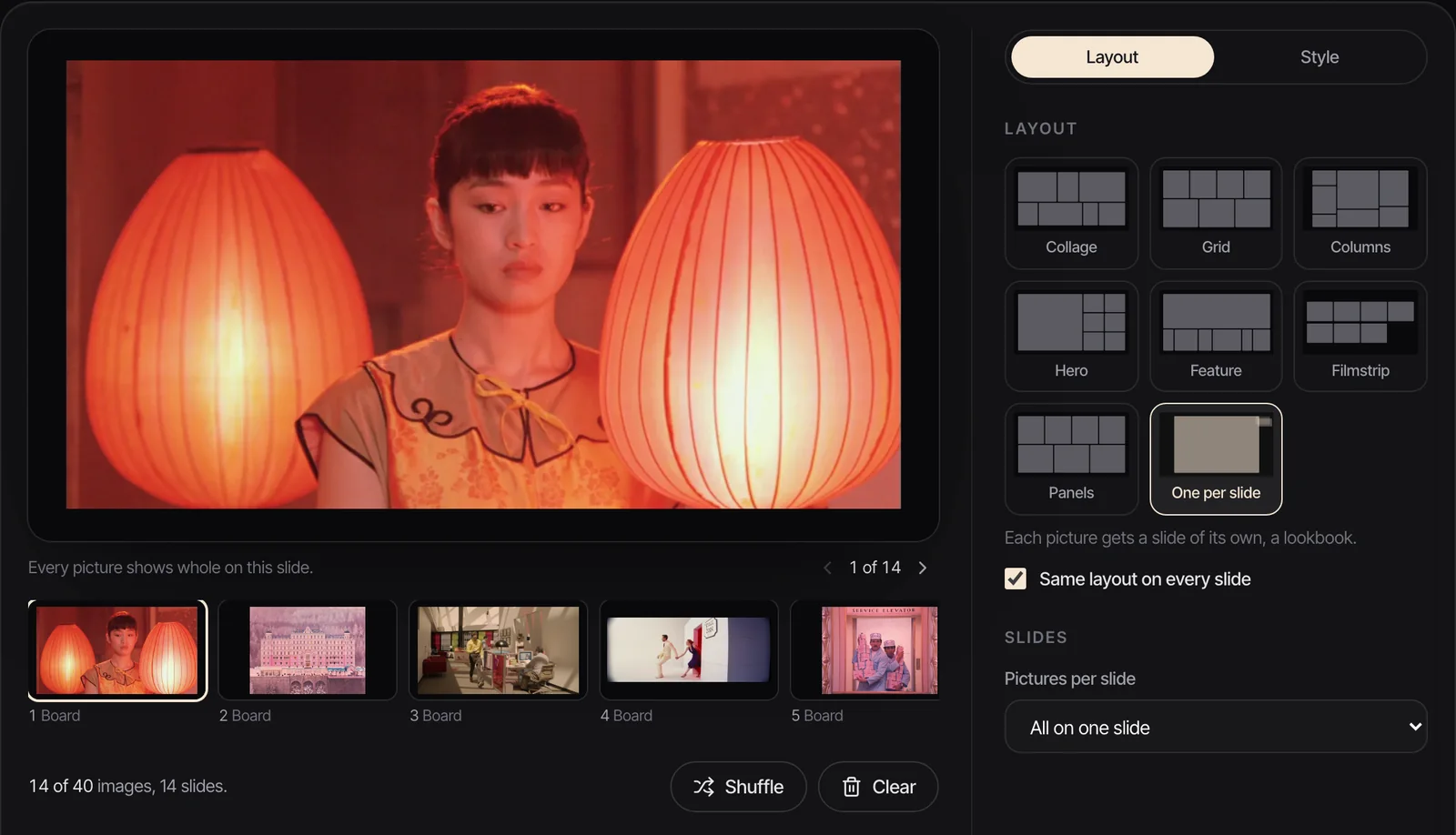
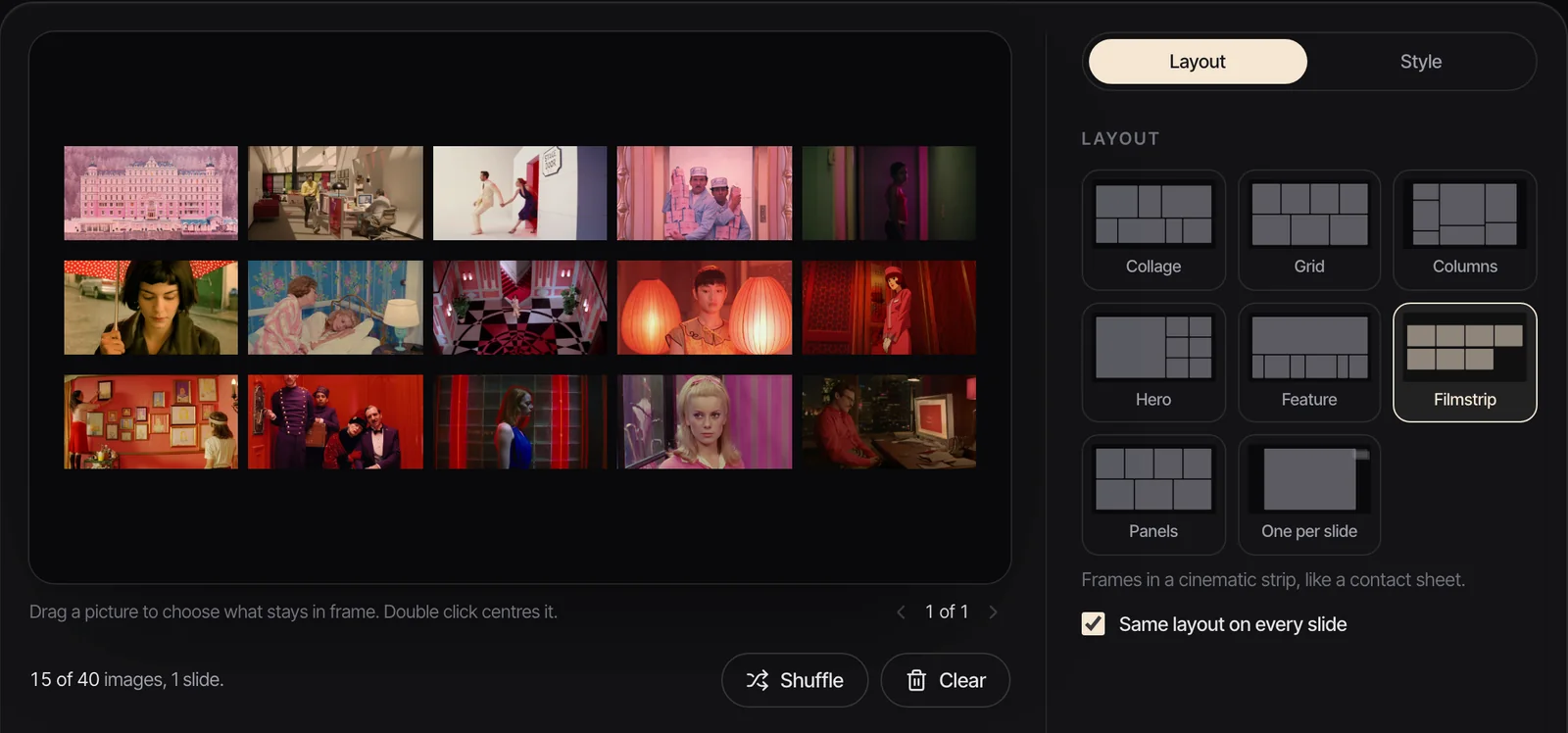
If you need a quick deck, our free moodboard maker lays images out in eight layouts, including One per slide for the frames and Filmstrip for a one page overview, and exports a .pptx for PowerPoint, Keynote, Google Slides or Canva, where GIFs keep playing when you present. A PDF freezes them on their first frame, so send the .pptx if the motion references matter. When the frames are part of a bigger document, our guide to building a film treatment covers where they sit and how long it should run.
After the yes: design boards and the animatic
Once a direction is picked, the frames become the reference everyone matches, and the work moves from selling to planning. Design boards fill in a finished frame for every shot. A storyboard, if you didn't have one already, fixes the order and the action. Then the animatic: the boards cut to time against the music or voiceover, at the real running length, so everyone can feel the pacing before a frame is animated.
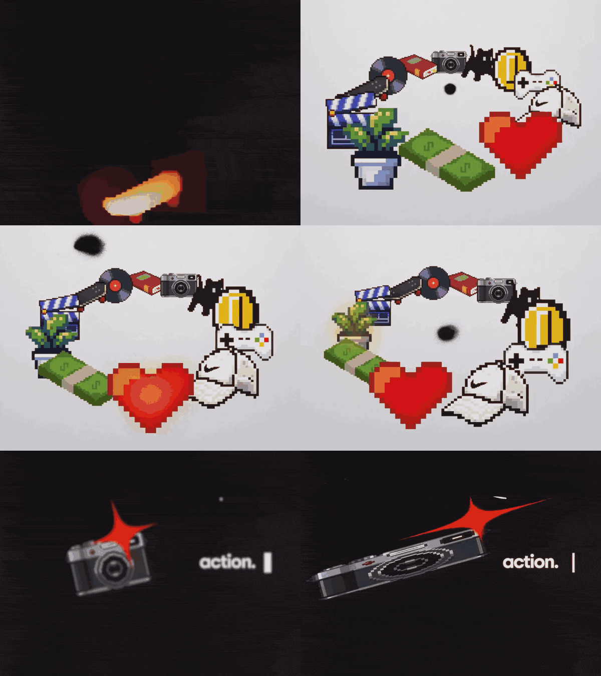
Keep the approved style frames pinned somewhere the whole team sees them. When an animator is three weeks in and a shot feels off, the first question is always whether it still matches the frame.
FAQs
What is a style frame in motion design?
A style frame is a finished still that shows exactly how a moment from an animated film will look: its palette, type, texture, light and composition. Studios make them before animation starts, to win the pitch and to give the team one look to match. They're your own design, unlike a moodboard, which collects other people's work.
How many style frames do you need for a pitch?
There's no fixed standard. Our rule is three to five frames per direction, one for each key moment, and two or three directions at most. One strong direction is enough when the client already knows your style.
What size should style frames be?
Design them at the size the film will deliver: 1920 x 1080 for a 16:9 HD film, 1080 x 1920 for vertical social. Keep type and logos inside the graphics safe area, which the EBU's R 95 sets at 5% in from each edge of a 16:9 frame. If the campaign runs in several shapes, make the hero frame in each.
What's the difference between style frames and a storyboard?
A storyboard shows what happens, shot by shot, usually as rough sketches. Style frames show what the film will look like, at final quality, for a handful of key moments. Many pitches use both: style frames to sell the look, a storyboard to show the story.
What software do motion designers use for style frames?
Whatever produces the final look fastest. Photoshop and Illustrator for 2D design, Cinema 4D, Blender or Houdini for 3D frames, Procreate for drawn work, and After Effects when the frame depends on effects. The software matters less than designing at delivery size with a fixed palette.
Are style frames the same as keyframes?
No. Keyframes are points in an animation where you set a value, like a position or opacity, and the software fills in the motion between them. Style frames are design stills that set the look of the whole film. Keep the two words apart in a quote so nobody expects the wrong thing.
Keep reading
All articles
How to Build a Video Ad Swipe File That Your Team Actually Uses
Saving an ad takes ten seconds. The swipe files that get used are the ones where someone can find the right opening months later, without remembering who made it.
How to Use ChatGPT and Claude for Creative Research (and With Your Reference Library)
An AI chat is a brilliant vocabulary partner and an unreliable librarian. Use it for the first job and it saves hours. Trust it with the second and you'll be hunting for films that were never made.
How to Make a Ripomatic (or Mood Film) for a Pitch
A good ripomatic lets a room feel the film before it exists. A careless one turns up online with other people's footage and your client's logo on it.